WEBLEB
Inicio
Editora de código
Iniciar sesión
Pro
Español
English
Français
Español
Un código de Mete
1,730
Metehan
Abrir en el editor
Publica tu código
0
Recomendado
22 February 2026
Ejemplo de código de interfaz de usuario de calculadora HTML
17 July 2025
Plantilla HTML del panel de control de Couture Atelier
26 February 2026
Plantilla HTML de juegos desbloqueados con búsqueda y configuración
HTML
Copy
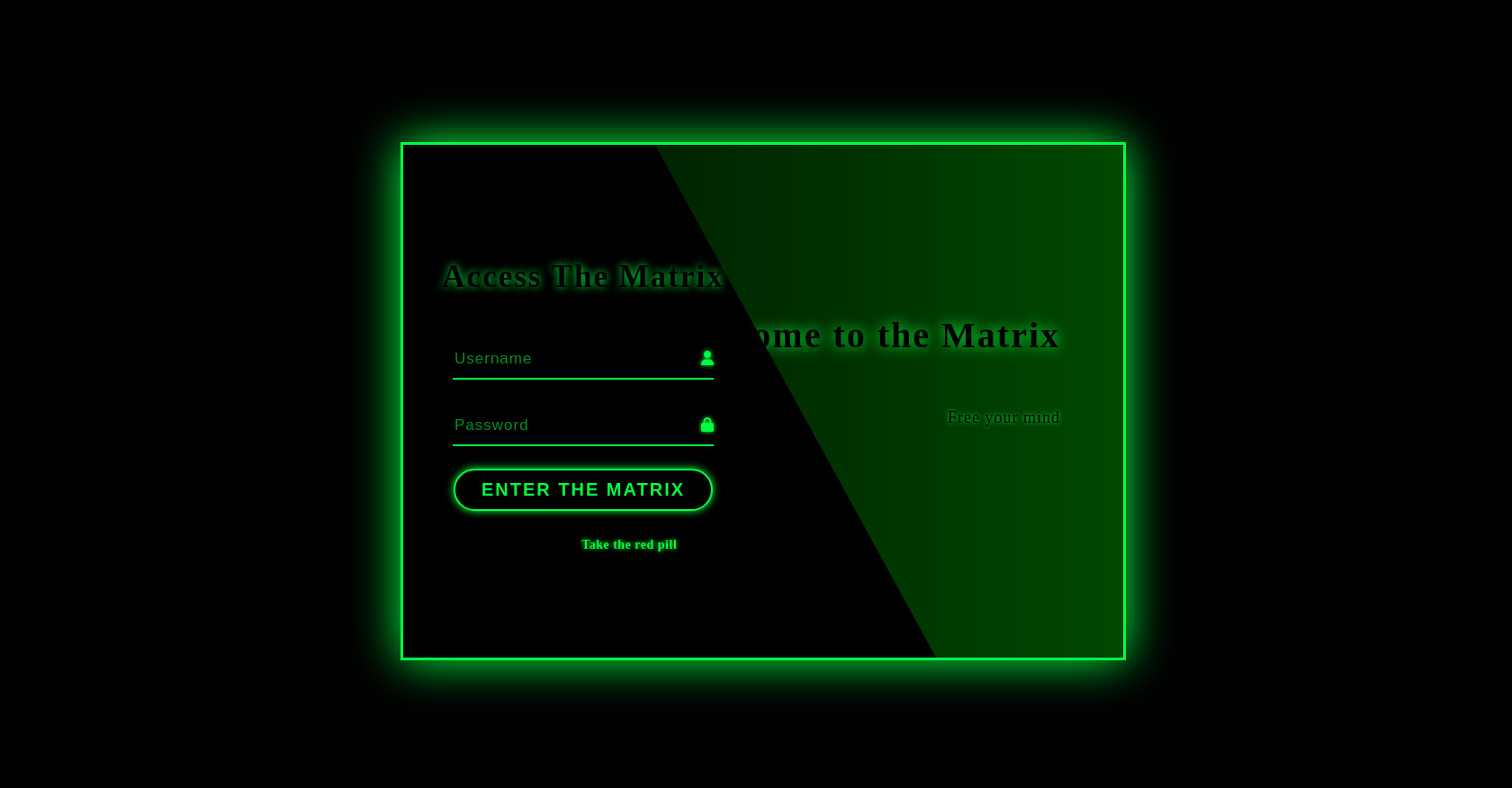
Matrix Login
Access The Matrix
Enter The Matrix
No account yet?
Take the red pill
Welcome to the Matrix
Free your mind
CSS
Copy
<!-- Replace with your HTML Code (Leave empty if not needed) --> * { margin: 0; padding: 0; font-family: 'Courier New', monospace; color: #00ff41; } body { width: 100vw; height: 100vh; background: #000000; display: grid; justify-content: center; align-content: center; overflow: hidden; } ::-webkit-input-placeholder { color: #00cc36; opacity: 0.7; } .wrapper { position: relative; width: 800px; height: 65vh; display: grid; grid-template-columns: 1fr 1fr; border: 3px solid #00ff41; box-shadow: 0 0 50px 0 #00ff41; background-color: rgba(0, 0, 0, 0.8); overflow: hidden; z-index: 10; } .matrix-rain { position: absolute; top: 0; left: 0; right: 0; bottom: 0; opacity: 0.3; z-index: -1; } .form { display: flex; flex-direction: column; justify-content: center; align-items: center; z-index: 100; } .title { font-size: 35px; text-shadow: 0 0 10px #00ff41; letter-spacing: 2px; margin-bottom: 20px; } .inp { padding-bottom: 10px; border-bottom: 2px solid #00ff41; position: relative; } .inp i { color: #00ff41; text-shadow: 0 0 5px #00ff41; } .input { border: none; outline: none; background: none; width: 260px; margin-top: 40px; padding-right: 10px; font-size: 17px; color: #00ff41; letter-spacing: 1px; } .submit { border: none; outline: none; width: 288px; margin-top: 25px; padding: 10px 0; font-size: 20px; border-radius: 40px; letter-spacing: 2px; cursor: pointer; background: #000; border: 2px solid #00ff41; color: #00ff41; font-weight: bold; text-transform: uppercase; transition: all 0.3s ease; box-shadow: 0 0 10px #00ff41; } .submit:hover { background: #00ff41; color: #000; box-shadow: 0 0 20px #00ff41; } .footer { margin-top: 30px; letter-spacing: 0.5px; font-size: 14px; } .link { color: #00ff41; text-decoration: none; text-shadow: 0 0 5px #00ff41; font-weight: bold; } .link:hover { text-shadow: 0 0 10px #00ff41; text-decoration: underline; } .banner { position: absolute; top: 0; right: 0; width: 450px; height: 100%; background: linear-gradient(to right, rgba(0, 50, 0, 0.7), rgba(0, 80, 0, 0.9)); clip-path: polygon(0 0, 100% 0, 100% 100%, 60% 100%); padding-right: 70px; text-align: right; display: flex; flex-direction: column; justify-content: center; align-items: flex-end; } .wel_text { font-size: 40px; margin-top: -50px; line-height: 50px; text-shadow: 0 0 15px #00ff41; font-weight: bold; letter-spacing: 2px; } .para { margin-top: 10px; font-size: 18px; line-height: 24px; letter-spacing: 1px; text-shadow: 0 0 5px #00ff41; } /* Matrix rain animation styles */ @keyframes matrixFade { 0% { opacity: 1; } 50% { opacity: 0.8; } 100% { opacity: 0; } } .matrix-character { position: absolute; color: #00ff41; font-size: 20px; text-shadow: 0 0 5px #00ff41; animation: matrixFade 2s linear infinite; }
JS
Copy
/* Replace with your JS Code (Leave empty if not needed) */ // Matrix rain animation document.addEventListener('DOMContentLoaded', function() { const container = document.getElementById('matrix-rain'); const width = container.offsetWidth; const height = container.offsetHeight; // Matrix characters (katakana + some numbers/symbols) const matrixChars = "アイウエオカキクケコサシスセソタチツテトナニヌネノハヒフヘホマミムメモヤユヨラリルレロワヲン0123456789+=<>¦|「」"; // Number of columns (based on character width) const fontSize = 16; const columns = Math.floor(width / fontSize); // Array to track the y position of each column const drops = []; for (let i = 0; i < columns; i++) { drops[i] = Math.floor(Math.random() * -20); // Start above the container } function createRaindrop() { for (let i = 0; i < columns; i++) { if (Math.random() > 0.98) { // Control the frequency of new characters const char = document.createElement('div'); char.className = 'matrix-character'; char.textContent = matrixChars.charAt(Math.floor(Math.random() * matrixChars.length)); char.style.left = i * fontSize + 'px'; char.style.top = drops[i] * fontSize + 'px'; char.style.opacity = Math.random() * 0.5 + 0.5; // Vary the opacity // Random animation duration for more natural effect const duration = Math.random() * 1.5 + 0.5; char.style.animation = `matrixFade ${duration}s linear forwards`; container.appendChild(char); // Remove character after animation completes setTimeout(() => { if (char.parentNode === container) { container.removeChild(char); } }, duration * 1000); // Move the drop down drops[i]++; // Reset drops that reach the bottom if (drops[i] * fontSize > height) { drops[i] = Math.floor(Math.random() * -10); } } } } // Create raindrops at intervals setInterval(createRaindrop, 100); });