WEBLEB
Home
Editor
Accedi
Pro
Italiano
English
Français
Español
Português
Deutsch
Italiano
हिंदी
2736
logicalbug531
Apri nell'Editor
Video
Pubblica il Tuo Codice
4
13 June 2025
Un codice di Metehan
4 February 2025
Frazione di animazione
HTML
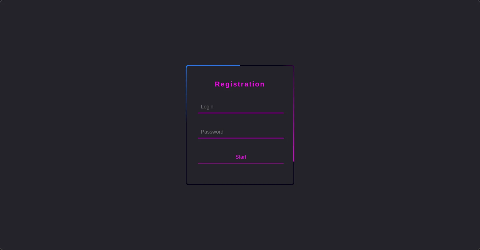
Copy
<!-- Replace with your HTML Code (Leave empty if not needed) --> <html> <head> <title>COCCAINA MUZZ</title> </head> <body> <div class="container"> <div class="form"> <h2>Registration</h2> <div class="box"> <input type="text" placeholder="Login"> </div> <div class="box"> <input type="password" placeholder="Password"> </div> <div class="box"> <input type="submit" value="Start"> </div> </div> </div>
CSS
Copy
/* Replace with your CSS Code (Leave empty if not needed) */ *{ margin: 0; padding: 0; box-sizing: border-box; font-family: 'poppins', sans-serif; } body{ display: flex; align-items: center; justify-content: center; height: 100vh; background: #24232a; } .container{ position: relative; width: 380px; height: 420px; background: #030013; border-radius: 8px; overflow: hidden; } .container::before{ content: ""; position: absolute; width: 380px; height: 420px; background: linear-gradient(0deg, transparent, #fe03f6, #fe03f6); top: -50%; left: -50%; transform-origin: bottom right; animation: anime 7s linear infinite; } .container::after{ content: ""; position: absolute; width: 380px; height: 420px; background: linear-gradient(0deg, transparent, #2376f5, #2376f5); top: -50%; left: -50%; transform-origin: bottom right; animation: anime 7s linear infinite; animation-delay: 3s; } @keyframes anime{ 100% { transform: rotate(360deg); } } .form{ position: absolute; inset: 3px; background: #24232a; border-radius: 8px; z-index: 10; padding: 50px 40px; display: flex; flex-direction: column; } .form h2{ text-align: center; color: #fe03f6; letter-spacing: 3px; } .box{ position: relative; width: 300px; margin-top: 35px; } .box input{ width: 100%; padding: 20px 10px 10px; border-color: #fe03f6; background: transparent; border-top: none; border-left: none; border-right: none; font-size: 18px; outline: none; color: #fe03f6; }
JS
Copy
/* Replace with your JS Code (Leave empty if not needed) */ No problem