WEBLEB
Startseite
Editor
Anmelden
Pro
Deutsch
English
Français
Español
Português
Deutsch
Italiano
हिंदी
Glitch Crypt: P2P-Verschlüsselung
277
zegarkidawida
Im Editor öffnen
Veröffentlichen Sie Ihren Code
HTML
Copy
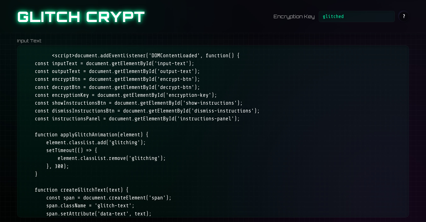
Glitch Crypt
Glitch Crypt
Encryption Key
?
How to use Glitch Crypt
Set your encryption key
Enter notes in the input
Click "Encrypt" to convert your text
Share the encrypted text and key with your recipient
Paste the encrypted text and enter the correct encryption key
Click "Decrypt" to reveal the original message
Dismiss
Input Text
Encrypt
Decrypt
Output Text
CSS
Copy
@import url('https://fonts.googleapis.com/css2?family=Orbitron:wght@400;500;700;900&family=Share+Tech+Mono&display=swap'); :root { --primary-color: #00ffaa; --primary-dark: #00cc88; --secondary-color: #ff00ff; --tertiary-color: #0088ff; --dark-bg: #0a0a12; --panel-bg: rgba(20, 20, 40, 0.7); --glass-highlight: rgba(255, 255, 255, 0.1); --glass-border: rgba(255, 255, 255, 0.05); --text-color: #ffffff; --text-dim: #a0a0a0; --neu-shadow-dark: rgba(5, 5, 10, 0.5); --neu-shadow-light: rgba(40, 40, 80, 0.5); --glow-radius: 15px; } * { margin: 0; padding: 0; box-sizing: border-box; font-family: 'Share Tech Mono', monospace; } body, html { width: 100%; height: 100%; overflow: hidden; background: var(--dark-bg); color: var(--text-color); } .app-container { position: relative; width: 100%; height: 100%; display: flex; flex-direction: column; background-image: radial-gradient(circle at 10% 10%, rgba(0, 255, 170, 0.05) 0%, transparent 50%), radial-gradient(circle at 90% 90%, rgba(255, 0, 255, 0.05) 0%, transparent 50%), linear-gradient(45deg, rgba(0, 0, 0, 0.9) 0%, rgba(10, 10, 18, 0.9) 100%); background-attachment: fixed; overflow: hidden; backdrop-filter: blur(3px); } .app-header { display: flex; justify-content: space-between; align-items: center; padding: 2vh 4vw; height: 15vh; position: relative; z-index: 10; backdrop-filter: blur(10px); -webkit-backdrop-filter: blur(10px); border-bottom: 1px solid var(--glass-border); box-shadow: 0 5px 20px rgba(0, 0, 0, 0.2); } .app-title { position: relative; } .app-title h1 { font-family: 'Orbitron', sans-serif; font-size: clamp(1.8rem, 4vw, 3.5rem); font-weight: 900; letter-spacing: 2px; color: var(--text-color); text-transform: uppercase; position: relative; text-shadow: 0 0 10px var(--primary-color), 0 0 20px rgba(0, 255, 170, 0.5); animation: titlePulse 4s infinite alternate; } .title-glow { position: absolute; top: 50%; left: 50%; transform: translate(-50%, -50%); width: 100%; height: 100%; background: radial-gradient(ellipse at center, var(--primary-color) 0%, transparent 70%); opacity: 0.1; filter: blur(10px); z-index: -1; animation: glowPulse 4s infinite alternate; } .key-container { display: flex; align-items: center; gap: 1rem; } .key-container label { font-size: clamp(0.9rem, 1.5vw, 1.2rem); color: var(--text-dim); font-family: 'Orbitron', sans-serif; } .input-wrapper { position: relative; } .input-wrapper input { background-color: rgba(0, 255, 170, 0.05); border: 1px solid var(--glass-border); border-radius: 8px; padding: 10px 15px; color: var(--primary-color); font-size: clamp(0.9rem, 1.5vw, 1.2rem); width: clamp(150px, 20vw, 300px); backdrop-filter: blur(5px); -webkit-backdrop-filter: blur(5px); transition: all 0.3s ease; box-shadow: inset 0 2px 5px rgba(0, 0, 0, 0.2), 0 0 0 var(--glow-radius) rgba(0, 255, 170, 0); } .input-wrapper input:focus { outline: none; border-color: var(--primary-color); box-shadow: inset 0 2px 5px rgba(0, 0, 0, 0.2), 0 0 0 4px rgba(0, 255, 170, 0.2); } .input-glow { position: absolute; top: 50%; left: 50%; transform: translate(-50%, -50%); width: 100%; height: 100%; background: radial-gradient(ellipse at center, var(--primary-color) 0%, transparent 70%); opacity: 0; filter: blur(10px); z-index: -1; transition: opacity 0.3s ease; } .input-wrapper input:focus + .input-glow { opacity: 0.2; } .help-button { width: 40px; height: 40px; border-radius: 50%; background: rgba(0, 0, 0, 0.3); border: 1px solid var(--glass-border); color: var(--text-color); font-size: 1.2rem; font-weight: bold; cursor: pointer; box-shadow: -2px -2px 5px var(--neu-shadow-light), 2px 2px 5px var(--neu-shadow-dark); transition: all 0.3s ease; display: flex; align-items: center; justify-content: center; } .help-button:hover { background: rgba(0, 0, 0, 0.4); box-shadow: -1px -1px 3px var(--neu-shadow-light), 1px 1px 3px var(--neu-shadow-dark), 0 0 10px var(--primary-color); color: var(--primary-color); } .help-button:active { box-shadow: inset -1px -1px 3px var(--neu-shadow-light), inset 1px 1px 3px var(--neu-shadow-dark); } .instructions-panel { position: absolute; top: 50%; left: 50%; transform: translate(-50%, -50%) scale(0.95); width: clamp(300px, 80%, 600px); background: var(--panel-bg); backdrop-filter: blur(10px); -webkit-backdrop-filter: blur(10px); border: 1px solid var(--glass-border); border-radius: 15px; padding: 2rem; z-index: 100; box-shadow: 0 10px 30px rgba(0, 0, 0, 0.3), 0 0 20px rgba(0, 255, 170, 0.2); opacity: 0; visibility: hidden; transition: all 0.4s cubic-bezier(0.16, 1, 0.3, 1); } .instructions-panel.active { opacity: 1; visibility: visible; transform: translate(-50%, -50%) scale(1); } .instructions-panel h2 { font-family: 'Orbitron', sans-serif; font-size: clamp(1.3rem, 3vw, 2rem); margin-bottom: 1.5rem; color: var(--primary-color); text-shadow: 0 0 10px rgba(0, 255, 170, 0.5); } .instructions-panel ol { margin: 0 0 1.5rem 1.5rem; line-height: 1.6; } .instructions-panel li { margin-bottom: 0.8rem; color: var(--text-dim); font-size: clamp(0.9rem, 1.5vw, 1.1rem); } .dismiss-button { padding: 10px 20px; background: rgba(0, 0, 0, 0.3); border: 1px solid var(--glass-border); border-radius: 8px; color: var(--text-color); font-size: 1rem; cursor: pointer; transition: all 0.3s ease; box-shadow: -2px -2px 5px var(--neu-shadow-light), 2px 2px 5px var(--neu-shadow-dark); margin: 0 auto; display: block; } .dismiss-button:hover { background: rgba(0, 0, 0, 0.4); color: var(--primary-color); box-shadow: -2px -2px 5px var(--neu-shadow-light), 2px 2px 5px var(--neu-shadow-dark), 0 0 10px var(--primary-color); } .dismiss-button:active { box-shadow: inset -1px -1px 3px var(--neu-shadow-light), inset 1px 1px 3px var(--neu-shadow-dark); } .content-area { flex: 1; display: flex; justify-content: center; align-items: center; padding: 2vh 4vw; overflow: hidden; position: relative; } .content-area::before { content: ""; position: absolute; top: 0; left: 0; right: 0; bottom: 0; background: repeating-linear-gradient(90deg, rgba(255, 255, 255, 0.03) 0px, rgba(255, 255, 255, 0.03) 1px, transparent 1px, transparent 20px), repeating-linear-gradient(0deg, rgba(255, 255, 255, 0.03) 0px, rgba(255, 255, 255, 0.03) 1px, transparent 1px, transparent 20px); z-index: -1; pointer-events: none; } .text-container { width: 100%; height: 100%; display: flex; flex-direction: column; gap: 2vh; } .text-area-wrapper { flex: 1; position: relative; display: flex; flex-direction: column; } .text-area-wrapper label { margin-bottom: 0.5rem; font-family: 'Orbitron', sans-serif; font-size: clamp(0.9rem, 1.5vw, 1.1rem); color: var(--text-dim); } .text-area-wrapper textarea { width: 100%; height: 100%; padding: 1.5rem; background-color: rgba(0, 255, 170, 0.05); border: 1px solid var(--glass-border); border-radius: 15px; color: var(--text-color); font-size: clamp(1rem, 1.5vw, 1.3rem); line-height: 1.5; resize: none; backdrop-filter: blur(5px); -webkit-backdrop-filter: blur(5px); transition: all 0.3s ease; box-shadow: inset 0 2px 10px rgba(0, 0, 0, 0.3), 0 0 0 var(--glow-radius) rgba(0, 255, 170, 0); } .text-area-wrapper textarea:focus { outline: none; border-color: var(--primary-color); box-shadow: inset 0 2px 10px rgba(0, 0, 0, 0.3), 0 0 0 4px rgba(0, 255, 170, 0.2); } .textarea-glow { position: absolute; top: 50%; left: 50%; transform: translate(-50%, -50%); width: 100%; height: 100%; background: radial-gradient(ellipse at center, var(--primary-color) 0%, transparent 70%); opacity: 0; filter: blur(20px); z-index: -1; transition: opacity 0.3s ease; pointer-events: none; } .text-area-wrapper textarea:focus + .textarea-glow { opacity: 0.1; } .control-buttons { display: flex; justify-content: center; gap: 2vw; margin: 1vh 0; } .action-button { position: relative; padding: 12px 30px; border-radius: 12px; border: 1px solid var(--glass-border); font-size: clamp(1rem, 2vw, 1.3rem); font-family: 'Orbitron', sans-serif; text-transform: uppercase; letter-spacing: 2px; cursor: pointer; transition: all 0.3s ease; background-color: rgba(0, 0, 0, 0.5); backdrop-filter: blur(5px); -webkit-backdrop-filter: blur(5px); overflow: hidden; box-shadow: -3px -3px 6px var(--neu-shadow-light), 3px 3px 6px var(--neu-shadow-dark); } .action-button::before { content: ''; position: absolute; top: -2px; left: -2px; right: -2px; bottom: -2px; z-index: -1; border-radius: 12px; background: linear-gradient(45deg, var(--primary-color), var(--secondary-color), var(--tertiary-color), var(--primary-color)); background-size: 400%; opacity: 0; transition: opacity 0.3s ease; } .action-button:hover::before { opacity: 1; animation: glowBorder 3s linear infinite; } .action-button .button-text { position: relative; z-index: 2; } .encrypt .button-text { color: var(--primary-color); } .decrypt .button-text { color: var(--secondary-color); } .action-button:hover .button-text { color: white; } .action-button:active { transform: translateY(2px); box-shadow: -1px -1px 3px var(--neu-shadow-light), 1px 1px 3px var(--neu-shadow-dark); } .button-glow { position: absolute; top: 50%; left: 50%; transform: translate(-50%, -50%); width: 100%; height: 100%; background: radial-gradient(ellipse at center, var(--primary-color) 0%, transparent 70%); opacity: 0; filter: blur(15px); z-index: 0; transition: opacity 0.3s ease; } .encrypt .button-glow { background: radial-gradient(ellipse at center, var(--primary-color) 0%, transparent 70%); } .decrypt .button-glow { background: radial-gradient(ellipse at center, var(--secondary-color) 0%, transparent 70%); } .action-button:hover .button-glow { opacity: 0.4; } .app-footer { height: 8vh; padding: 0 4vw; display: flex; align-items: center; justify-content: center; border-top: 1px solid var(--glass-border); backdrop-filter: blur(10px); -webkit-backdrop-filter: blur(10px); box-shadow: 0 -5px 20px rgba(0, 0, 0, 0.2); position: relative; z-index: 10; } .footer-elements { width: 100%; display: flex; justify-content: space-between; align-items: center; } .status-indicator { display: flex; align-items: center; gap: 10px; } .status-dot { width: 12px; height: 12px; background-color: var(--primary-color); border-radius: 50%; box-shadow: 0 0 10px var(--primary-color); animation: pulse 2s infinite; } .status-text { color: var(--text-dim); font-size: 0.9rem; } .created-by { color: var(--text-dim); font-size: 0.9rem; } @keyframes pulse { 0% { opacity: 0.6; transform: scale(0.9); } 50% { opacity: 1; transform: scale(1.1); } 100% { opacity: 0.6; transform: scale(0.9); } } @keyframes glowBorder { 0% { background-position: 0% 50%; } 50% { background-position: 100% 50%; } 100% { background-position: 0% 50%; } } @keyframes titlePulse { 0% { text-shadow: 0 0 10px var(--primary-color), 0 0 20px rgba(0, 255, 170, 0.5); } 50% { text-shadow: 0 0 15px var(--primary-color), 0 0 30px rgba(0, 255, 170, 0.7), 0 0 40px rgba(0, 255, 170, 0.4); } 100% { text-shadow: 0 0 10px var(--primary-color), 0 0 20px rgba(0, 255, 170, 0.5); } } @keyframes glowPulse { 0% { opacity: 0.05; filter: blur(10px); } 50% { opacity: 0.15; filter: blur(15px); } 100% { opacity: 0.05; filter: blur(10px); } } @keyframes textGlitch { 0% { clip-path: inset(50% 0 30% 0); transform: skew(0.15turn, 5deg); } 5% { clip-path: inset(20% 0 60% 0); transform: skew(0.25turn, 2deg); } 10% { clip-path: inset(40% 0 40% 0); transform: skew(-0.25turn, 2deg); } 15% { clip-path: inset(80% 0 5% 0); transform: skew(0.15turn, -5deg); } 20% { clip-path: inset(10% 0 70% 0); transform: skew(-0.15turn, 5deg); } 25% { clip-path: inset(30% 0 50% 0); transform: skew(0.25turn, -2deg); } 30% { clip-path: inset(50% 0 30% 0); transform: skew(-0.05turn, 2deg); } 35% { clip-path: inset(70% 0 10% 0); transform: skew(0.15turn, -5deg); } 40% { clip-path: inset(10% 0 70% 0); transform: skew(-0.15turn, 5deg); } 45% { clip-path: inset(40% 0 40% 0); transform: skew(0.05turn, -2deg); } 50% { clip-path: inset(20% 0 60% 0); transform: skew(-0.25turn, 2deg); } 55% { clip-path: inset(60% 0 20% 0); transform: skew(0.15turn, -5deg); } 60% { clip-path: inset(10% 0 70% 0); transform: skew(-0.15turn, 5deg); } 65% { clip-path: inset(40% 0 40% 0); transform: skew(0.05turn, -2deg); } 70% { clip-path: inset(80% 0 5% 0); transform: skew(-0.05turn, 2deg); } 75% { clip-path: inset(20% 0 60% 0); transform: skew(0.15turn, -5deg); } 80% { clip-path: inset(10% 0 70% 0); transform: skew(-0.15turn, 5deg); } 85% { clip-path: inset(40% 0 40% 0); transform: skew(0.05turn, -2deg); } 90% { clip-path: inset(60% 0 20% 0); transform: skew(-0.25turn, 2deg); } 95% { clip-path: inset(30% 0 50% 0); transform: skew(0.15turn, -5deg); } 100% { clip-path: inset(50% 0 30% 0); transform: skew(-0.15turn, 5deg); } } .glitch-text { position: relative; display: inline-block; } .glitch-text::before, .glitch-text::after { content: attr(data-text); position: absolute; top: 0; left: 0; width: 100%; height: 100%; } .glitch-text::before { left: 2px; text-shadow: -2px 0 #ff00de; background: var(--dark-bg); animation: textGlitch 0.3s infinite linear alternate-reverse; } .glitch-text::after { left: -2px; text-shadow: 2px 0 #00ffaa; background: var(--dark-bg); animation: textGlitch 0.3s infinite linear alternate-reverse; animation-delay: 0.05s; } .glitching { animation: textGlitch 0.3s; } ::-webkit-scrollbar { width: 8px; height: 8px; } ::-webkit-scrollbar-track { background: rgba(0, 0, 0, 0.2); border-radius: 10px; } ::-webkit-scrollbar-thumb { background: var(--primary-color); border-radius: 10px; box-shadow: 0 0 5px var(--primary-color); } ::-webkit-scrollbar-thumb:hover { background: var(--primary-dark); } @media (max-width: 768px) { .app-header { flex-direction: column; gap: 2vh; height: auto; padding-top: 4vh; padding-bottom: 4vh; } .key-container { width: 100%; justify-content: center; flex-wrap: wrap; } .input-wrapper input { width: clamp(150px, 50vw, 300px); } .control-buttons { gap: 4vw; } .action-button { padding: 10px 20px; } .text-container { gap: 3vh; } } @media (min-width: 2000px) { .app-header { height: 12vh; } .app-footer { height: 6vh; } } @media (max-height: 600px) { .app-header { height: auto; padding: 1vh 4vw; } .app-footer { height: auto; padding: 1vh 4vw; } .text-container { gap: 1vh; } } body { cursor: none; } .custom-cursor { position: fixed; width: 20px; height: 20px; border: 2px solid var(--primary-color); border-radius: 50%; transform: translate(-50%, -50%); pointer-events: none; z-index: 9999; mix-blend-mode: exclusion; } .cursor-glitch { position: fixed; width: 20px; height: 20px; background: rgba(0, 255, 170, 0.2); border-radius: 50%; transform: translate(-50%, -50%); pointer-events: none; z-index: 9998; filter: blur(5px); opacity: 0.7; mix-blend-mode: screen; } .click-effect { position: fixed; width: 50px; height: 50px; border: 3px solid var(--secondary-color); border-radius: 50%; transform: translate(-50%, -50%) scale(0); pointer-events: none; z-index: 9997; animation: clickExpand 0.6s forwards; } @keyframes clickExpand { 0% { transform: translate(-50%, -50%) scale(0); opacity: 1; } 100% { transform: translate(-50%, -50%) scale(1.5); opacity: 0; } } .glitch-effect { position: relative; display: inline-block; color: var(--text-color); } .glitch-effect::before, .glitch-effect::after { content: attr(data-text); position: absolute; top: 0; left: 0; width: 100%; height: 100%; background: var(--dark-bg); clip-path: polygon(0 0, 100% 0, 100% 45%, 0 45%); z-index: 1; animation: glitchLoop 4s infinite alternate-reverse; } .glitch-effect::before { left: -2px; text-shadow: 2px 0 var(--secondary-color); animation-delay: -1s; } .glitch-effect::after { left: 2px; text-shadow: -2px 0 var(--primary-color); animation-delay: -2s; } @keyframes glitchLoop { 0% { clip-path: inset(80% 0 0 0); transform: translate(-2px, 0); } 10% { clip-path: inset(10% 0 70% 0); transform: translate(2px, -2px); } 20% { clip-path: inset(20% 0 20% 0); transform: translate(-2px, 2px); } 30% { clip-path: inset(30% 0 40% 0); transform: translate(2px, 2px); } 40% { clip-path: inset(10% 0 60% 0); transform: translate(-2px, -2px); } 50% { clip-path: inset(50% 0 30% 0); transform: translate(2px, 2px); } 60% { clip-path: inset(5% 0 70% 0); transform: translate(-2px, -2px); } 70% { clip-path: inset(40% 0 30% 0); transform: translate(-2px, 2px); } 80% { clip-path: inset(20% 0 60% 0); transform: translate(2px, -2px); } 90% { clip-path: inset(60% 0 10% 0); transform: translate(2px, 2px); } 100% { clip-path: inset(40% 0 30% 0); transform: translate(-2px, -2px); } } .app-title h1, textarea, .key-container label, .text-area-wrapper label { position: relative; }
JS
Copy
document.addEventListener('DOMContentLoaded', function() { const inputText = document.getElementById('input-text'); const outputText = document.getElementById('output-text'); const encryptBtn = document.getElementById('encrypt-btn'); const decryptBtn = document.getElementById('decrypt-btn'); const encryptionKey = document.getElementById('encryption-key'); const showInstructionsBtn = document.getElementById('show-instructions'); const dismissInstructionsBtn = document.getElementById('dismiss-instructions'); const instructionsPanel = document.getElementById('instructions-panel'); function applyGlitchAnimation(element) { element.classList.add('glitching'); setTimeout(() => { element.classList.remove('glitching'); }, 300); } function createGlitchText(text) { const span = document.createElement('span'); span.className = 'glitch-text'; span.setAttribute('data-text', text); span.textContent = text; return span; } async function animateTyping(element, text, delay = 20) { element.value = ''; let displayText = ''; return new Promise(resolve => { let index = 0; const chars = text.split(''); function typeNextChar() { if (index < chars.length) { displayText += chars[index]; element.value = displayText; index++; setTimeout(typeNextChar, delay); } else { setTimeout(resolve, 100); } } typeNextChar(); }); } function encrypt(text, key) { if (!text) return ''; let result = ''; const saltedKey = key + "p2pGlitchCrypt" + key.length; for (let i = 0; i < text.length; i++) { const charCode = text.charCodeAt(i); const keyChar = saltedKey.charCodeAt(i % saltedKey.length); const encryptedCharCode = charCode ^ keyChar; result += String.fromCharCode(encryptedCharCode); } return btoa(result).replace(/=/g, '').replace(/\+/g, '-').replace(/\//g, '_'); } function decrypt(encryptedText, key) { if (!encryptedText) return ''; try { const paddedText = encryptedText.replace(/-/g, '+').replace(/_/g, '/'); const padding = paddedText.length % 4; const normalizedText = padding ? paddedText + '='.repeat(4 - padding) : paddedText; let decodedText = atob(normalizedText); const saltedKey = key + "p2pGlitchCrypt" + key.length; let result = ''; for (let i = 0; i < decodedText.length; i++) { const charCode = decodedText.charCodeAt(i); const keyChar = saltedKey.charCodeAt(i % saltedKey.length); const decryptedCharCode = charCode ^ keyChar; result += String.fromCharCode(decryptedCharCode); } return result; } catch (e) { console.error('Decryption error:', e); return 'Error: Invalid encrypted text or wrong key'; } } function glitchInputOnType() { const span = document.createElement('span'); span.textContent = inputText.value.charAt(inputText.value.length - 1); span.style.position = 'absolute'; span.style.color = 'var(--primary-color)'; span.style.opacity = '0.7'; span.style.fontSize = '1.3rem'; span.style.pointerEvents = 'none'; const rect = inputText.getBoundingClientRect(); const charWidth = 10; const approxPos = (inputText.value.length - 1) % (rect.width / charWidth); span.style.left = `${approxPos * charWidth}px`; span.style.top = '0'; document.body.appendChild(span); applyGlitchAnimation(span); setTimeout(() => { document.body.removeChild(span); }, 300); } encryptBtn.addEventListener('click', async function() { const text = inputText.value; const key = encryptionKey.value || 'glitched'; if (!text) { outputText.value = ''; return; } encryptBtn.disabled = true; const buttonText = encryptBtn.querySelector('.button-text'); applyGlitchAnimation(buttonText); setTimeout(async () => { const encrypted = encrypt(text, key); await animateTyping(outputText, encrypted, 5); encryptBtn.disabled = false; }, 300); }); decryptBtn.addEventListener('click', async function() { const text = inputText.value; const key = encryptionKey.value || 'glitched'; if (!text) { outputText.value = ''; return; } decryptBtn.disabled = true; const buttonText = decryptBtn.querySelector('.button-text'); applyGlitchAnimation(buttonText); setTimeout(async () => { const decrypted = decrypt(text, key); await animateTyping(outputText, decrypted, 5); decryptBtn.disabled = false; }, 300); }); inputText.addEventListener('input', function() { glitchInputOnType(); }); showInstructionsBtn.addEventListener('click', function() { instructionsPanel.classList.add('active'); }); dismissInstructionsBtn.addEventListener('click', function() { instructionsPanel.classList.remove('active'); }); if (encryptionKey.value === '') { encryptionKey.value = 'glitched'; } document.addEventListener('mousemove', function(e) { if (Math.random() > 0.98) { const cursorGlitch = document.createElement('div'); cursorGlitch.style.position = 'fixed'; cursorGlitch.style.width = '10px'; cursorGlitch.style.height = '10px'; cursorGlitch.style.background = 'var(--primary-color)'; cursorGlitch.style.borderRadius = '50%'; cursorGlitch.style.filter = 'blur(2px)'; cursorGlitch.style.boxShadow = '0 0 10px var(--primary-color)'; cursorGlitch.style.pointerEvents = 'none'; cursorGlitch.style.zIndex = '9999'; cursorGlitch.style.opacity = '0.7'; cursorGlitch.style.left = `${e.clientX}px`; cursorGlitch.style.top = `${e.clientY}px`; document.body.appendChild(cursorGlitch); setTimeout(() => { cursorGlitch.style.opacity = '0'; cursorGlitch.style.transition = 'opacity 0.2s'; setTimeout(() => { document.body.removeChild(cursorGlitch); }, 200); }, 100); } }); setInterval(() => { const elements = [ document.querySelector('.app-title h1'), document.querySelector('.status-indicator'), document.querySelector('.created-by span') ]; const randomElement = elements[Math.floor(Math.random() * elements.length)]; applyGlitchAnimation(randomElement); }, 5000); function createFloatingParticle() { const particle = document.createElement('div'); particle.style.position = 'absolute'; particle.style.width = `${Math.random() * 4}px`; particle.style.height = particle.style.width; particle.style.background = 'var(--primary-color)'; particle.style.borderRadius = '50%'; particle.style.filter = 'blur(1px)'; particle.style.opacity = `${Math.random() * 0.5}`; particle.style.pointerEvents = 'none'; const startPos = Math.random() * 100; particle.style.left = `${startPos}vw`; particle.style.top = '100%'; const duration = 5 + Math.random() * 15; particle.style.animation = `floatUp ${duration}s linear forwards`; const style = document.createElement('style'); style.textContent = ` @keyframes floatUp { 0% { transform: translateY(0) rotate(0deg); } 100% { transform: translateY(-100vh) rotate(${Math.random() * 360}deg); } } `; document.head.appendChild(style); document.querySelector('.app-container').appendChild(particle); setTimeout(() => { if (particle.parentNode) { particle.parentNode.removeChild(particle); } if (style.parentNode) { style.parentNode.removeChild(style); } }, duration * 1000); } setInterval(createFloatingParticle, 1000); const customCursor = document.createElement('div'); customCursor.classList.add('custom-cursor'); document.body.appendChild(customCursor); const cursorGlitch = document.createElement('div'); cursorGlitch.classList.add('cursor-glitch'); document.body.appendChild(cursorGlitch); document.addEventListener('mousemove', function(e) { customCursor.style.left = `${e.clientX}px`; customCursor.style.top = `${e.clientY}px`; const offsetX = (Math.random() - 0.5) * 10; const offsetY = (Math.random() - 0.5) * 10; cursorGlitch.style.left = `${e.clientX + offsetX}px`; cursorGlitch.style.top = `${e.clientY + offsetY}px`; }); document.addEventListener('click', function(e) { const clickEffect = document.createElement('div'); clickEffect.classList.add('click-effect'); clickEffect.style.left = `${e.clientX}px`; clickEffect.style.top = `${e.clientY}px`; document.body.appendChild(clickEffect); for (let i = 0; i < 5; i++) { createGlitchParticle(e.clientX, e.clientY); } setTimeout(() => { document.body.removeChild(clickEffect); }, 600); }); function createGlitchParticle(x, y) { const particle = document.createElement('div'); particle.style.position = 'fixed'; particle.style.width = `${Math.random() * 10 + 5}px`; particle.style.height = `${Math.random() * 10 + 5}px`; particle.style.background = Math.random() > 0.5 ? 'var(--primary-color)' : 'var(--secondary-color)'; particle.style.left = `${x}px`; particle.style.top = `${y}px`; particle.style.borderRadius = Math.random() > 0.7 ? '50%' : '0'; particle.style.filter = 'blur(2px)'; particle.style.opacity = '0.8'; particle.style.zIndex = '9000'; particle.style.pointerEvents = 'none'; const angle = Math.random() * Math.PI * 2; const speed = Math.random() * 100 + 50; const vx = Math.cos(angle) * speed; const vy = Math.sin(angle) * speed; particle.style.transform = 'translate(-50%, -50%)'; document.body.appendChild(particle); const startTime = performance.now(); const duration = Math.random() * 600 + 300; function animate(currentTime) { const elapsed = currentTime - startTime; if (elapsed < duration) { const progress = elapsed / duration; const x_pos = x + vx * progress; const y_pos = y + vy * progress; const scale = 1 - progress; const opacity = 1 - progress; particle.style.left = `${x_pos}px`; particle.style.top = `${y_pos}px`; particle.style.transform = `translate(-50%, -50%) scale(${scale})`; particle.style.opacity = opacity; requestAnimationFrame(animate); } else { if (particle.parentNode) { document.body.removeChild(particle); } } } requestAnimationFrame(animate); } function applyGlitch() { const title = document.querySelector('.app-title h1'); wrapInGlitch(title); const labels = document.querySelectorAll('.text-area-wrapper label'); labels.forEach(label => wrapInGlitch(label)); const keyLabel = document.querySelector('.key-container label'); wrapInGlitch(keyLabel); } function wrapInGlitch(element) { if (!element || element.querySelector('.glitch-effect')) return; const text = element.textContent; element.innerHTML = ''; const glitchSpan = document.createElement('span'); glitchSpan.className = 'glitch-effect'; glitchSpan.setAttribute('data-text', text); glitchSpan.textContent = text; element.appendChild(glitchSpan); } applyGlitch(); });