WEBLEB
Startseite
Editor
Anmelden
Pro
Deutsch
English
Français
Español
Português
Deutsch
Italiano
हिंदी
10953
webleb
Video
Veröffentlichen Sie Ihren Code
4
Empfohlen
6 December 2024
Landingpage – Galaxy S24 Ultra 5G
18 November 2025
Metehan
index.html
Copy
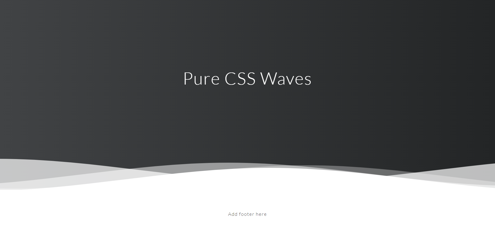
<html> <head> <meta charset="utf-8" /> <title>Webleb</title> <link href="/css/styles.css" rel="stylesheet" type="text/css" /> </head> <body> <div class="header"> <div class="inner-header flex"> <h1>Pure CSS Waves</h1> </div> <div> <svg class="waves" xmlns="http://www.w3.org/2000/svg" xmlns:xlink="http://www.w3.org/1999/xlink" viewBox="0 24 150 28" preserveAspectRatio="none" shape-rendering="auto"> <defs> <path id="gentle-wave" d="M-160 44c30 0 58-18 88-18s 58 18 88 18 58-18 88-18 58 18 88 18 v44h-352z" /> </defs> <g class="parallax"> <use xlink:href="#gentle-wave" x="48" y="0" fill="rgba(255,255,255,0.7)" /> <use xlink:href="#gentle-wave" x="48" y="3" fill="rgba(255,255,255,0.5)" /> <use xlink:href="#gentle-wave" x="48" y="5" fill="rgba(255,255,255,0.3)" /> <use xlink:href="#gentle-wave" x="48" y="7" fill="#fff" /> </g> </svg> </div> </div> <div class="content flex"> <p>Add footer here </p> </div> </body> </html>
styles.css
Copy
@import url(//fonts.googleapis.com/css?family=Lato:300:400); body { margin:0; } h1 { font-family: 'Lato', sans-serif; font-weight:300; letter-spacing: 2px; font-size:48px; } p { font-family: 'Lato', sans-serif; letter-spacing: 1px; font-size:14px; color: #333333; } .header { position:relative; text-align:center; background: -webkit-linear-gradient(to right, #414345, #232526); background: linear-gradient(to right, #414345, #232526); color:white; } .logo { width:50px; fill:white; padding-right:15px; display:inline-block; vertical-align: middle; } .inner-header { height:65vh; width:100%; margin: 0; padding: 0; } .flex { /*Flexbox for containers*/ display: flex; justify-content: center; align-items: center; text-align: center; } .waves { position:relative; width: 100%; height:15vh; margin-bottom:-7px; min-height:100px; max-height:150px; } .content { position:relative; height:20vh; text-align:center; background-color: white; } /* Animation */ .parallax > use { animation: move-forever 25s cubic-bezier(.55,.5,.45,.5)infinite; } .parallax > use:nth-child(1) { animation-delay: -2s; animation-duration: 7s; } .parallax > use:nth-child(2) { animation-delay: -3s; animation-duration: 10s; } .parallax > use:nth-child(3) { animation-delay: -4s; animation-duration: 13s; } .parallax > use:nth-child(4) { animation-delay: -5s; animation-duration: 20s; } @keyframes move-forever { 0% { transform: translate3d(-90px,0,0); } 100% { transform: translate3d(85px,0,0); } } @media (max-width: 768px) { .waves { height:40px; min-height:40px; } .content { height:30vh; } h1 { font-size:24px; } }
main.js
Copy
Nothing to copy