WEBLEB
Home
Editor
Login
Pro
English
English
Français
Español
Português
Deutsch
Italiano
हिंदी
3d
735
mambetov1237.b
Open In Editor
Publish Your Code
Recommended
19 May 2025
3d form
30 August 2024
3D Card Hover Effect
2 June 2025
3d headphones
HTML
Copy
Document
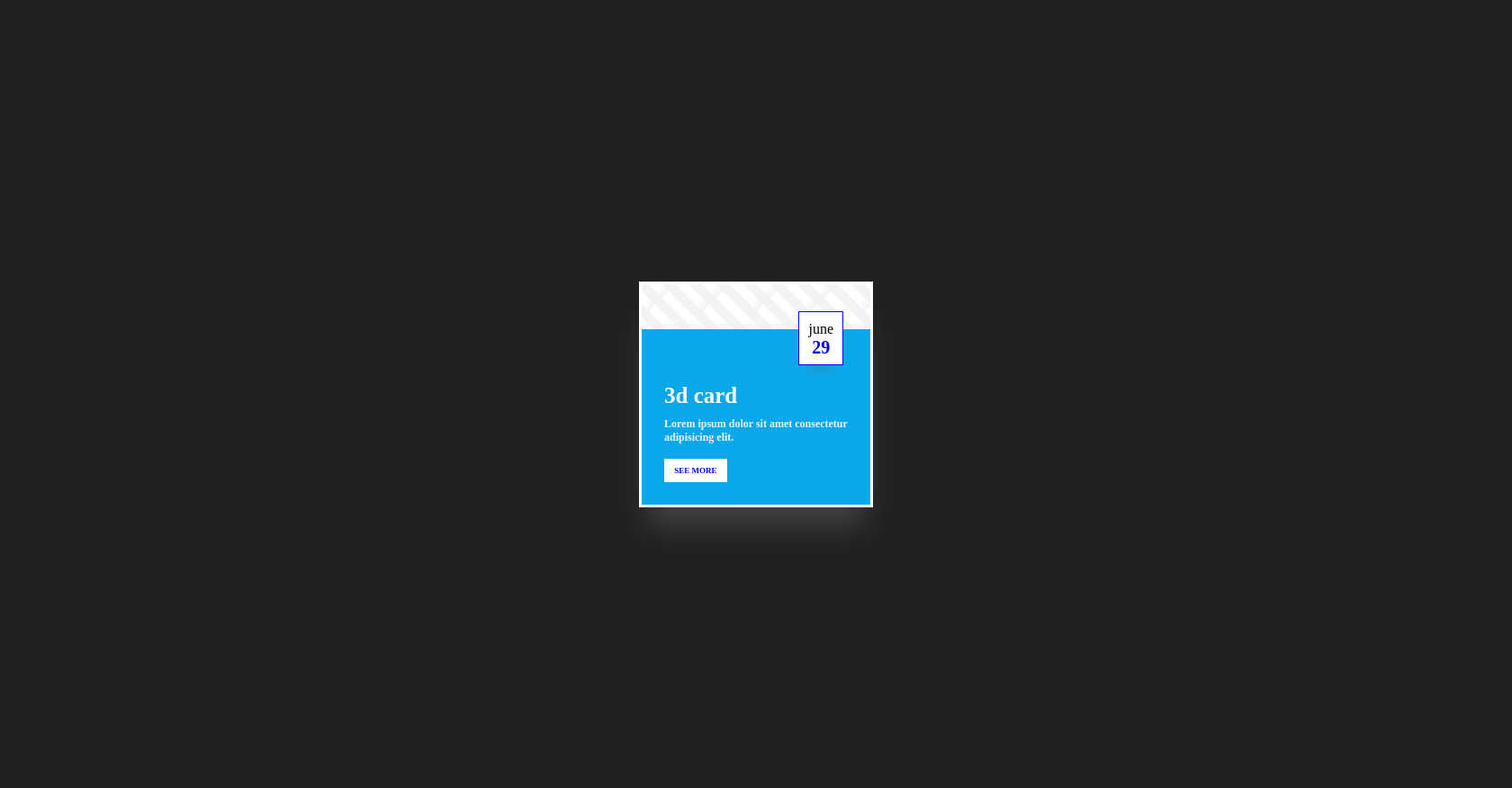
3d card
Lorem ipsum dolor sit amet consectetur adipisicing elit.
see more
june
29
CSS
Copy
* { margin: 0; padding: 0; box-sizing: border-box; } body { display: flex; justify-content: center; align-items: center; min-height: 100vh; background: #212121; } .parent { width: 300px; padding: 20px; perspective: 1000px; } .card { padding-top: 50px; border: 3px solid rgb(255, 255, 255); transform-style: preserve-3d; background: linear-gradient(135deg, #0000 18.75%, #f3f3f3 031.25%, #0000 0), repeating-linear-gradient(45deg, #f3f3f3 -6.25% 6.25%, #ffffff 0 18.75%); background-size: 60px 60px; background-position: 0 0, 0 0; background-color: #f0f0f0; width: 100%; box-shadow: rgba(142, 142, 142, 0.3) 0px 30px 30px -10px; transition: all 0.5s ease-in-out; } .card:hover { background-position: -100px 100px, -100px 100px; transform: rotate3d(0.5, 1, 0, 30deg); } .content-box { background: rgb(10, 168, 235); transition: all 0.5s ease-in-out; padding: 60px 25px 25px 25px; transform-style: preserve-3d; } .content-box .card-title { display: inline-block; color: white; font-size: 25px; font-weight: 900; transition: all 0.5s ease-in-out; transform: translate3d(0px 0px 50px); } .content-box .card-title:hover { transform: translate3d(0px 0px 60px); } .content-box .card-content { margin-top: 10px; font-size: 12px; font-weight: 700; color: #f2f2f2; transition: all 0.5s ease-in-out; transform: translate3d(0px 0px 30px); } .content-box .card-content:hover { transform: translate3d(0px 0px 60px); } .content-box .see-more { cursor: pointer; margin-top: 1rem; display: inline-block; font-weight: 900; font-size: 9px; text-transform: uppercase; color: blue; background: white; padding: 0.5rem 0.7rem; transition: all 0.5s ease-in-out; transform: translate3d(0px 0px 20px); } .content-box .see-more:hover { transform: translate3d(0px 0px 60px); } .date-box { position: absolute; top: 30px; right: 30px; height: 60px; background-color: white; border: 1px solid blue; padding: 10px; transform: translate3d(0px 0px 80px); box-shadow: rgba(100, 100, 111, 0.2) 0px 17px 10px -10px; } .date-box span { display: block; text-align: center; } .date-box .moth { color: blue; font-size: 9px; font-weight: 700; } .date-box .date { font-size: 20px; font-weight: 900; color: blue; } <!-- Replace with your HTML Code (Leave empty if not needed) -->
JS
Copy
/* Replace with your JS Code (Leave empty if not needed) */