WEBLEB
Home
Editor
Login
Pro
English
English
Français
Español
Português
Deutsch
Italiano
हिंदी
portfolio
1449
Mikeykun
Open In Editor
Publish Your Code
Recommended
26 October 2024
HTML CSS Developer Portfolio Website Template
3 May 2025
Developer Portfolio Page
10 February 2025
Sample Developer Portfolio Landing Page
HTML
Copy
Portfolio
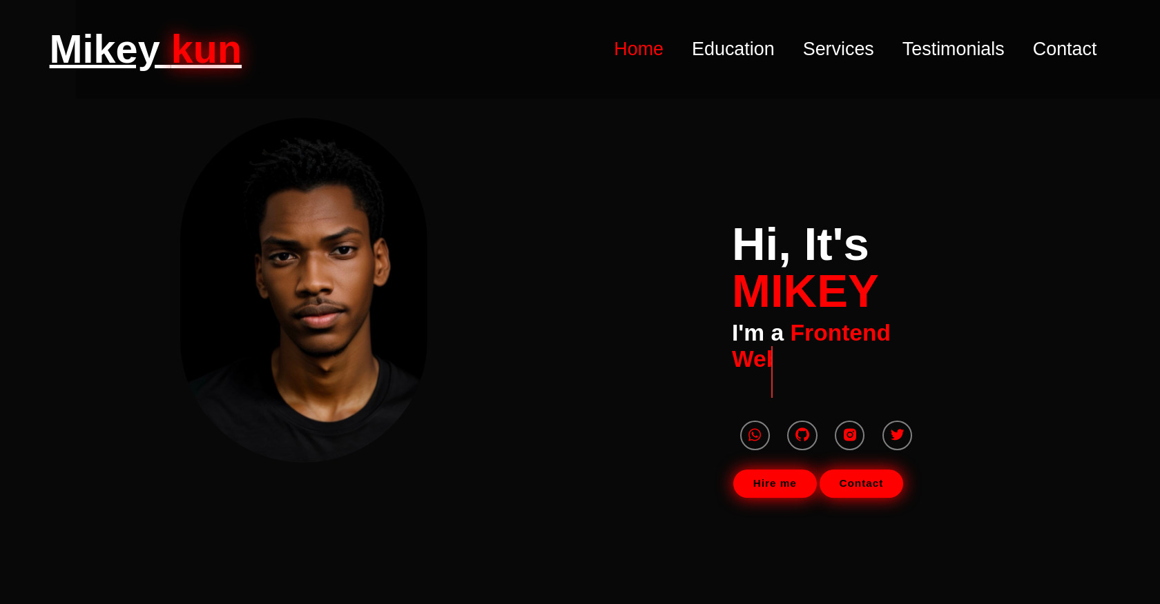
Mikey
kun
Home
Education
Services
Testimonials
Contact
Hi, It's
MIKEY
I'm a
Hire me
Contact
CSS
Copy
*{ margin: 0; padding: 0; box-sizing: border-box; border: none; outline: none; font-family: 'Poppins' , sans-serif; } :root { --bg-color:#080808; --second-bg-color:#131313; --text-color:white; --main-color:#00ffee; } html{ font-size: 60%; overflow-x: hidden; } body{ background-color: var(--bg-color); color: var(--text-color); } .header{ position: fixed; top: 0; left: 0; width: 100%; padding: 4rem 12% 4rem; background: rgba(0, 0, 0, 0.3) ; display: flex; justify-content: space-between; align-items: center; z-index: 5; margin-left: 110px; text-decoration: none; } .logo{ font-size: 6rem; color: white; font-weight: 800; cursor: pointer; transition: 0.3s ease; margin-left: -240px } .logo:hover{ transform: scale(1.1); } .logo span{ text-shadow: 0 0 25px red;} .profile{ display: flex; height: 300px; width: 300px; margin-left:-380px ; margin-bottom:-500px ; } .profile img{ width: 400px; height: 500px; display: flex; border-radius: 1550px } .navbar a{ font-size: 2.8rem; color: white; margin-left: 4rem; font-weight:500; transition: 0.3s ease; border-bottom: 3px solid transparent; text-decoration: none; } .navbar a:hover, .navbar a.active{ color: red; border-bottom: 3px red; } #menu-icon{ font-size: 3.6rem; color: var(--main-color); display: none; } section{ min-height: 100vh; padding: 10rem 12% 10rem; } .home{ display: flex; align-items: center; justify-content: center; margin: 15rem; } .home-content{ display: flex; flex-direction: column; align-items: baseline; text-align: left; justify-content: center; margin-top: 3rem; margin-left:700px; margin-top:-120px; } span{ color: red; } .logo span{ color: red; } .home-content h3{ margin-bottom: 2rem; margin-top: 1rem; font-size: 3.5rem; } .home-content h1{ font-size: 7rem; font-weight: 700; margin-top: 1.5rem; line-height: 1; } .home-img{ border-radius: 50%; } .home-img img{ position: relative; top: 3rem; width: 32vw; border-radius: 50%; box-shadow: 0 0 25px var(--main-color); cursor: pointer; transition: 0.4s ease-in-out; } .home-img img:hover{ box-shadow: 0 0 25px var(--main-color), 0 0 50px var(--main-color), 0 0 100px var(--main-color); } .home-content p{ font-size:1.5rem ; font-weight: 500; line-height: 1.8; max-width: 1000px; } .social-icons a { display: inline-flex; justify-content: center; align-items: center; width: 4.5rem; height: 4.5rem; background: transparent; border: 2px solid gray; font-size: 2.5rem; border-radius: 50%; color: red; margin:1.2rem; transition: 0.3s ease-in-out; text-decoration: none; margin-top: 50px; } .social-icons a:hover{ color: brown; transform: scale(1.3) translateY(-5px) ; box-shadow: 0 0 25px red; background-color:red; } .btn{ display: inline-block; padding: 1rem 2.8rem; background: red; box-shadow: 0 0 25px red; border-radius: 4rem; font-size: 1.6rem; color: black; border: 2px solid transparent; letter-spacing: 0.1rem; font-weight: 600; transition: 0.3s ease-in-out; cursor: pointer; text-decoration: none; margin: .2rem; } .btn:hover{ transform: scale(1.05); box-shadow: 0 0 50px red; } .btn-group{ display: flex; align-items: center; margin: 1.5rem; } .btn-group a:nth-of-type(2){ background-color: red; color: black; border: 2px solid red; box-shadow: 0 0 25px red; text-decoration: none; } .btn-group a:nth-of-type(2):hover{ box-shadow: 0 0 25px red; background-color: red; color: black; } .text-animation{ font-size: 34px ; font-weight: 600; min-width: 280px; } .text-animation span{ position: relative; } .text-animation span::before{ content: 'Web Developer'; color: red; animation: words 20s infinite; } .text-animation span::after{ content: ""; background-color: var(--bg-color); position: absolute; width: calc(100% + 80px); height: 100%; border-left: 3px solid red; right: -8px; animation: cursor 0.6s infinite, typing 20s steps(14) infinite; } @keyframes cursor{ to{ border-left: 2px solid var(--main-color); } } @keyframes words{ 0%, 20%{ content: 'Frontend Web Developer'; } 21%, 40%{ content: 'App Developer'; } 41%, 60%{ content: 'UI / Ux Designer'; } 61%, 80%{ content: 'Flutter Developer'; } 81%, 100%{ content: ''; } } @keyframes typing{ 10%, 15%, 30%, 35%, 50%, 55%, 70%, 75%, 90%, 95%{ width: 0; } 5%, 20%, 25%, 40%, 45%, 60%, 65%, 80%, 85%{ width: calc(100% + 8px); } }
JS
Copy
/* Replace with your JS Code (Leave empty if not needed) */