WEBLEB
Home
Editor
Login
Pro
English
English
Français
Español
Português
Deutsch
Italiano
हिंदी
card information
878
AmirAliAkrami
Open In Editor
Publish Your Code
Recommended
11 December 2024
Responsive Card
28 October 2024
Profile card design
20 June 2025
Social Media Link Cards HTML
HTML
Copy
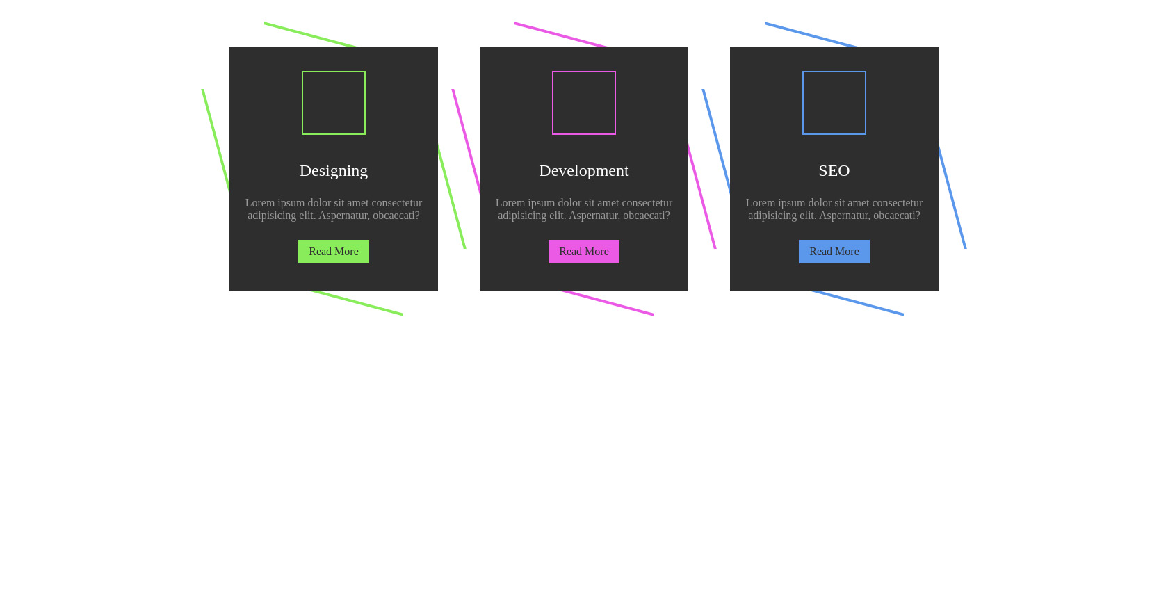
Designing
Lorem ipsum dolor sit amet consectetur adipisicing elit. Aspernatur, obcaecati?
Read More
Development
Lorem ipsum dolor sit amet consectetur adipisicing elit. Aspernatur, obcaecati?
Read More
SEO
Lorem ipsum dolor sit amet consectetur adipisicing elit. Aspernatur, obcaecati?
Read More
CSS
Copy
.container { position: relative; display: flex; justify-content: center; align-items: center; flex-wrap: wrap; padding: 60px 0; gap: 60px; } .container .box { position: relative; width: 300px; height: 350px; background: #2e2e2e; display: flex; justify-content: center; align-items: center; } .container .box::before { content: ""; position: absolute; inset: -10px 50px; border-top: 4px solid var(--clr); border-bottom: 4px solid var(--clr); z-index: -1; transform: skewY(15deg); transition: 0.5s ease-in-out; } .container .box:hover:before { transform: skewY(0); inset: -10px 40px; } .container .box::after { content: ""; position: absolute; inset: 60px -10px; border-left: 4px solid var(--clr); border-right: 4px solid var(--clr); z-index: -1; transform: skew(15deg); transition: 0.5s ease-in-out; } .container .box:hover::after { transform: skew(0); inset: 40px -10px; } .container .box .content { position: relative; display: flex; justify-content: center; align-items: center; flex-direction: column; text-align: center; gap: 20px; padding: 0 20px; width: 100%; height: 100%; overflow: hidden; } .container .box .content .icon { color: var(--clr); width: 80px; height: 80px; box-shadow: 0 0 0 4px #2e2e2e, 0 0 0 6px var(--clr); display: flex; justify-content: center; align-items: center; font-size: 2.5em; background: #2e2e2e; transition: 0.5s ease-in-out; } .container .box:hover .content .icon { background: var(--clr); color: #2e2e2e; box-shadow: 0 0 0 4px #2e2e2e, 0 0 0 300px var(--clr); } .container .box .content .text h3 { font-size: 1.5em; color: #fff; font-weight: 500; transition: 0.5s ease-in-out; } .container .box:hover .content .text h3 { color: #2e2e2e; } .container .box .content .text p { color: #999; transition: 0.5s ease-in-out; } .container .box:hover .content .text p { color: #2e2e2e; } .container .box .content .text a { position: relative; background: var(--clr); color: #2e2e2e; padding: 8px 15px; display: inline-block; text-decoration: none; font-weight: 500; margin-top: 10px; transition: 0.5s ease-in-out; } .container .box:hover .content .text a { background: #2e2e2e; color: var(--clr); }
JS
Copy
/* Replace with your JS Code (Leave empty if not needed) */