WEBLEB
Home
Editor
Login
Pro
English
English
Français
Español
Português
Deutsch
Italiano
हिंदी
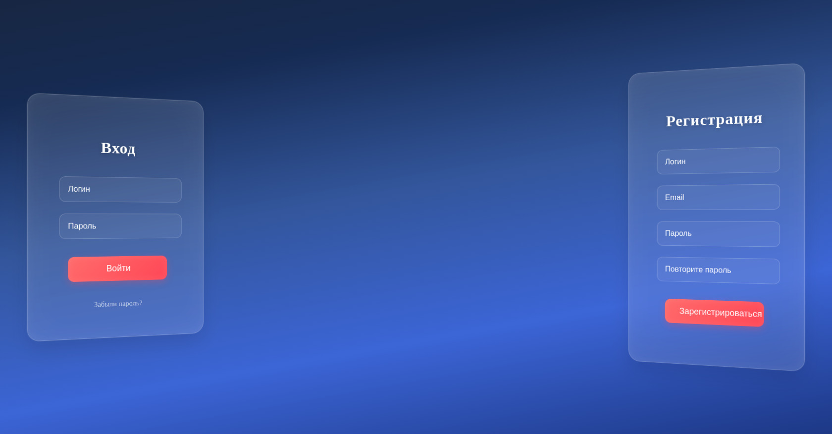
3D Login/Register
917
ytr3d3
Open In Editor
Publish Your Code
Recommended
25 August 2024
CSS 3D Solar System
19 May 2025
3D Ripple UI
23 May 2025
3d login hamburger menü
HTML
Copy
Document
Вход
Войти
Забыли пароль?
Регистрация
Зарегистрироваться
Восстановление
Отправить
Вернуться назад
Подтверждение
Подтвердить
Вернуться назад
CSS
Copy
:root { --bg: #101010; --auth-bg: #101010; --auth-text: #fff; } body { margin: 0; padding: 0; min-height: 100vh; background: linear-gradient( 350deg, #5b72f3, #8B9BFA, #6B7280, #4B5563, #395375, #373d80, #203552, #1E3A8A, #3c65d6, #33569c, #162b53, #18243a, #3b5996, #375daa, #103c94, #2c426d ); background-size: 400% 400%; animation: gradient 30s ease infinite; } @keyframes gradient { 0% { background-position: 0% 50%; } 50% { background-position: 100% 50%; } 100% { background-position: 0% 50%; } } .auth-form{ background: rgba(255, 255, 255, 0.1); backdrop-filter: blur(20px); -webkit-backdrop-filter: blur(20px); border: 1px solid rgba(255, 255, 255, 0.2); border-radius: 24px; margin: 0 8rem 0 8rem; padding: 40px; transform-style: preserve-3d; transition: all 0.6s cubic-bezier(0.23, 1, 0.32, 1); box-shadow: 0 20px 40px rgba(0, 0, 0, 0.1), inset 0 0 80px rgba(255, 255, 255, 0.05), inset 0 0 20px rgba(255, 255, 255, 0.05), 0 0 0 1px rgba(255, 255, 255, 0.1); position: relative; } .auth-container{ position: fixed; top: 0; left: 0; width: 100%; height: 100%; display: flex; align-items: center; justify-content: space-between; perspective: 2000px; } .card-content{ display: flex; flex-direction: column; align-items: center; justify-content: center; } .auth-button{ position: relative; width: 200px; margin: 25px 0; padding: 15px 30px; font-size: 1.1rem; font-weight: 500; color: #ffffff; background: linear-gradient(135deg, #ff6b6b, #ff4757); border: none; border-radius: 12px; cursor: pointer; transition: all 0.4s cubic-bezier(0.23, 1, 0.32, 1); box-shadow: 0 5px 15px rgba(255, 71, 87, 0.3), inset 0 0 15px rgba(255, 255, 255, 0.1); overflow: hidden; } .auth-button::before { content: ''; position: absolute; top: 0; left: -100%; width: 100%; height: 100%; background: linear-gradient( 90deg, transparent, rgba(255, 255, 255, 0.2), transparent ); transition: 0.5s; } .auth-button:hover { transform: translateY(-2px); box-shadow: 0 8px 25px rgba(255, 71, 87, 0.4), inset 0 0 20px rgba(255, 255, 255, 0.2); } .auth-button:hover::before { left: 100%; } #forgot-password { color: rgba(255, 255, 255, 0.7); font-size: 0.9rem; text-decoration: none; margin-top: 15px; transition: all 0.3s ease; position: relative; display: inline-block; cursor: pointer; } #forgot-password::after { content: ''; position: absolute; width: 100%; height: 1px; bottom: -2px; left: 0; background: rgba(255, 255, 255, 0.3); transform: scaleX(0); transition: transform 0.3s ease; } #forgot-password:hover { color: #ffffff; text-shadow: 0 0 10px rgba(255, 255, 255, 0.5); } #forgot-password:hover::after { transform: scaleX(1); } .auth-card{ padding: 20px; position: relative; transform-style: preserve-3d; z-index: 1; transition: all 0.6s cubic-bezier(0.23, 1, 0.32, 1); backface-visibility: hidden; } .recovery-card h2, .verification-card h2, .auth-card h2 { color: #ffffff; font-size: 2rem; margin-bottom: 30px; text-align: center; font-weight: 600; text-shadow: 0 2px 10px rgba(0, 0, 0, 0.2); letter-spacing: 1px; } .auth-input{ display: flex; flex-direction: column; flex-wrap: nowrap; } .auth-input input{ width: calc(100% - 20px); font-size: 1rem; margin: 12px 0; padding: 16px; border: 1px solid rgba(255, 255, 255, 0.2); border-radius: 12px; background: rgba(255, 255, 255, 0.05); backdrop-filter: blur(5px); color: #fff; transition: all 0.3s ease; } .auth-input input::placeholder{ color: #fff; } .auth-input input:hover { background: rgba(255, 255, 255, 0.1); border-color: rgba(255, 255, 255, 0.3); } .auth-input input:focus{ outline: none; background: rgba(255, 255, 255, 0.15); border-color: rgba(255, 255, 255, 0.5); box-shadow: 0 0 20px rgba(255, 255, 255, 0.1), inset 0 0 10px rgba(255, 255, 255, 0.05); transform: translateZ(5px); } .login-form { transform: rotateY(25deg) translateZ(-100px) translateX(-50px); } .register-form { transform: rotateY(-25deg) translateZ(-100px) translateX(50px); } .login-form:hover { transform: rotateY(15deg) translateZ(50px) translateX(30px); box-shadow: -20px 20px 40px rgba(0, 0, 0, 0.3); background: rgba(25, 25, 25, 0.3); border: 1px solid rgba(255, 255, 255, 0.15); } .register-form:hover { transform: rotateY(-15deg) translateZ(50px) translateX(-30px); box-shadow: 20px 20px 40px rgba(0, 0, 0, 0.3); background: rgba(25, 25, 25, 0.3); border: 1px solid rgba(255, 255, 255, 0.15); } /* Обновляем стили для карточек */ .auth-card { padding: 20px; position: relative; transform-style: preserve-3d; z-index: 1; transition: all 0.6s cubic-bezier(0.23, 1, 0.32, 1); backface-visibility: hidden; } /* Стили для основной карточки */ .main-card { transform: translateZ(0); } /* Добавляем анимации для карточек */ @keyframes endpoint-recovery { 0% { opacity: 0; visibility: visible; transform: translate(-50%, -50%) rotateY(0deg) translateZ(-100px); } 100% { opacity: 1; visibility: visible; transform: rotateY(-25deg) translateZ(-100px) translateX(100%) translateY(-50%); } } @keyframes endpoint-verification { 0% { opacity: 0; visibility: visible; transform: translate(50%, -50%) rotateY(0deg) translateZ(-100px); } 100% { opacity: 1; visibility: visible; transform: rotateY(25deg) translateZ(-100px) translateX(-50px) translateY(-50%); } } /* Обновляем стили для карточки восстановления */ .recovery-card { position: absolute; top: 50%; left: 35%; /* Центрируем карточку */ padding: 40px; background: rgba(255, 255, 255, 0.1); backdrop-filter: blur(20px); -webkit-backdrop-filter: blur(20px); border-radius: 24px; opacity: 0; visibility: hidden; transform: translate(-50%, -50%) rotateY(0deg) translateZ(-100px); transition: none; /* Убираем transition, будем использовать animation */ border: 1px solid rgba(255, 255, 255, 0.2); box-shadow: 0 20px 40px rgba(0, 0, 0, 0.1), inset 0 0 80px rgba(255, 255, 255, 0.05); } /* Обновляем стили для карточки верификации */ .verification-card { position: absolute; top: 50%; left: 35%; /* Центрируем карточку */ padding: 40px; background: rgba(255, 255, 255, 0.1); backdrop-filter: blur(20px); -webkit-backdrop-filter: blur(20px); border-radius: 24px; opacity: 0; visibility: hidden; transform: translate(-50%, -50%) rotateY(0deg) translateZ(-100px); transition: none; /* Убираем transition, будем использовать animation */ border: 1px solid rgba(255, 255, 255, 0.2); box-shadow: 0 20px 40px rgba(0, 0, 0, 0.1), inset 0 0 80px rgba(255, 255, 255, 0.05); } /* Применяем анимации при показе карточек */ .show-recovery .recovery-card { animation: endpoint-recovery 0.8s cubic-bezier(0.23, 1, 0.32, 1) forwards; } .show-verification .verification-card { animation: endpoint-verification 0.8s cubic-bezier(0.23, 1, 0.32, 1) forwards; } /* Обновляем поведение карточки восстановления при показе верификации */ .show-verification .recovery-card { transform: rotateY(-35deg) translateZ(-100px) translateX(50%) translateY(-50%); } /* Стили для кнопки "Вернуться назад" */ .back-to-login { color: rgba(255, 255, 255, 0.7); font-size: 0.9rem; text-decoration: none; margin-top: 15px; transition: all 0.3s ease; position: relative; display: inline-block; cursor: pointer; } .back-to-login::after { content: ''; position: absolute; width: 100%; height: 1px; bottom: -2px; left: 0; background: rgba(255, 255, 255, 0.3); transform: scaleX(0); transition: transform 0.3s ease; } .back-to-login:hover { color: #ffffff; text-shadow: 0 0 10px rgba(255, 255, 255, 0.5); } .back-to-login:hover::after { transform: scaleX(1); } /* Стили для кнопки "Вернуться к восстановлению" */ .back-to-recovery { color: rgba(255, 255, 255, 0.7); font-size: 0.9rem; text-decoration: none; margin-top: 15px; transition: all 0.3s ease; position: relative; display: inline-block; cursor: pointer; } .back-to-recovery::after { content: ''; position: absolute; width: 100%; height: 1px; bottom: -2px; left: 0; background: rgba(255, 255, 255, 0.3); transform: scaleX(0); transition: transform 0.3s ease; } .back-to-recovery:hover { color: #ffffff; text-shadow: 0 0 10px rgba(255, 255, 255, 0.5); } .back-to-recovery:hover::after { transform: scaleX(1); }
JS
Copy
/* Replace with your JS Code (Leave empty if not needed) */