WEBLEB
Home
Editor
Login
Pro
English
English
Français
Español
Português
Deutsch
Italiano
हिंदी
loading icon 3
491
ByBy.inc
Open In Editor
Publish Your Code
Recommended
22 May 2025
3d silder effect
22 August 2024
Animated card with 3d hover effect
24 July 2025
CSS Loading Animation Snippet
HTML
Copy
CSS
Copy
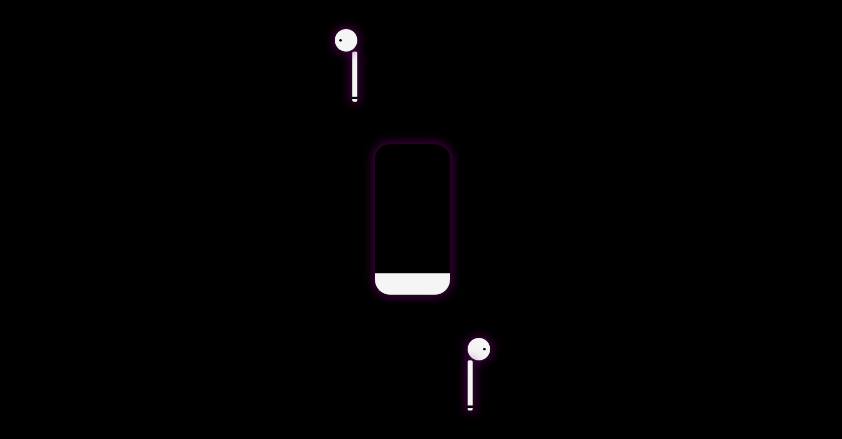
* { margin: 0; padding: 0; box-sizing: border-box; } body { background: black; width: 100vw; height: 100vh; display: flex; flex-direction: row; justify-content: center; align-items: center; font-family: 'Playfair Display', serif; overflow: hidden; } /*barra de carregamento */ .loading-container{ width:150px; height:300px; background-image: linear-gradient(#f5f5f5, #f5f5f5); background-repeat:no-repeat; background-size:100% 0%; rotate:180deg; border-radius:30px; margin-right:35px; box-shadow: 0 0 20px 5px rgba(128, 0, 128, 0.5); } /*fones de ouvido iguais aproveitando o display flex center */ .headphone1, .headphone-2{ display:flex; flex-direction:column; } /*animacao para o fone de ouvido inteiro 1 */ .headphone-1{ animation: comeFromTopAndFade 12s linear forwards; } @keyframes comeFromTopAndFade{ 0%{ transform: translateY(-300%); } 20%{ transform: translateY(0); } 95%{ transform: translateY(0); } 96%{ transform: translateX(0)rotateY(0); } 100%{ transform:translateX(-3000%) rotateY(180deg); } } /*animacao para o fone de ouvido 2 */ .headphone-2{ animation: comeFromBottomAndFade 12s linear forwards; } @keyframes comeFromBottomAndFade{ 0%{ transform: translateY(300%); } 20%{ transform: translateY(0); } 95%{ transform: translateY(0); } 96%{ transform: translateX(0)rotateY(0); } 100%{ transform:translateX(3970%) rotateY(180deg); } } /*animacao de carregamento com sincronia com os fones */ .loading-container{ opacity:1; animation: loadAndFade 12s linear forwards; } @keyframes loadAndFade{ 0%{background-size: 100% 0%;opacity:1;} 40%{background-size: 100% 100%;} 95%{opacity:1} 100%{background-size:100% 100%;opacity:0;} } /*cabo dos fones iguais aproveitando o flex */ .headphone-1 .base, .headphone-2 .base{ height: 100px; width:10px; background:#f5f5f5; border-radius:3px; display:flex; align-items:flex-end; box-shadow: 0 0 20px 5px rgba(128, 0, 128, 0.5); } /*marca preta no fim do cabo dos fones */ .headphone-1 .base::before, .headphone-2 .base::before{ content:''; width:10px; height:5px; margin-bottom:50%; background:rgb(0, 0, 0); } /*cabeca dos fones */ .headphone-1 .head, .headphone-2 .head{ width:45px; height:45px; background:#f5f5f5; border-radius:50%; display:flex; align-items:center; justify-content:center; box-shadow: 0 0 20px 5px rgba(128, 0, 128, 0.5); } /*ajustando cabeca 1 por causa do flex */ .headphone-1 .head{ transform: translateX(-35px); } /*buraco na cabeca dos fones */ .headphone-1 .head::before, .headphone-2 .head::before{ content:''; background:rgb(0, 0, 0); border-radius:50%; width:5px; height:5px; } /*margens opostas para os furos */ .headphone-2 .head::before{ margin-left:50%; } .headphone-1 .head::before{ margin-right:50%; }
JS
Copy
/* Replace with your JS Code (Leave empty if not needed) */