WEBLEB
Home
Editor
Login
Pro
English
English
Français
Español
Português
Deutsch
Italiano
हिंदी
Futuristic login form
145
ByBy.inc
Open In Editor
Publish Your Code
Recommended
23 March 2024
HTML Login Page
28 March 2023
Form Database Connection - Php
27 August 2024
Login 1
HTML
Copy
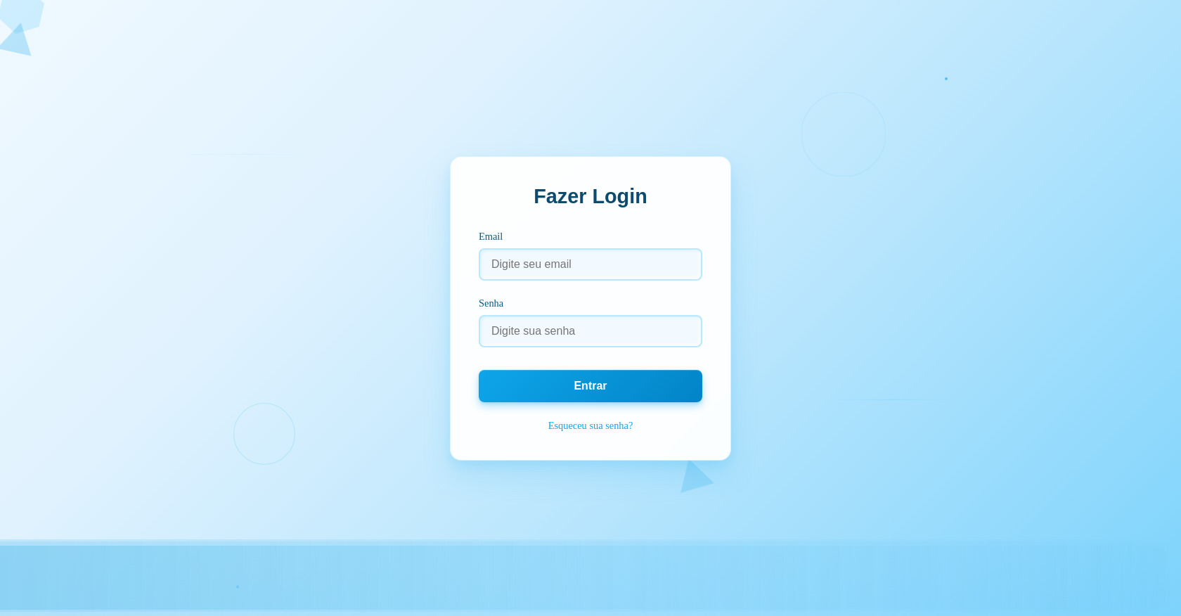
Fazer Login
Email
Senha
Entrar
Esqueceu sua senha?
CSS
Copy
* { margin: 0; padding: 0; box-sizing: border-box; } body { height: 100vh; overflow: hidden; background: linear-gradient(135deg, #f0f9ff 0%, #e0f2fe 30%, #bae6fd 60%, #7dd3fc 100% ); position: relative; } /* Formas geométricas flutuantes */ .geometric-shapes { position: absolute; width: 100%; height: 100%; } .shape { position: absolute; opacity: 0.6; animation: floatSmooth 12s ease-in-out infinite; } /* Hexágonos */ .hexagon { width: 60px; height: 34px; background: rgba(56, 189, 248, 0.3); position: relative; } .hexagon:before, .hexagon:after { content: ""; position: absolute; width: 0; border-left: 30px solid transparent; border-right: 30px solid transparent; } .hexagon:before { bottom: 100%; border-bottom: 17px solid rgba(56, 189, 248, 0.3); } .hexagon:after { top: 100%; border-top: 17px solid rgba(56, 189, 248, 0.3); } /* Triângulos */ .triangle { width: 0; height: 0; border-left: 25px solid transparent; border-right: 25px solid transparent; border-bottom: 43px solid rgba(14, 165, 233, 0.4); } .shape:nth-child(4) { top: 10%; right: 30%; animation-delay: -2s; } .shape:nth-child(5) { bottom: 20%; right: 40%; animation-delay: -6s; } .shape:nth-child(6) { top: 70%; left: 70%; animation-delay: -10s; } @keyframes floatSmooth { 0%, 100% { transform: translateY(0px) rotate(0deg); opacity: 0.6; } 33% { transform: translateY(-20px) rotate(120deg); opacity: 0.8; } 66% { transform: translateY(10px) rotate(240deg); opacity: 0.4; } } .wave { position: absolute; bottom: 0; left: 0; width: 200%; height: 100px; background: linear-gradient(90deg, transparent, rgba(56, 189, 248, 0.1), rgba(14, 165, 233, 0.2), rgba(56, 189, 248, 0.1), transparent ); border-radius: 100px; animation: gentleWave 15s ease-in-out infinite; } .wave:nth-child(2) { animation-delay: -5s; opacity: 0.7; } .wave:nth-child(3) { animation-delay: -10s; opacity: 0.5; } @keyframes gentleWave { 0%, 100% { transform: translateX(-50%) translateY(0px); } 50% { transform: translateX(-50%) translateY(-10px); } } /* Partículas mínimas */ .minimal-particles { position: absolute; width: 100%; height: 100%; } .dot { position: absolute; width: 4px; height: 4px; background: rgba(14, 165, 233, 0.6); border-radius: 50%; animation: gentleFloat 20s linear infinite; } .dot:nth-child(1) { left: 20%; animation-delay: 0s; } .dot:nth-child(2) { left: 40%; animation-delay: -5s; } .dot:nth-child(3) { left: 60%; animation-delay: -10s; } .dot:nth-child(4) { left: 80%; animation-delay: -15s; } @keyframes gentleFloat { 0% { transform: translateY(100vh); opacity: 0; } 10%, 90% { opacity: 1; } 100% { transform: translateY(-10vh); opacity: 0; } } /* Linhas sutis */ .subtle-lines { position: absolute; width: 100%; height: 100%; } .line { position: absolute; height: 1px; background: linear-gradient(90deg, transparent, rgba(56, 189, 248, 0.3), transparent ); animation: subtleGlow 8s ease-in-out infinite; } .line:nth-child(1) { width: 200px; top: 25%; left: 15%; transform: rotate(30deg); } .line:nth-child(2) { width: 150px; bottom: 35%; right: 20%; transform: rotate(-45deg); animation-delay: -4s; } @keyframes subtleGlow { 0%, 100% { opacity: 0.2; transform: scale(1); } 50% { opacity: 0.6; transform: scale(1.1); } } /* Círculos suaves */ .soft-circles { position: absolute; width: 100%; height: 100%; } .circle { position: absolute; border: 1px solid rgba(56, 189, 248, 0.3); border-radius: 50%; animation: breathe 10s ease-in-out infinite; } .circle:nth-child(1) { width: 120px; height: 120px; top: 15%; right: 25%; } .circle:nth-child(2) { width: 80px; height: 80px; bottom: 25%; left: 20%; animation-delay: -5s; } @keyframes breathe { 0%, 100% { transform: scale(1); opacity: 0.4; } 50% { transform: scale(1.1); opacity: 0.7; } } /* Container de Login */ .login-container { position: relative; z-index: 10; display: flex; align-items: center; justify-content: center; height: 100vh; } .login-box { background: rgba(255, 255, 255, 0.95); backdrop-filter: blur(10px); border-radius: 16px; padding: 2.5rem; width: 400px; box-shadow: 0 20px 40px rgba(14, 165, 233, 0.15), 0 8px 16px rgba(14, 165, 233, 0.1), inset 0 1px 0 rgba(255, 255, 255, 0.8); border: 1px solid rgba(56, 189, 248, 0.2); transition: transform 0.3s ease; } .login-box:hover { transform: translateY(-2px); box-shadow: 0 25px 50px rgba(14, 165, 233, 0.2), 0 12px 24px rgba(14, 165, 233, 0.15), inset 0 1px 0 rgba(255, 255, 255, 0.8); } .login-title { text-align: center; color: #0c4a6e; font-size: 1.8rem; font-weight: 600; margin-bottom: 2rem; font-family: 'Arial', sans-serif; } .form-group { margin-bottom: 1.5rem; } .form-label { display: block; color: #075985; font-size: 0.9rem; font-weight: 500; margin-bottom: 0.5rem; } .form-input { width: 100%; padding: 0.75rem 1rem; border: 2px solid rgba(56, 189, 248, 0.3); border-radius: 8px; font-size: 1rem; background: rgba(240, 249, 255, 0.8); color: #0c4a6e; transition: all 0.3s ease; box-shadow: inset 2px 2px 4px rgba(14, 165, 233, 0.1), inset -2px -2px 4px rgba(255, 255, 255, 0.8); } .form-input:focus { outline: none; border-color: #0ea5e9; background: rgba(240, 249, 255, 1); box-shadow: 0 0 0 3px rgba(14, 165, 233, 0.1), inset 2px 2px 6px rgba(14, 165, 233, 0.15), inset -2px -2px 6px rgba(255, 255, 255, 0.9); transform: translateY(-1px); } .login-button { width: 100%; padding: 0.875rem; background: linear-gradient(135deg, #0ea5e9, #0284c7); color: white; border: none; border-radius: 8px; font-size: 1rem; font-weight: 600; cursor: pointer; transition: all 0.2s ease; box-shadow: 0 6px 12px rgba(14, 165, 233, 0.3), 0 2px 4px rgba(14, 165, 233, 0.2), inset 0 1px 0 rgba(255, 255, 255, 0.2); margin-top: 0.5rem; } .login-button:hover { background: linear-gradient(135deg, #0284c7, #0369a1); transform: translateY(-2px); box-shadow: 0 8px 16px rgba(14, 165, 233, 0.4), 0 4px 8px rgba(14, 165, 233, 0.3), inset 0 1px 0 rgba(255, 255, 255, 0.2); } .login-button:active { transform: translateY(0px); box-shadow: 0 2px 4px rgba(14, 165, 233, 0.3), 0 1px 2px rgba(14, 165, 233, 0.2), inset 0 2px 4px rgba(0, 0, 0, 0.1); } .forgot-password { text-align: center; margin-top: 1.5rem; } .forgot-password a { color: #0ea5e9; text-decoration: none; font-size: 0.9rem; transition: color 0.3s ease; } .forgot-password a:hover { color: #0284c7; text-decoration: underline; }
JS
Copy