WEBLEB
Home
Editor
Login
Pro
English
English
Français
Español
Português
Deutsch
Italiano
हिंदी
CSS OTP Page
4827
codex
Open In Editor
Publish Your Code
Recommended
26 August 2025
Turkish Portfolio Website: HTML, CSS, JS, Tailwind
17 July 2025
3D Rotating Login Signup Form HTML CSS
12 July 2025
CSS Card Glow Effect
HTML
Copy
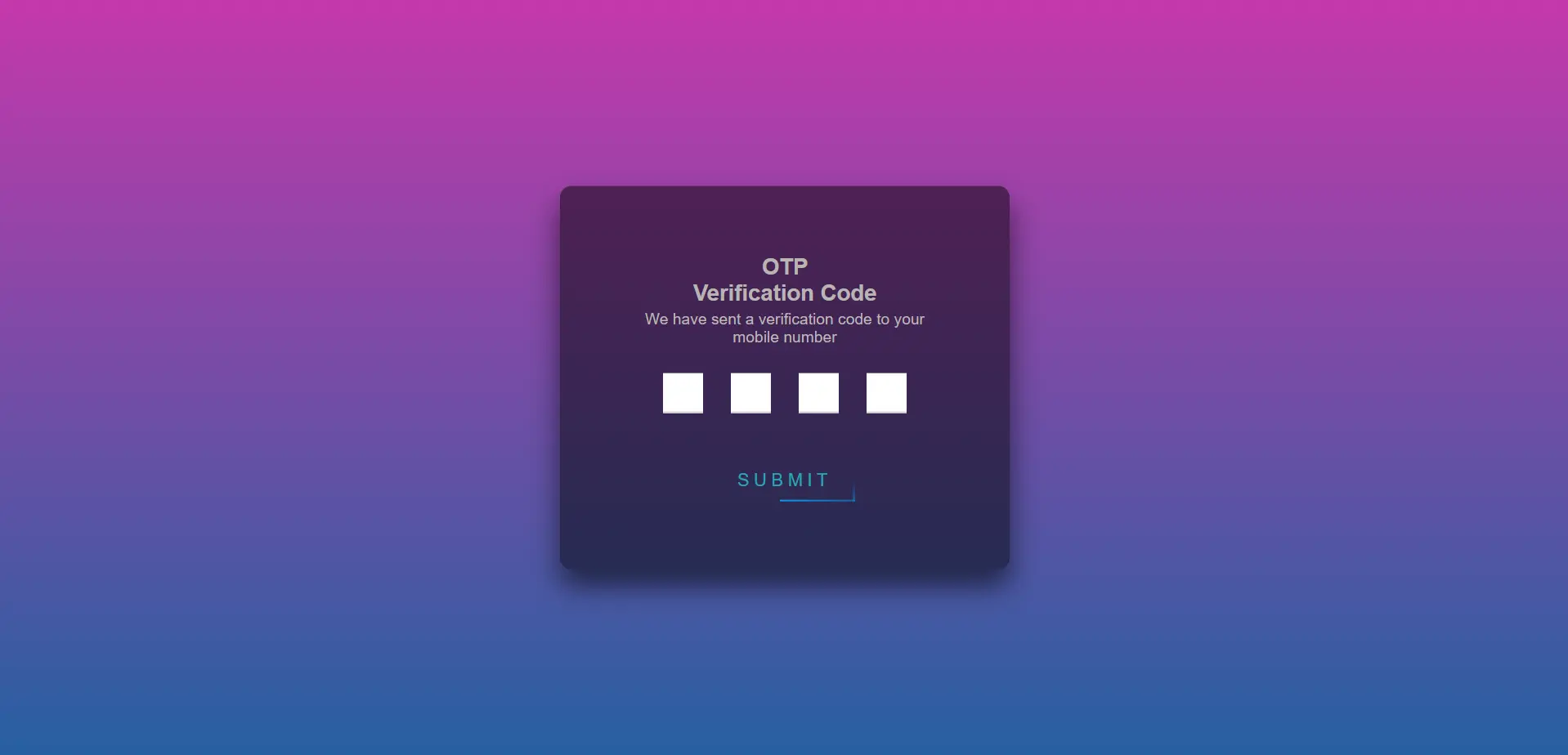
OTP Verification Page
OTP
Verification Code
We have sent a verification code to your mobile number
Submit
CSS
Copy
html { height: 100%; } body { margin:0; padding:0; font-family: sans-serif; background: linear-gradient(#c538ab, #2760a1); } .login-box { position: absolute; top: 50%; left: 50%; width: 400px; padding: 40px; transform: translate(-50%, -50%); background: rgba(0,0,0,.5); box-sizing: border-box; box-shadow: 0 15px 25px rgba(0,0,0,.6); border-radius: 10px; } .login-box h2 { margin: 0 0 30px; padding: 0; color: #fff; text-align: center; } .login-box .user-box { position: relative; } .login-box .user-box input { width: 100%; padding: 10px 0; font-size: 16px; color: #fff; margin-bottom: 30px; border: none; border-bottom: 1px solid #fff; outline: none; background: transparent; } .login-box .user-box label { position: absolute; top:0; left: 0; padding: 10px 0; font-size: 16px; color: #fff; pointer-events: none; transition: .5s; } .login-box .user-box input:focus ~ label, .login-box .user-box input:valid ~ label { top: -20px; left: 0; color: #448bf6; font-size: 12px; } .login-box form a { position: relative; display: inline-block; padding: 10px 20px; color: #26a6b7; font-size: 16px; text-decoration: none; text-transform: uppercase; overflow: hidden; transition: .5s; margin-top: 40px; letter-spacing: 4px } .login-box a:hover { background: #03a8f4; color: #fff; border-radius: 5px; box-shadow: 0 0 5px #0327f4, 0 0 25px #0b26bd, 0 0 50px #0343f4, 0 0 100px #1e58d5; } .login-box a span { position: absolute; display: block; } .login-box a span:nth-child(1) { top: 0; left: -100%; width: 100%; height: 2px; background: linear-gradient(90deg, transparent, #0388f4); animation: btn-anim1 1s linear infinite; } @keyframes btn-anim1 { 0% { left: -100%; } 50%,100% { left: 100%; } } .login-box a span:nth-child(2) { top: -100%; right: 0; width: 2px; height: 100%; background: linear-gradient(180deg, transparent, #0394f4); animation: btn-anim2 1s linear infinite; animation-delay: .25s } @keyframes btn-anim2 { 0% { top: -100%; } 50%,100% { top: 100%; } } .login-box a span:nth-child(3) { bottom: 0; right: -100%; width: 100%; height: 2px; background: linear-gradient(270deg, transparent, #039cf4); animation: btn-anim3 1s linear infinite; animation-delay: .5s } @keyframes btn-anim3 { 0% { right: -100%; } 50%,100% { right: 100%; } } .login-box a span:nth-child(4) { bottom: -100%; left: 0; width: 2px; height: 100%; background: linear-gradient(360deg, transparent, #036bf4); animation: btn-anim4 1s linear infinite; animation-delay: .75s } @keyframes btn-anim4 { 0% { bottom: -100%; } 50%,100% { bottom: 100%; } } .form { display: flex; align-items: center; flex-direction: column; justify-content: space-around; border-radius: 12px; padding: 20px; } .title { font-size: 20px; font-weight: bold; color: rgb(185, 180, 180) } .message { color: #b9b7b7; font-size: 14px; margin-top: 4px; text-align: center } .inputs { margin-top: 10px } .inputs input { width: 32px; height: 32px; text-align: center; border: none; border-bottom: 1.5px solid #d2d2d2; margin: 0 10px; } .inputs input:focus { border-bottom: 1.5px solid royalblue; outline: none; }
JS
Copy
// No JS