WEBLEB
Home
Editor
Login
Pro
English
English
Français
Español
Português
Deutsch
Italiano
हिंदी
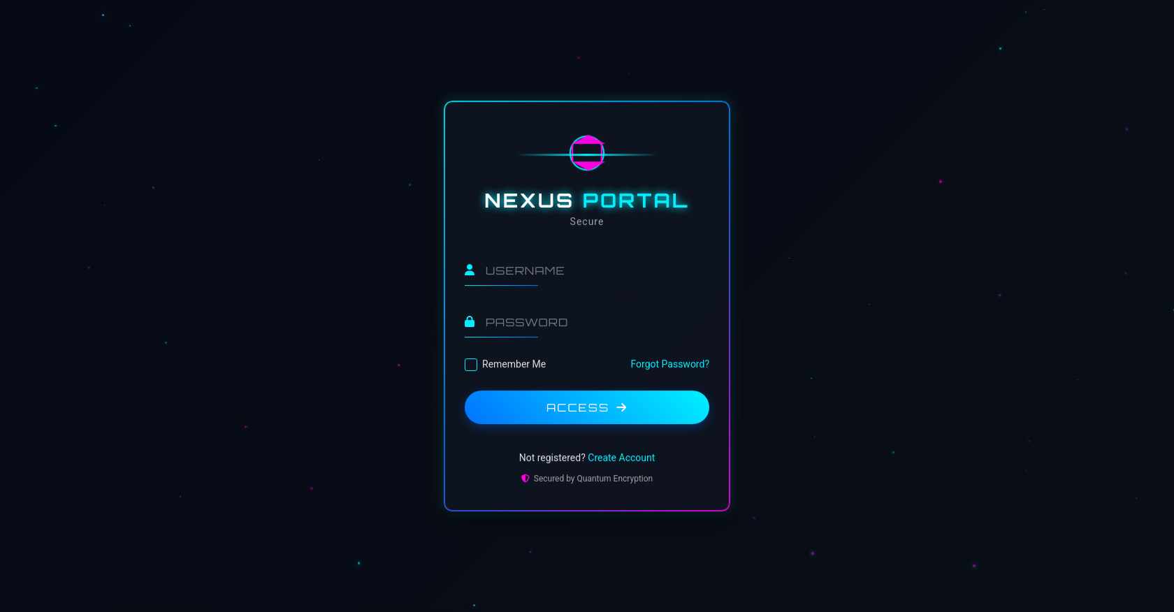
Futuristic Login Form
109
alejandrokundrah
Open In Editor
Publish Your Code
Recommended
6 November 2024
Text Animation
22 May 2025
CUBE
30 August 2024
Neon Clock
HTML
Copy
Futuristic Login Portal
NEXUS
PORTAL
Secure Authentication System
Remember Me
Forgot Password?
ACCESS
CSS
Copy
@import url('https://fonts.googleapis.com/css2?family=Orbitron:wght@400;500;600;700&family=Roboto:wght@300;400&display=swap'); :root { --primary-color: #00f0ff; --secondary-color: #0072ff; --accent-color: #ff00e6; --dark-color: #0a0e17; --darker-color: #060a14; --text-color: #e0e0e0; --shadow-color: rgba(0, 240, 255, 0.2); } * { margin: 0; padding: 0; box-sizing: border-box; } body { font-family: 'Roboto', sans-serif; background: linear-gradient(135deg, var(--darker-color), var(--dark-color)); color: var(--text-color); min-height: 100vh; display: flex; justify-content: center; align-items: center; overflow: hidden; position: relative; } .particles-container { position: absolute; top: 0; left: 0; width: 100%; height: 100%; z-index: -1; } .container { width: 100%; max-width: 450px; padding: 20px; z-index: 1; perspective: 1000px; } .login-card { background: rgba(14, 20, 33, 0.8); backdrop-filter: blur(8px); border-radius: 12px; overflow: hidden; padding: 40px 30px; position: relative; box-shadow: 0 15px 35px rgba(0, 0, 0, 0.5), 0 0 20px var(--shadow-color); transform-style: preserve-3d; animation: cardAppear 0.8s ease-out forwards; } @keyframes cardAppear { 0% { opacity: 0; transform: translateY(30px) rotateX(10deg); } 100% { opacity: 1; transform: translateY(0) rotateX(0); } } .glowing-border { position: absolute; top: 0; left: 0; right: 0; bottom: 0; border: 2px solid transparent; border-radius: 12px; background: linear-gradient(135deg, var(--primary-color), var(--secondary-color), var(--accent-color)) border-box; -webkit-mask: linear-gradient(#fff 0 0) padding-box, linear-gradient(#fff 0 0); -webkit-mask-composite: destination-out; mask-composite: exclude; animation: borderPulse 4s infinite; } @keyframes borderPulse { 0%, 100% { opacity: 0.6; } 50% { opacity: 1; } } .scanner-line { position: absolute; height: 3px; width: 100%; background: linear-gradient(90deg, transparent, rgba(0, 240, 255, 0), var(--primary-color), rgba(0, 240, 255, 0), transparent); top: 0; left: 0; animation: scan 3s cubic-bezier(0.42, 0, 0.58, 1) infinite; z-index: 2; } @keyframes scan { 0% { top: 0; opacity: 0; } 5% { opacity: 1; } 95% { opacity: 1; } 100% { top: 100%; opacity: 0; } } .header { text-align: center; margin-bottom: 40px; } .logo { position: relative; width: 70px; height: 70px; margin: 0 auto 15px; } .circle { position: absolute; width: 50px; height: 50px; border: 2px solid var(--primary-color); border-radius: 50%; top: 10px; left: 10px; animation: rotateLogo 8s linear infinite; } .hexagon { position: absolute; width: 40px; height: 23px; background: transparent; border-left: 2px solid var(--accent-color); border-right: 2px solid var(--accent-color); top: 23px; left: 15px; animation: pulseLogo 2s infinite; } .hexagon:before, .hexagon:after { content: ""; position: absolute; width: 0; height: 0; left: -2px; border-left: 22px solid transparent; border-right: 22px solid transparent; } .hexagon:before { top: -12px; border-bottom: 12px solid var(--accent-color); } .hexagon:after { bottom: -12px; border-top: 12px solid var(--accent-color); } @keyframes rotateLogo { 0% { transform: rotate(0deg); } 100% { transform: rotate(360deg); } } @keyframes pulseLogo { 0%, 100% { opacity: 0.6; transform: scale(1); } 50% { opacity: 1; transform: scale(1.1); } } h1 { font-family: 'Orbitron', sans-serif; font-size: 28px; letter-spacing: 3px; margin-bottom: 5px; color: white; text-shadow: 0 0 10px var(--primary-color); animation: textGlow 2s infinite alternate; } h1 span { color: var(--primary-color); } @keyframes textGlow { 0% { text-shadow: 0 0 5px var(--primary-color); } 100% { text-shadow: 0 0 15px var(--primary-color); } } .subtitle { font-size: 14px; color: #a0a0a0; letter-spacing: 1px; } .input-group { position: relative; margin-bottom: 30px; } .input-icon { position: absolute; left: 0; top: 12px; color: var(--primary-color); font-size: 16px; } input[type="text"], input[type="password"] { width: 100%; background: transparent; border: none; padding: 12px 0 12px 30px; font-size: 16px; color: var(--text-color); font-family: 'Orbitron', sans-serif; letter-spacing: 1px; outline: none; } input::placeholder { color: rgba(224, 224, 224, 0.5); } .input-line { position: absolute; bottom: 0; left: 0; width: 100%; height: 1px; background: linear-gradient(90deg, var(--primary-color), var(--secondary-color)); transform-origin: left; transform: scaleX(0.3); transition: transform 0.3s ease; } .input-group:focus-within .input-line { transform: scaleX(1); } .options { display: flex; justify-content: space-between; align-items: center; margin-bottom: 30px; font-size: 14px; } .remember-me { display: flex; align-items: center; position: relative; cursor: pointer; padding-left: 25px; } .remember-me input { position: absolute; opacity: 0; cursor: pointer; height: 0; width: 0; } .checkmark { position: absolute; top: 0; left: 0; height: 18px; width: 18px; background-color: transparent; border: 1px solid var(--primary-color); border-radius: 3px; } .remember-me:hover .checkmark { background-color: rgba(0, 240, 255, 0.1); } .remember-me input:checked ~ .checkmark { background-color: var(--primary-color); } .checkmark:after { content: ""; position: absolute; display: none; } .remember-me input:checked ~ .checkmark:after { display: block; } .remember-me .checkmark:after { left: 6px; top: 2px; width: 4px; height: 9px; border: solid white; border-width: 0 2px 2px 0; transform: rotate(45deg); } .forgot-password { color: var(--primary-color); text-decoration: none; transition: all 0.3s; } .forgot-password:hover { text-shadow: 0 0 8px var(--primary-color); } .login-btn { width: 100%; padding: 14px; background: linear-gradient(45deg, var(--secondary-color), var(--primary-color)); border: none; border-radius: 30px; color: white; font-family: 'Orbitron', sans-serif; font-size: 16px; letter-spacing: 2px; cursor: pointer; box-shadow: 0 5px 15px rgba(0, 114, 255, 0.3); position: relative; overflow: hidden; display: flex; justify-content: center; align-items: center; transition: all 0.3s ease; } .login-btn:hover { box-shadow: 0 8px 20px rgba(0, 114, 255, 0.5); transform: translateY(-2px); } .login-btn:active { transform: translateY(0); box-shadow: 0 3px 10px rgba(0, 114, 255, 0.3); } .btn-text { margin-right: 10px; } .btn-icon { display: flex; align-items: center; justify-content: center; transform: translateX(0); transition: transform 0.3s ease; } .login-btn:hover .btn-icon { transform: translateX(5px); } .footer { margin-top: 40px; text-align: center; font-size: 14px; } .footer a { color: var(--primary-color); text-decoration: none; transition: all 0.3s; } .footer a:hover { text-shadow: 0 0 8px var(--primary-color); } .security-badge { display: flex; align-items: center; justify-content: center; margin-top: 15px; font-size: 12px; color: #a0a0a0; } .security-badge i { color: var(--accent-color); margin-right: 6px; } /* Responsive styles */ @media (max-width: 480px) { .login-card { padding: 30px 20px; } h1 { font-size: 24px; } .options { flex-direction: column; align-items: flex-start; } .forgot-password { margin-top: 10px; } }
JS
Copy
document.addEventListener('DOMContentLoaded', () => { // Create floating particles createParticles(); // Form handling setupFormInteractions(); // Add typewriter effect to the subtitle typewriterEffect(); }); // Create floating particles in the background function createParticles() { const container = document.querySelector('.particles-container'); const particleCount = 50; for (let i = 0; i < particleCount; i++) { const particle = document.createElement('div'); // Randomize particle properties const size = Math.random() * 3 + 1; const posX = Math.random() * 100; const posY = Math.random() * 100; const opacity = Math.random() * 0.5 + 0.2; const duration = Math.random() * 20 + 10; const delay = Math.random() * 5; // Apply styles particle.style.cssText = ` position: absolute; width: ${size}px; height: ${size}px; background: ${Math.random() > 0.5 ? '#00f0ff' : '#ff00e6'}; border-radius: 50%; top: ${posY}%; left: ${posX}%; opacity: ${opacity}; box-shadow: 0 0 ${size * 2}px ${Math.random() > 0.5 ? '#00f0ff' : '#ff00e6'}; animation: float ${duration}s ease-in-out ${delay}s infinite; pointer-events: none; `; container.appendChild(particle); } // Add the float animation const style = document.createElement('style'); style.textContent = ` @keyframes float { 0%, 100% { transform: translateY(0) translateX(0); } 25% { transform: translateY(-20px) translateX(10px); } 50% { transform: translateY(-10px) translateX(-15px); } 75% { transform: translateY(-25px) translateX(15px); } } `; document.head.appendChild(style); } // Handle form interactions function setupFormInteractions() { const form = document.getElementById('login-form'); const inputs = form.querySelectorAll('input'); // Add focus effects to inputs inputs.forEach(input => { input.addEventListener('focus', () => { input.parentElement.classList.add('focused'); playTechSound('focus'); }); input.addEventListener('blur', () => { input.parentElement.classList.remove('focused'); }); }); // Handle form submission form.addEventListener('submit', (e) => { e.preventDefault(); const username = document.getElementById('username').value; const password = document.getElementById('password').value; if (username && password) { simulateLogin(); } else { showError('Please fill in all fields'); } }); } // Simulate login process with animations function simulateLogin() { const loginBtn = document.querySelector('.login-btn'); const loginCard = document.querySelector('.login-card'); // Change button text and add loading effect loginBtn.innerHTML = '<span class="loading"></span> AUTHENTICATING'; loginBtn.disabled = true; loginBtn.style.cursor = 'wait'; playTechSound('authenticate'); // Add loading style const style = document.createElement('style'); style.textContent = ` .loading { display: inline-block; width: 20px; height: 20px; border: 2px solid rgba(255,255,255,0.3); border-radius: 50%; border-top-color: white; animation: spin 1s linear infinite; margin-right: 10px; } @keyframes spin { to { transform: rotate(360deg); } } @keyframes success { 0% { box-shadow: 0 0 0 0px rgba(0, 255, 0, 0.4); } 100% { box-shadow: 0 0 0 20px rgba(0, 255, 0, 0); } } @keyframes accessGranted { 0% { transform: scale(1); } 50% { transform: scale(1.05); } 100% { transform: scale(0); opacity: 0; } } `; document.head.appendChild(style); // Simulate authentication process setTimeout(() => { // Simulate success loginBtn.innerHTML = '<i class="fas fa-check"></i> ACCESS GRANTED'; loginBtn.style.background = 'linear-gradient(45deg, #00b300, #00ff00)'; loginBtn.style.animation = 'success 1s ease forwards'; playTechSound('success'); // Fade out the login card setTimeout(() => { loginCard.style.animation = 'accessGranted 1s ease forwards'; // Redirect or show dashboard (simulated) setTimeout(() => { alert('Login successful! This is a demo, so no actual authentication is performed.'); location.reload(); }, 1000); }, 1500); }, 2500); } // Show error message function showError(message) { // Create error element if it doesn't exist let errorElement = document.querySelector('.error-message'); if (!errorElement) { errorElement = document.createElement('div'); errorElement.className = 'error-message'; errorElement.style.cssText = ` color: #ff3366; text-align: center; margin-bottom: 20px; font-size: 14px; letter-spacing: 0.5px; animation: errorFadeIn 0.3s ease forwards; opacity: 0; `; const loginBtn = document.querySelector('.login-btn'); loginBtn.parentNode.insertBefore(errorElement, loginBtn); // Add error animation const style = document.createElement('style'); style.textContent = ` @keyframes errorFadeIn { from { opacity: 0; transform: translateY(-10px); } to { opacity: 1; transform: translateY(0); } } `; document.head.appendChild(style); } // Set message and play error sound errorElement.textContent = message; playTechSound('error'); // Remove error after 3 seconds setTimeout(() => { errorElement.style.opacity = '0'; errorElement.style.transform = 'translateY(-10px)'; setTimeout(() => { errorElement.remove(); }, 300); }, 3000); } // Typewriter effect for subtitle function typewriterEffect() { const subtitle = document.querySelector('.subtitle'); const text = subtitle.textContent; subtitle.textContent = ''; let i = 0; const interval = setInterval(() => { if (i < text.length) { subtitle.textContent += text.charAt(i); i++; } else { clearInterval(interval); } }, 100); } // Play tech sounds for interactions function playTechSound(type) { // In a real application, you could create and play actual sound effects // This is a placeholder for demonstration purposes // Console log for demonstration console.log(`Playing ${type} sound effect`); // In a real implementation, you would create AudioContext and play sounds: /* const audioContext = new (window.AudioContext || window.webkitAudioContext)(); // Different sound types if (type === 'focus') { const oscillator = audioContext.createOscillator(); oscillator.type = 'sine'; oscillator.frequency.setValueAtTime(600, audioContext.currentTime); oscillator.connect(audioContext.destination); oscillator.start(); oscillator.stop(audioContext.currentTime + 0.1); } else if (type === 'error') { // Error sound } else if (type === 'success') { // Success sound } */ }