WEBLEB
Home
Editor
Login
Pro
English
English
Français
Español
Português
Deutsch
Italiano
हिंदी
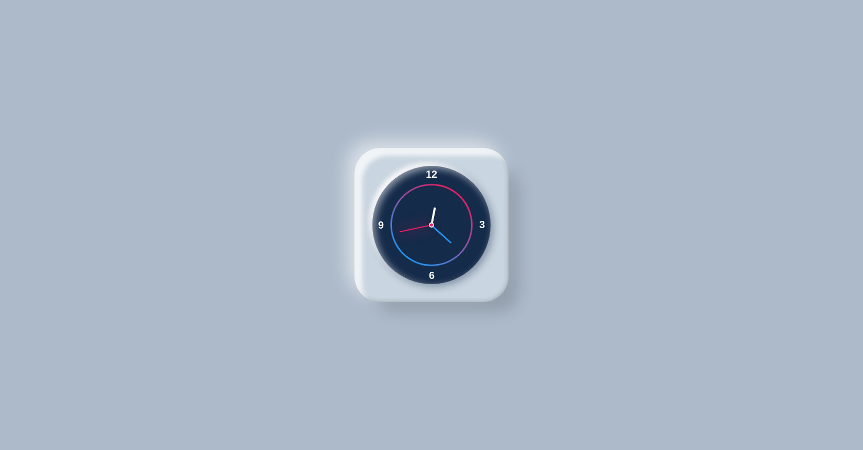
Analog Clock
592
alejandrokundrah
Open In Editor
Publish Your Code
Recommended
31 March 2024
Card Carousel JavaScript
21 October 2024
Recording Toggle
18 October 2025
Basic HTML Button Example
HTML
Copy
Analog Digital Watch
12
3
6
9
CSS
Copy
* { font-family: sans-serif; margin: 0; padding: 0; box-sizing: border-box; } body { display: flex; justify-content: center; align-items: center; min-height: 100vh; background: #acbaca; } .clock { position: relative; width: 300px; height: 300px; background: #c9d5e0; display: flex; justify-content: center; align-items: center; border-radius: 50px; box-shadow: 30px 30px 30px -10px rgba(0, 0, 0, 0.15), inset 15px 15px 10px rgba(255, 255, 255, 0.75), -15px -15px 35px rgba(255, 255, 255, 0.55), inset -1px -1px 10px rgba(0, 0, 0, 0.2); } .clock::before{ content: ''; position: absolute; width: 4px; height: 4px; background: #e91e63; border-radius: 50%; z-index: 10000; box-shadow: 0 0 0 1px #e91e63, 0 0 0 3px #fff, 0 0 5px 5px rgba(0,0,0,0.15); } .clock .digits { position: absolute; inset: 35px; background: #152b4a; border-radius: 50%; box-shadow: 5px 5px 15px #152b4a66, inset 5px 5px 15px rgba(255, 255, 255, 0.55), -6px -6px 10px rgba(255, 255, 255, 1); } .clock .digits span { position: absolute; inset: 5px; text-align: center; color: #fff; font-size: 1.25rem; transform: rotate(calc(90deg * var(--i))); } .clock .digits span b { font-weight: 600; display: inline-block; transform: rotate(calc(-90deg * var(--i))); } .clock .digits::before { content: ''; position: absolute; inset: 35px; background: linear-gradient(#2196f3, #e91e63); border-radius: 50%; animation: animate 2s linear infinite; } @keyframes animate { 0% { transform: rotate(360deg); } 100% { transform: rotate(0deg); } } .clock .digits::after { content: ''; position: absolute; inset: 38px; background: #152b4a; border-radius: 50%; } .clock .digits .circle { position: absolute; inset: 0; border-radius: 50%; display: flex; justify-content: center; z-index: 10; } .clock .digits .circle i { position: absolute; width: 3px; height: 50%; background: #fff; transform-origin: bottom; transform: scaleY(0.55); } .clock .digits .circle#hr i { transform: scaleY(0.3); width: 4px; } .clock .digits .circle#min i { transform: scaleY(0.45); background: #2196f3; } .clock .digits .circle#sec i { transform: scaleY(0.55); width: 2px; background: #e91e63; box-shadow: 0 0 30px #e91e63; }
JS
Copy
/* Replace with your JS Code (Leave empty if not needed) */