WEBLEB
Home
Editor
Login
Pro
English
English
Français
Español
Português
Deutsch
Italiano
हिंदी
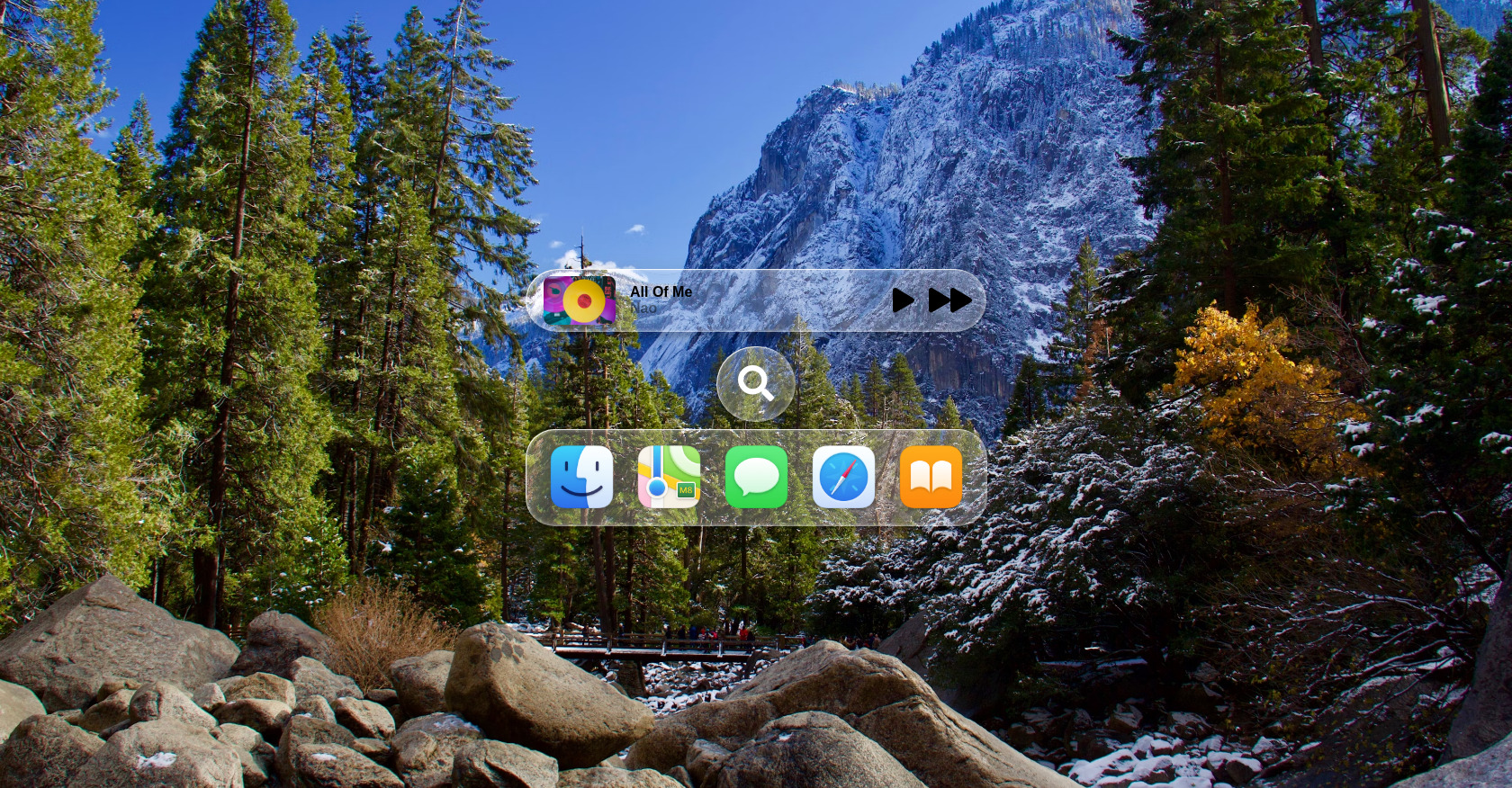
Apple Liquid Glass HTML CSS Effect
1510
codex
Open In Editor
Publish Your Code
Recommended
12 December 2025
Ruffle Flash Game Player HTML Embed
30 August 2025
CSS Animated Button & Layer
11 September 2025
CSS Animation Layers: Alert & Joy
HTML
Copy
Fancy
Drake
CSS
Copy
:root { --lg-bg-color: rgba(255, 255, 255, 0.25); --lg-highlight: rgba(255, 255, 255, 0.75); --lg-text: #ffffff; --lg-hover-glow: rgba(255, 255, 255, 0.4); --lg-red: #fb4268; --lg-grey: #5b5b5b; } /* ========== BASE LAYOUT ========== */ body { margin: 0; padding: 2rem 0; min-height: calc(100vh - 4rem); display: flex; flex-direction: column; align-items: center; justify-content: center; font-family: sans-serif; background: url("https://images.unsplash.com/photo-1551384963-cccb0b7ed94b?q=80&w=3247&auto=format&fit=crop&ixlib=rb-4.1.0&ixid=M3wxMjA3fDB8MHxwaG90by1wYWdlfHx8fGVufDB8fHx8fA%3D%3D") center/cover; animation: bg-move 5s ease-in-out infinite alternate; } @keyframes bg-move { from { background-position: center center; } to { background-position: center top; } } /* ========== CONTAINER ========== */ .container { display: flex; flex-direction: column; align-items: center; justify-content: center; } .container--inline { flex-direction: row; } /* ========== GLASS CONTAINER ========== */ .glass-container { position: relative; display: flex; font-weight: 600; color: var(--lg-text); cursor: pointer; background: transparent; border-radius: 2rem; overflow: hidden; box-shadow: 0 6px 6px rgba(0, 0, 0, 0.2), 0 0 20px rgba(0, 0, 0, 0.1); transition: all 0.4s cubic-bezier(0.175, 0.885, 0.32, 2.2); } .glass-container--rounded { border-radius: 5rem; margin: 0.5rem; fill: var(--lg-grey); } .glass-container--small { margin: 5rem 0 1rem; border-radius: 5rem; text-shadow: 1px 1px 1px rgba(0, 0, 0, 0.25); } .glass-container--large { min-width: 32rem; } .glass-container--medium { min-width: 25rem; } .glass-container svg { fill: white; } /* ========== GLASS ITEM ========== */ .glass-item { display: flex; flex-direction: column; align-items: center; justify-content: space-between; border-radius: 1rem; color: white; transition: color 0.3s ease; text-align: center; } .glass-item svg { fill: white; height: 50px; margin-bottom: 0.25rem; } .glass-item--active { background: rgba(0, 0, 0, 0.25); color: black; margin: 0 -0.5rem; padding: 0.25rem 1.95rem; border-radius: 5rem; } .glass-item--active svg { fill: black; } .player { display: flex; align-items: center; width: 100%; flex: 1 1 auto; justify-content: space-between; } .player__thumb { display: flex; align-items: center; justify-content: center; margin-left: 0.5rem; } .player__img { width: 5rem; height: auto; margin: 0.25rem 0; border-radius: 0.5rem; } .player__legend { display: flex; flex-direction: column; margin: 0 1rem; color: black; } .player__legend__title { font-size: 1rem; margin: 0; } .player__legend__sub-title { font-size: 1rem; margin: 0; opacity: 0.45; } .player__controls { margin-right: -1rem; display: flex; align-items: center; justify-content: center; } .player__controls__play { margin-right: 1rem; display: flex; } .player__controls__ff { display: flex; } /* ========== GLASS LAYERS ========== */ .glass-filter { position: absolute; inset: 0; z-index: 0; backdrop-filter: blur(0px); filter: url(#lg-dist); isolation: isolate; } .glass-overlay { position: absolute; inset: 0; z-index: 1; background: var(--lg-bg-color); } .glass-specular { position: absolute; inset: 0; z-index: 2; border-radius: inherit; overflow: hidden; box-shadow: inset 1px 1px 0 var(--lg-highlight), inset 0 0 5px var(--lg-highlight); } .glass-content { position: relative; z-index: 3; display: flex; align-items: center; gap: 20px; padding: 1rem 1.5rem 0.9rem; } .glass-content--inline { padding: 0.25rem 2rem 0.25rem 0.75rem; flex: 1 1 auto; justify-content: space-between; } /* ========== ICONS AND IMAGES ========== */ .glass-content a { display: inline-block; position: relative; padding: 1px; border-radius: 1.2rem; } .glass-content a img { display: block; width: 75px; transition: transform 0.4s cubic-bezier(0.175, 0.885, 0.32, 2.2); } .glass-content a img:hover { transform: scale(0.95); }
JS
Copy
/* Replace with your JS Code (Leave empty if not needed) */