WEBLEB
Home
Editor
Login
Pro
English
English
Français
Español
Português
Deutsch
Italiano
हिंदी
Social Links Profile
38
fathyhesham2001
Open In Editor
Publish Your Code
Recommended
13 October 2024
my social media
11 September 2023
CSS Social Icons
12 August 2024
Information profile
HTML
Copy
Fathy Hesham | Front-End Developer & ML Engineer
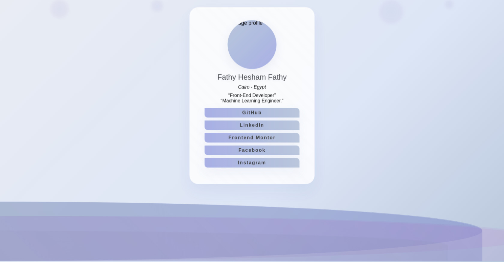
Fathy Hesham Fathy
Cairo - Egypt
Front-End Developer
Machine Learning Engineer.
GitHub
LinkedIn
Frontend Montor
Facebook
Instagram
CSS
Copy
* { -webkit-box-sizing: border-box; -moz-box-sizing: border-box; box-sizing: border-box; margin: 0; padding: 0; } body { font-family: sans-serif; height: 100vh; background: linear-gradient(135deg, #e9ecf3 0%, #dde6f6 60%, #b8c6db 100%); position: relative; overflow: hidden; } .wave-container { position: absolute; top: 0; left: 0; width: 100%; height: 100%; overflow: hidden; } .wave-container .wave { position: absolute; bottom: 0; left: 0; width: 200%; height: 200px; background: linear-gradient(45deg, rgba(120, 144, 156, 0.5), rgba(121, 134, 203, 0.5)); animation: wave-animation 10s ease-in-out infinite; opacity: 0.7; } .wave-container .wave:nth-child(2) { height: 150px; background: linear-gradient(45deg, rgba(121, 134, 203, 0.3), rgba(186, 104, 200, 0.2)); animation: wave-animation 8s ease-in-out infinite reverse; opacity: 0.5; } .wave-container .wave:nth-child(3) { height: 100px; background: linear-gradient(45deg, rgba(186, 104, 200, 0.15), rgba(120, 144, 156, 0.15)); animation: wave-animation 6s ease-in-out infinite; opacity: 0.3; } .wave-container .wave::before { content: ""; position: absolute; top: 0; left: 0; width: 100%; height: 100%; background: inherit; border-radius: 50% 50% 0 0; } @keyframes wave-animation { 0%, 100% { transform: translateX(-50%) translateY(0px); border-radius: 40% 60% 70% 30%; } 25% { transform: translateX(-60%) translateY(-10px); border-radius: 30% 70% 50% 50%; } 50% { transform: translateX(-70%) translateY(-20px); border-radius: 60% 40% 30% 70%; } 75% { transform: translateX(-40%) translateY(-10px); border-radius: 50% 50% 60% 40%; } } .bubble-container { position: absolute; width: 100%; height: 100%; /* pointer-events: none; */ } .bubble-container .bubble { position: absolute; background: radial-gradient(circle, rgba(121, 134, 203, 0.10) 0%, rgba(186, 104, 200, 0.06) 100%); border-radius: 50%; filter: blur(5px); animation: bubble-animation 8s ease-in-out infinite; } .bubble-container .bubble:nth-child(1) { width: 60px; height: 60px; left: 10%; animation-delay: 0; } .bubble-container .bubble:nth-child(2) { width: 40px; height: 40px; left: 30%; animation-delay: 2s; } .bubble-container .bubble:nth-child(3) { width: 80px; height: 80px; right: 20%; animation-delay: 4s; } .bubble-container .bubble:nth-child(4) { width: 30px; height: 30px; right: 10%; animation-delay: 6s; } @keyframes bubble-animation { 0%, 100% { transform: translateY(100vh) scale(0); opacity: 0; } 10% { transform: scale(1); opacity: 1; } 90% { transform: scale(1); opacity: 1; } 100% { transform: translateY(-100px) scale(0); opacity: 0; } } .container { display: flex; justify-content: center; align-items: center; height: 70%; padding: 20px; z-index: 20; position: relative; } .container .box { background: rgba(255, 255, 255, 0.85); backdrop-filter: blur(18px); border-radius: 30px; padding: 50px; width: 420px; box-shadow: 0 25px 50px rgba(121, 134, 203, 0.10), 0 1px 0 rgba(120, 144, 156, 0.08); border: 1px solid rgba(121, 134, 203, 0.13); position: relative; overflow: hidden; animation: float-in 1s ease-out; } @keyframes float-in { from { opacity: 0; transform: translateY(50px) scale(0.9); } to { opacity: 1; transform: translateY(0) scale(1); } } .container .box::before { content: ""; position: absolute; top: 0; left: 0; right: 0; bottom: 0; background: linear-gradient(45deg, rgba(255, 255, 255, 0.1) 0%, rgba(255, 255, 255, 0.05) 50%, rgba(255, 255, 255, 0.1) 100%); border-radius: 30px; animation: shimmer 3s ease-in-out infinite; pointer-events: none; } @keyframes shimmer { 0%, 100% { opacity: 0.5; } 50% { opacity: 1; } } .wave-container .container .info { text-align: center; margin-bottom: 40px; position: relative; z-index: 2; } .container .box .info { display: flex; align-items: center; justify-content: center; flex-wrap: wrap; flex-direction: column; } .container .box .info .image img { width: 150px; height: 150px; background: linear-gradient(135deg, #b8c6db 0%, #a5aee4 100%); border-radius: 50%; margin: 0 auto 20px; animation: image-profile 2s ease-in-out infinite; box-shadow: 0 10px 30px rgba(121, 134, 203, 0.13); display: block; } @keyframes image-profile { 0%, 100% { transform: scale(1); } 50% { transform: scale(1.1); } } .container .box .info .name { color: #3a3d40; text-shadow: 0 2px 10px rgba(121, 134, 203, 0.10); font-size: 25px; font-weight: 300; margin-bottom: 10px; display: block; } .container .box .info address { font-size: 16px; font-weight: 300px; text-align: center; display: block; margin-bottom: 10px; } .container .box .info .position { margin-bottom: 10px; } .container .box .info .position span { font-size: 16px; font-weight: 300px; text-align: center; display: block; } .container .box .links { display: flex; flex-direction: column; justify-content: center; align-items: center; } .container .box .links a { text-decoration: none; /* text-transform: uppercase; */ color: #3a3d40; background: linear-gradient(90deg, #a5aee4 0%, #b8c6db 100%); border: none; margin: 5px; padding: 7px; width: 100%; border-radius: 0 10px; text-align: center; font-size: 16px; font-weight: 600; transition: all 0.3s cubic-bezier(0.4, 0, 0.2, 1); letter-spacing: 2px; box-shadow: 0 15px 35px rgba(121, 134, 203, 0.10); position: relative; overflow: hidden; } .container .box .links a::before { content: ""; position: absolute; top: 50%; left: 50%; width: 0; height: 0; background: rgba(121, 134, 203, 0.08); border-radius: 0 10px; transition: all 0.3s ease; transform: translate(-50%, -50%); } .container .box .links a:hover::before { width: 300px; height: 300px; } .container .box .links a:hover { background: linear-gradient(90deg, #b8c6db 0%, #a5aee4 100%); box-shadow: 0 20px 40px rgba(186, 104, 200, 0.13); color: #6a1b9a; } .container .box .links a:active { transform: translateY(-1px); }
JS
Copy
/* Replace with your JS Code (Leave empty if not needed) */