WEBLEB
Home
Editor
Login
Pro
English
English
Français
Español
Português
Deutsch
Italiano
हिंदी
growing magic shapes
529
ByBy.inc
Open In Editor
Publish Your Code
Recommended
27 September 2025
CSS Animated Background with Shapes and Text
28 June 2025
Shapeshifter Showdown
10 September 2024
Menú de navegación mágica
HTML
Copy
CSS
Copy
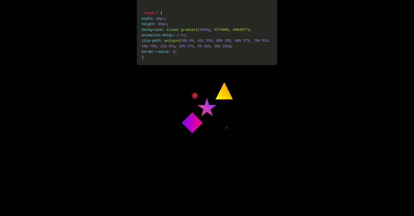
* { margin: 0; padding: 0; box-sizing: border-box; } body { background: #000; height: 100vh; overflow: hidden; display: flex; justify-content: center; align-items: center; font-family: 'Arial', sans-serif; } /*container */ .container { position: relative; width: 100%; height: 100%; display: flex; justify-content: center; align-items: center; } /* shape */ .shape { position: absolute; border-radius: 50%; animation: grow 4s ease-in-out infinite; } /* circulo */ .shape-1 { translate: -100% -100%; width: 50px; height: 50px; background: linear-gradient(45deg, #ff0080, #ff8000); animation-delay: 0s; } /*quadrado com bordas arredondadas */ .shape-2 { translate: 100% 100%; width: 80px; height: 80px; background: linear-gradient(45deg, #00ff80, #0080ff); animation-delay: 0.5s; border-radius: 20px; } /*quadrado */ .shape-3 { translate: -100% 100%; width: 60px; height: 60px; background: linear-gradient(45deg, #8000ff, #ff0080); animation-delay: 1s; border-radius: 0; transform: rotate(45deg); } /*clip path do triangulo */ .shape-4 { translate: 100% -100%; width: 70px; height: 70px; background: linear-gradient(45deg, #ffff00, #ff8000); animation-delay: 1.5s; clip-path: polygon(50% 0%, 0% 100%, 100% 100%); border-radius: 0; } /*clip path da estrela */ .shape-5 { width: 80px; height: 80px; background: linear-gradient(45deg, #ff4080, #8040ff); animation-delay: 2.5s; clip-path: polygon(50% 0%, 61% 35%, 98% 35%, 68% 57%, 79% 91%, 50% 70%, 21% 91%, 32% 57%, 2% 35%, 39% 35%); border-radius: 0; } /*animacao das formas */ @keyframes grow { 0% { transform: scale(0); opacity: 0; filter: blur(10px); } 25% { transform: scale(0.5); opacity: 0.7; filter: blur(5px); } 50% { transform: scale(1.2); opacity: 1; filter: blur(0px); box-shadow: 0 0 30px currentColor; } 100% { transform: scale(0) rotate(360deg); opacity: 0; filter: blur(10px); } } /*apenas para o video, pode remover */ .codigo { position: absolute; top: 0; line-height: 1.6; text-align: left; color: #F8F8F2; max-width: 570px; background: #272822; padding: 20px; font-family: 'Consolas', 'Monaco', 'Courier New', monospace; border-radius: 8px; box-shadow: 0 4px 12px rgba(0, 0, 0, 0.3); white-space: pre-line; font-size: 14px; } .selector { color: #F92672; } .property { color: #66D9EF; } .value-number { color: #AE81FF; } .value-string { color: #E6DB74; } .value-color { color: #A6E22E; } .brace { color: #F8F8F2; } .comment { color: #75715E; } .function { color: #A6E22E; }
JS
Copy
/* Replace with your JS Code (Leave empty if not needed) */