WEBLEB
Home
Editor
Login
Pro
English
English
Français
Español
Português
Deutsch
Italiano
हिंदी
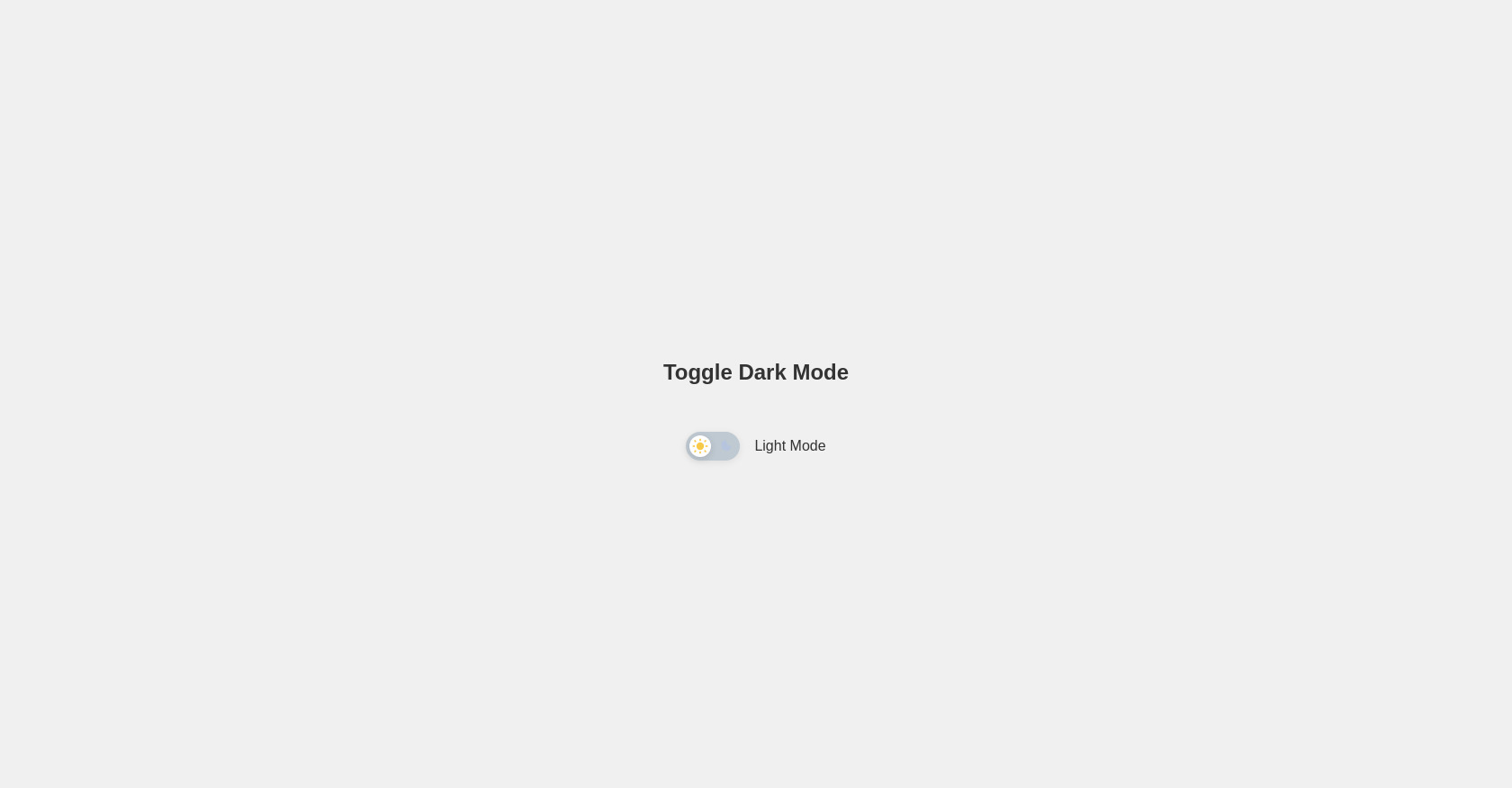
Dark Mode Toggle Switch (Sun & Moon)
37
TheDoc
Open In Editor
Publish Your Code
Recommended
29 June 2025
Turkish Blog & Podcast HTML Template
18 October 2024
Page web de Modern
1 July 2025
Modern Login Form
HTML
Copy
Modern Dark Mode Toggle Switch mit Sonne und Mond
Toggle Dark Mode
Light Mode
CSS
Copy
body { font-family: 'Segoe UI', Arial, sans-serif; background-color: #f0f0f0; color: #333; transition: background-color 0.4s cubic-bezier(.4,0,.2,1), color 0.4s cubic-bezier(.4,0,.2,1); min-height: 100vh; display: flex; flex-direction: column; align-items: center; justify-content: center; } .dark-mode { background-color: #181824; color: #f0f0f0; } .toggle-container { margin-top: 2rem; display: flex; align-items: center; gap: 1rem; } .toggle-switch { position: relative; width: 60px; height: 32px; } .toggle-switch input { opacity: 0; width: 0; height: 0; } .slider { position: absolute; cursor: pointer; top: 0; left: 0; right: 0; bottom: 0; background: #bfc9d1; border-radius: 32px; transition: background 0.4s; box-shadow: 0 2px 8px rgba(0,0,0,0.08); } .slider:before { position: absolute; content: ""; height: 24px; width: 24px; left: 4px; bottom: 4px; background: #fff; border-radius: 50%; transition: transform 0.4s cubic-bezier(.4,0,.2,1), background 0.4s; box-shadow: 0 2px 8px rgba(0,0,0,0.12); display: flex; align-items: center; justify-content: center; } .toggle-switch input:checked + .slider { background: #222b45; } .toggle-switch input:checked + .slider:before { transform: translateX(28px); background: #222b45; } /* Sun & Moon icons inside the toggle */ .slider .icon { position: absolute; top: 50%; transform: translateY(-50%); font-size: 18px; transition: opacity 0.3s; display: flex; align-items: center; justify-content: center; height: 100%; width: 24px; } .slider .icon.sun { left: 4px; color: #f7c948; } .slider .icon.moon { right: 4px; color: #a3bffa; } .toggle-switch input:checked + .slider .icon.sun { opacity: 0.3; } .toggle-switch input:checked + .slider .icon.moon { opacity: 1; } .toggle-switch input:not(:checked) + .slider .icon.sun { opacity: 1; } .toggle-switch input:not(:checked) + .slider .icon.moon { opacity: 0.3; } /* Responsive */ @media (max-width: 600px) { .toggle-container { flex-direction: column; gap: 0.5rem; } }
JS
Copy
const toggleCheckbox = document.getElementById('toggle-darkmode'); const body = document.body; const label = document.getElementById('toggle-label'); const darkModeClass = 'dark-mode'; // Set initial state from localStorage if (localStorage.getItem('dark-mode') === 'true') { body.classList.add(darkModeClass); toggleCheckbox.checked = true; label.textContent = 'Dark Mode'; } toggleCheckbox.addEventListener('change', () => { body.classList.toggle(darkModeClass); const isDark = body.classList.contains(darkModeClass); localStorage.setItem('dark-mode', isDark); label.textContent = isDark ? 'Dark Mode' : 'Light Mode'; });