WEBLEB
Home
Editor
Login
Pro
English
English
Français
Español
Português
Deutsch
Italiano
हिंदी
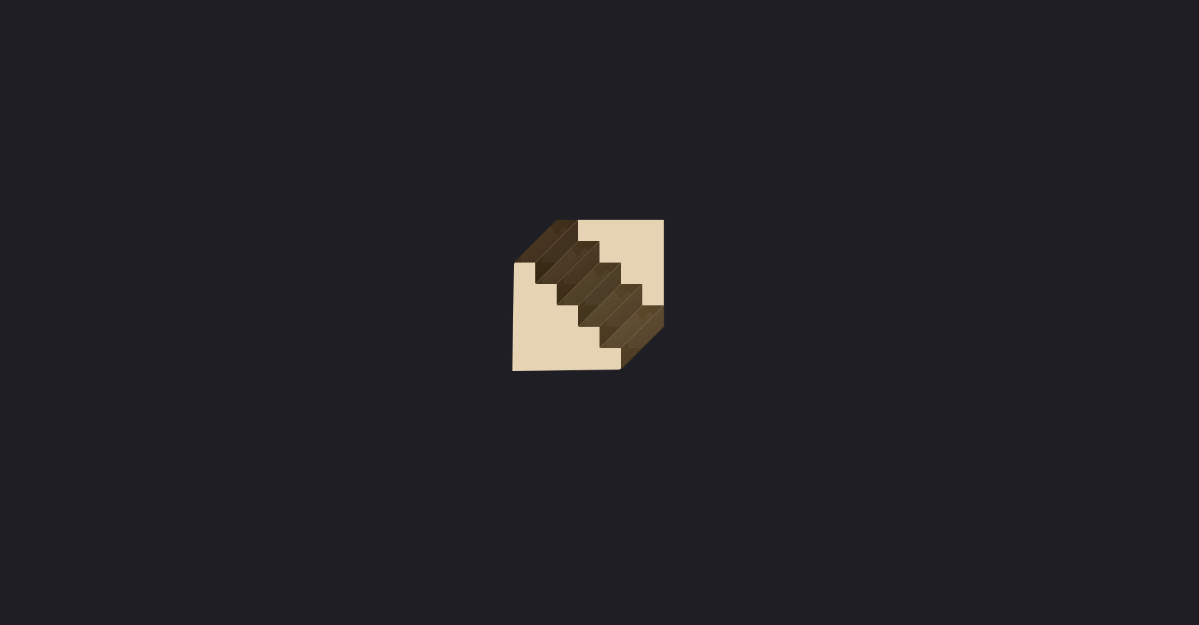
HTML Staircase Structure with CSS Classes
288
ByBy.inc
Open In Editor
Publish Your Code
Recommended
13 July 2025
Pac-Man Game HTML CSS JavaScript Code
22 August 2025
Blogium: Technology, Design & Life Blog HTML Template
25 August 2024
CSS 3D Solar System
HTML
Copy
CSS
Copy
* { margin: 0; padding: 0; box-sizing: border-box; } body { background: #1e1e24; color: white; display: flex; justify-content: center; align-items: center; height: 100vh; width: 100vw; font-family: monospace; position: relative; overflow: hidden; } .escada-container { position: relative; width: 300px; height: 400px; perspective: 800px; } /* Container para ficar atrás da escada e mostrar a parede */ .parede { position: absolute; width: 210px; height: 300px; top: 44%; left: 44.5%; transform: translate(-50%, -50%) rotate(45deg); background: #e5d3b3; z-index: 1; clip-path: polygon( 0% 35%, 50% 0%, 100% 35%, 100% 64%, 50% 100%, 0% 64% ); } /* Estilo geral dos degraus */ .degrau { position: absolute; background: linear-gradient(145deg, #4a3620 0%, #2e220f 100%); box-shadow: 2px 2px 10px rgba(0, 0, 0, 0.5); border-radius: 2px; transform-origin: center; z-index: 2; } /* Degraus horizontais (degraus ímpares) */ .degrau-horizontal { width: 120px; height: 60px; clip-path: polygon(50% 0, 75% 0, 25% 100%, 0 100%); } /* Degraus verticais (degraus pares) */ .degrau-vertical { width: 60px; height: 120px; clip-path: polygon(100% 25%, 100% 50%, 0 100%, 0 75%); } /* Posicionamento específico para cada degrau */ #degrau1 { top: 70px; left: 30px; background: linear-gradient(145deg, #4a3620 0%, #2e220f 100%); } #degrau2 { top: 40px; left: 60px; background: linear-gradient(145deg, #4a3620 0%, #2e220f 100%); } #degrau3 { top: 100px; left: 60px; background: linear-gradient(145deg, #503d24 0%, #352713 100%); } #degrau4 { top: 70px; left: 90px; background: linear-gradient(145deg, #503d24 0%, #352713 100%); } #degrau5 { top: 130px; left: 90px; background: linear-gradient(145deg, #574428 0%, #3a2d18 100%); } #degrau6 { top: 100px; left: 120px; background: linear-gradient(145deg, #574428 0%, #3a2d18 100%); } #degrau7 { top: 160px; left: 120px; background: linear-gradient(145deg, #5e4b2b 0%, #40321c 100%); } #degrau8 { top: 130px; left: 150px; background: linear-gradient(145deg, #5e4b2b 0%, #40321c 100%); } #degrau9 { top: 190px; left: 150px; background: linear-gradient(145deg, #65512f 0%, #463520 100%); } #degrau10 { top: 160px; left: 180px; background: linear-gradient(145deg, #65512f 0%, #463520 100%); } /* Detalhe para deixar o degrau com textura de madeira */ .degrau::after { content: ''; position: absolute; top: 0; left: 0; right: 0; bottom: 0; background-image: url('data:image/svg+xml;utf8,<svg xmlns="http://www.w3.org/2000/svg" width="100" height="100" viewBox="0 0 100 100"><rect fill="none" width="100" height="100"/><path fill="rgba(255,255,255,0.07)" d="M30 10C35 10 35 20 40 20S45 10 50 10s5 10 10 10s5-10 10-10s5 10 10 10s5-10 10-10v80H10V10C15 10 15 20 20 20S25 10 30 10z"/></svg>'); opacity: 0.5; pointer-events: none; } /* Efeito de rotação para melhorar a ilusão */ @keyframes rotate { 0% { transform: rotate(0deg); } 100% { transform: rotate(360deg); } }
JS
Copy
// Script para o efeito de piscar nos degraus function piscar() { var degraus = document.querySelectorAll('.degrau'); setInterval(() => { // Fade out for (let j = 0; j < degraus.length; j++) { degraus[j].style.transition = 'all 3s ease'; degraus[j].style.animation= 'rotate 1s linear infinite'; } // Fade in após delay setTimeout(() => { for (let j = 0; j < degraus.length; j++) { degraus[j].style.opacity = '1'; } }, 350); }, 5000); } // Iniciar o efeito de piscar ao carregar a página window.onload = function() { piscar(); }