WEBLEB
Home
Editor
Login
Pro
English
English
Français
Español
Português
Deutsch
Italiano
हिंदी
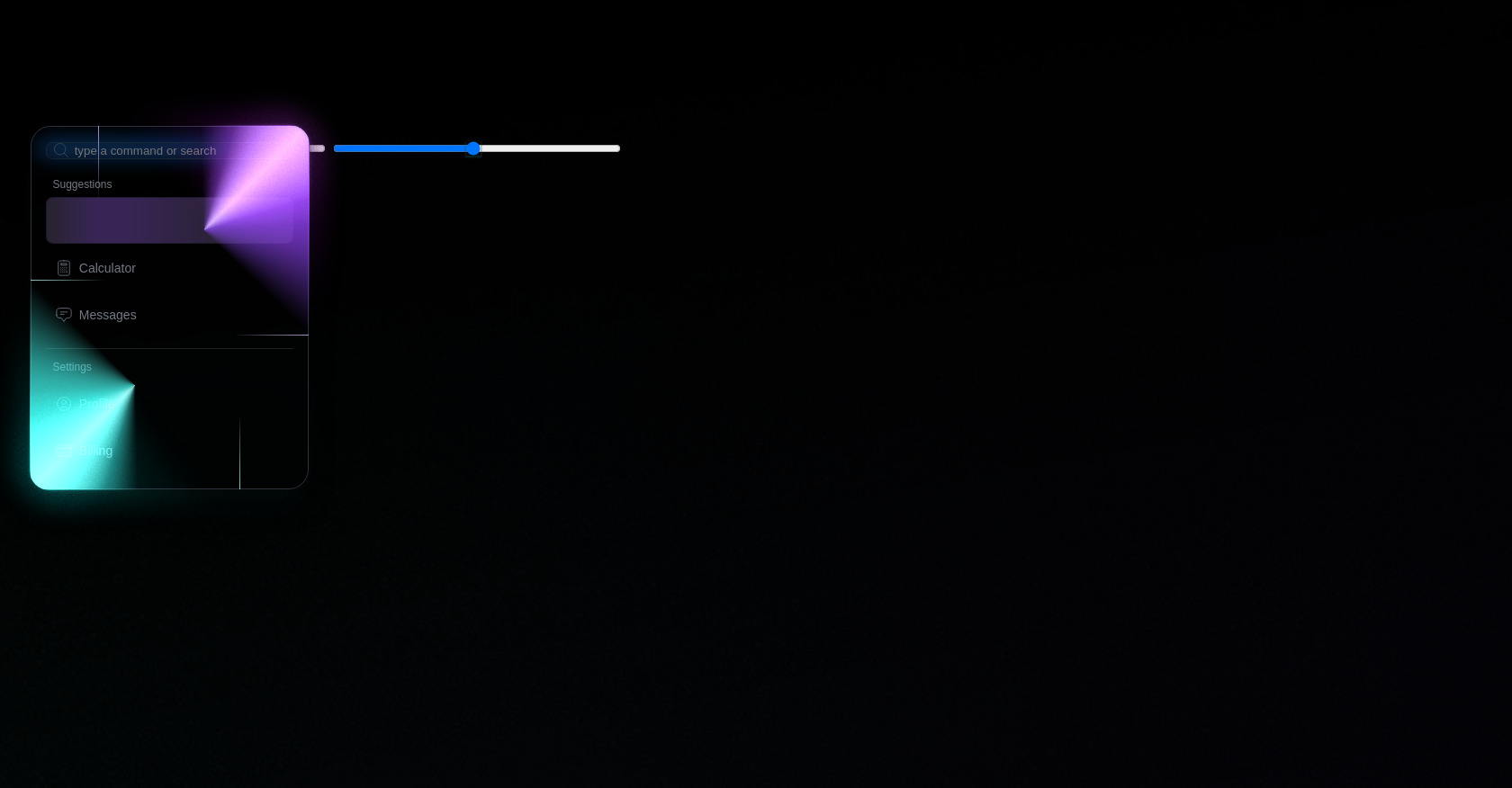
Neon Glass Context Menu with Color Picker
496
alejandrokundrah
Open In Editor
Publish Your Code
Recommended
28 June 2025
HTML Admin Dashboard Template with Sidebar
18 October 2025
HTML Next Button with SVG Arrow
25 September 2025
Animated CSS Checkboxes with SVG & JavaScript
HTML
Copy
Neon Glass Context menu
Right-click to open
Made by Simey
CSS
Copy
:root { /* vars */ --hue1: 255; --hue2: 222; --border: 1px; --border-color: hsl(var(--hue2), 12%, 20%); --radius: 22px; --ease: cubic-bezier(0.5, 1, 0.89, 1); } #menu { visibility: hidden; opacity: 0; pointer-events: none; transition-property: visibility, opacity, filter; transition-duration: 0s, 0.25s, 0.25s; transition-delay: 0.5s, 0s, 0s; transition-timing-function: var(--ease); filter: blur(4px); font-family: 'Asap', sans-serif; color: #737985; position: fixed; top: 140px; left: 2svw; min-width: 275px; min-height: 275px; border-radius: var(--radius); border: var(--border) solid var(--border-color); padding: 1em; background: linear-gradient(235deg, hsl(var(--hue1) 50% 10% / 0.8), hsl(var(--hue1) 50% 10% / 0) 33%), linear-gradient(45deg , hsl(var(--hue2) 50% 10% / 0.8), hsl(var(--hue2) 50% 10% / 0) 33%), linear-gradient(hsl(220deg 25% 4.8% / 0.66)); backdrop-filter: blur(12px); box-shadow: hsl(var(--hue2) 50% 2%) 0px 10px 16px -8px, hsl(var(--hue2) 50% 4%) 0px 20px 36px -14px; } #menu:not(.open)::before, #menu:not(.open)::after, #menu:not(.open) .glow { opacity: 0; pointer-events: none; animation: glowoff 0.25s var(--ease) both; } #menu.open { visibility: visible; opacity: 1; pointer-events: auto; transition-delay: 0s; filter: blur(0px); &::before, &::after, & .glow, & .shine { animation: glow 1s var(--ease) both; } & .shine { animation-delay: 0s; animation-duration: 2s; } & .glow { animation-delay: 0.2s; } & .glow-bright { animation-delay: 0.1s; animation-duration: 1.5s; } & .shine-bottom { animation-delay: 0.1s; animation-duration: 1.8s; } & .glow-bottom { animation-delay: 0.3s; } & .glow-bright.glow-bottom { animation-delay: 0.3s; animation-duration: 1.1s; } } #menu .shine, #menu .glow { --hue: var(--hue1); } #menu .shine-bottom, #menu .glow-bottom { --hue: var(--hue2); --conic: 135deg; } #menu .shine { } #menu .shine, #menu .shine::before, #menu .shine::after { pointer-events: none; border-radius: 0; border-top-right-radius: inherit; border-bottom-left-radius: inherit; border: 1px solid transparent; width: 75%; height: auto; min-height: 0px; aspect-ratio: 1; display: block; position: absolute; right: calc(var(--border) * -1); top: calc(var(--border) * -1); left: auto; z-index: 1; --start: 12%; background: conic-gradient( from var(--conic, -45deg) at center in oklch, transparent var(--start,0%), hsl( var(--hue), var(--sat,80%), var(--lit,60%)), transparent var(--end,50%) ) border-box; mask: linear-gradient(transparent), linear-gradient(black); mask-repeat: no-repeat; mask-clip: padding-box, border-box; mask-composite: subtract; } #menu .shine::before, #menu .shine::after { content: ""; width: auto; inset: -2px; mask: none; } #menu .shine::after { z-index: 2; --start: 17%; --end: 33%; background: conic-gradient( from var(--conic, -45deg) at center in oklch, transparent var(--start,0%), hsl( var(--hue), var(--sat,80%), var(--lit,85%)), transparent var(--end,50%) ); } #menu .shine-bottom { top: auto; bottom: calc(var(--border) * -1); left: calc(var(--border) * -1); right: auto; } #menu .glow { pointer-events: none; border-top-right-radius: calc(var(--radius) * 2.5); border-bottom-left-radius: calc(var(--radius) * 2.5); border: calc(var(--radius) * 1.25) solid transparent; inset: calc(var(--radius) * -2); width: 75%; height: auto; min-height: 0px; aspect-ratio: 1; display: block; position: absolute; left: auto; bottom: auto; mask: url('https://assets.codepen.io/13471/noise-base.png'); mask-mode: luminance; mask-size: 29%; opacity: 1; filter: blur(12px) saturate(1.25) brightness(0.5); mix-blend-mode: plus-lighter; z-index: 3; &.glow-bottom { inset: calc(var(--radius) * -2); top: auto; right: auto; } &::before, &::after { content: ""; position: absolute; inset: 0; border: inherit; border-radius: inherit; background: conic-gradient( from var(--conic, -45deg) at center in oklch, transparent var(--start,0%), hsl( var(--hue), var(--sat,95%), var(--lit,60%)), transparent var(--end,50%) ) border-box; mask: linear-gradient(transparent), linear-gradient(black); mask-repeat: no-repeat; mask-clip: padding-box, border-box; mask-composite: subtract; filter: saturate(2) brightness(1); } &::after { --lit: 70%; --sat: 100%; --start: 15%; --end: 35%; border-width: calc(var(--radius) * 1.75); border-radius: calc(var(--radius) * 2.75); inset: calc(var(--radius) * -0.25); z-index: 4; opacity: 0.75; } &.glow-bottom::after { } } #menu .glow-bright { --lit: 80%; --sat: 100%; --start: 13%; --end: 37%; border-width: 5px; border-radius: calc(var(--radius) + 2px); inset: -7px; left: auto; filter: blur(2px) brightness(0.66); &::after { content: none; } &.glow-bottom { inset: -7px; right: auto; top: auto; } } #menu .inner, #menu section { display: flex; flex-direction: column; gap: 0.5em; } #menu .inner { font-size: 0.875rem; } #menu hr { width: 100%; height: 0.5px; background: var(--border-color); border: none; margin: 0.25em 0 0.5em; opacity: 0.66; } #menu input { --tint2: hsl(var(--hue2) 50% 90% / 0.1); font-family: 'Asap', sans-serif; font-weight: 300; box-shadow: 0 0 0 1px transparent; border: 1px solid hsl(var(--hue2) 13% 18.5% / 0.5); background: hsl(var(--hue1) 0% 40% / 0.05); border-radius: calc(var(--radius) * 0.33333); padding-left: 2.33em; } #menu label { display: grid; grid-template: 1fr/1fr; margin-bottom: 1em; width: 100%; & > * { grid-area: 1/1; align-self: center; } & svg { margin-left: 0.5em; opacity: 0.5; } } #menu header { font-size: 0.75rem; font-weight: 300; padding: 0 0.66em; } #menu ul { list-style: none; padding: 0; margin: 0; } #menu li { position: relative; padding: 0.66em; height: 32px; display: flex; align-items: center; gap: 0.5em; border-radius: calc(var(--radius) * 0.33333); border: 1px solid transparent; transition: all 0.3s ease-in, --item-opacity 0.3s ease-in; background: linear-gradient( 90deg in oklch, hsl(var(--hue1) 29% 13% / var(--item-opacity)), hsl(var(--hue1) 30% 15% / var(--item-opacity)) 24% 32%, hsl(var(--hue1) 5% 7% / var(--item-opacity)) ) border-box; &::after { content: ""; position: absolute; inset: 0; border-radius: inherit; border: inherit; background: linear-gradient( 90deg in oklch, hsl(var(--hue1) 15% 16% / var(--item-opacity)), hsl(var(--hue1) 40% 24% / var(--item-opacity)) 20% 32%, hsl(var(--hue1) 2% 12% / var(--item-opacity)) ) border-box; mask: linear-gradient(transparent), linear-gradient(black); mask-repeat: no-repeat; mask-clip: padding-box, border-box; mask-composite: subtract; } &:hover, &.selected, &:hover::after, &.selected::after { --item-opacity: 0.5; transition: all 0.1s ease-out, --item-opacity 0.1s ease-out; color: white; } &.selected, &.selected::after { animation: flash 0.75s ease-out 1 forwards; } } @property --item-opacity { syntax: "<number>"; inherits: false; initial-value: 0; } /* other ui stuff */ body { background: #08090d; background-image: url(https://assets.codepen.io/13471/abstract-light.jpg), linear-gradient(to right in oklab, hsl(var(--hue2) 50% 75%), hsl(var(--hue1) 50% 75%)); background-size: cover; background-position: center; background-blend-mode: hard-light; padding: 0; } body, #app { min-height: 100svh; } #app { padding: 2svw; } #app > header { display: flex; gap: 0.5em; flex-direction: column; } #app > header h1, #app > header p { margin: 0; color: color-mix(in oklab, var(--fg) 70%, hsl(var(--hue1) 50% 50%)); } #app > header p { color: color-mix(in oklab, var(--fg) 40%, hsl(var(--hue2) 50% 50%)); } #app > footer { align-self: end; max-width: calc(96svw - 200px); display: flex; flex-wrap: wrap; gap: 0.5em; } #app > footer h2 { width: 100%; font-size: 1em; } #app > footer [type=range] { --tint: hsl( var(--hue2) 66% 50% ); --tint2: hsl( var(--hue1) 66% 50% ); width: 320px; margin: 0; } #app > footer #h1 { --tint: hsl( var(--hue1) 66% 50% ); --tint2: hsl( var(--hue1) 66% 50% ); --hue: var(--hue1); width: 320px; } #app > footer #h2 { --tint: hsl( var(--hue2) 66% 50% ); --tint2: hsl( var(--hue2) 66% 50% ); --hue: var(--hue2); width: 320px; } @media screen and (max-width: 480px) { #app > footer { gap: 1em; } } #app input[type="range"]::-webkit-slider-thumb { box-shadow: 0 1px 2px 1px hsl(var(--hue) 66% 20% / 0.5); } #app input[type="range"]::-moz-range-thumb { box-shadow: 0 1px 2px 1px hsl(var(--hue) 66% 20% / 0.5); } #app input[type="range"]::-ms-thumb { box-shadow: 0 1px 2px 1px hsl(var(--hue) 66% 20% / 0.5); } #menu svg { fill: none; stroke-width: 1; height: 20px; } @keyframes glow { 0% { opacity: 0; } 3% { opacity: 1; } 10% { opacity: 0; } 12% { opacity: 0.7; } 16% { opacity: 0.3; animation-timing-function: var(--ease); } 100% { opacity: 1; animation-timing-function: var(--ease); } } @keyframes glowoff { to { opacity: 0; } } @keyframes flash { 0% { opacity: 0; --item-opacity: 0; } 7% { opacity: 0.5; --item-opacity: 1; } 14% { opacity: 0; --item-opacity: 0.5; } 21%, 100% { opacity: 1; --item-opacity: 1; } }
JS
Copy
const $menu = document.getElementById('menu'); const $li = $menu.querySelectorAll('li'); const $hue1 = document.querySelector('#h1'); const $hue2 = document.querySelector('#h2'); document.addEventListener("contextmenu", (event) => { const menuBox = $menu.getBoundingClientRect(); const bodyBox = { width: window.innerWidth, height: window.innerHeight } const target = { x: event.clientX, y: event.clientY } const padding = { x: 30, y: 20 } const hitX = target.x + menuBox.width >= bodyBox.width - padding.x; const hitY = target.y + menuBox.height >= bodyBox.height - padding.y; if ( hitX ) { target.x = bodyBox.width - menuBox.width - padding.x; } if ( hitY ) { target.y = bodyBox.height - menuBox.height - padding.y; } const $target = event.target; const isMenu = $menu.contains( $target ); event.preventDefault(); if( !isMenu ) { $menu.style.left = target.x + 'px'; $menu.style.top = target.y + 'px'; $menu.classList.add('open'); $li.forEach($el => { $el.classList.remove('selected'); }) } }); document.addEventListener('pointerdown', (event) => { const $target = event.target; const isMenu = $menu.contains( $target ); const isSlider = $target.matches( 'input' ); if( !isMenu && !isSlider ) { $menu.classList.remove('open'); } else if (isMenu) { $li.forEach($el => { $el.classList.remove('selected'); }) if ( $target.matches('li') ) { $target.classList.add('selected'); } } }); $hue1.addEventListener( 'input', (event) => { requestAnimationFrame(() => { document.body.style.setProperty('--hue1', event.target.value ); $menu.classList.add('open'); }) }); $hue2.addEventListener( 'input', (event) => { requestAnimationFrame(() => { document.body.style.setProperty('--hue2', event.target.value ); $menu.classList.add('open'); }) }); const rand1 = 120 + Math.floor(Math.random() * 240); const rand2 = rand1 - 80 + (Math.floor(Math.random() * 60) - 30); $hue1.value = rand1; $hue2.value = rand2; document.body.style.setProperty('--hue1', rand1 ); document.body.style.setProperty('--hue2', rand2 );