WEBLEB
Home
Editor
Login
Pro
English
English
Français
Español
Português
Deutsch
Italiano
हिंदी
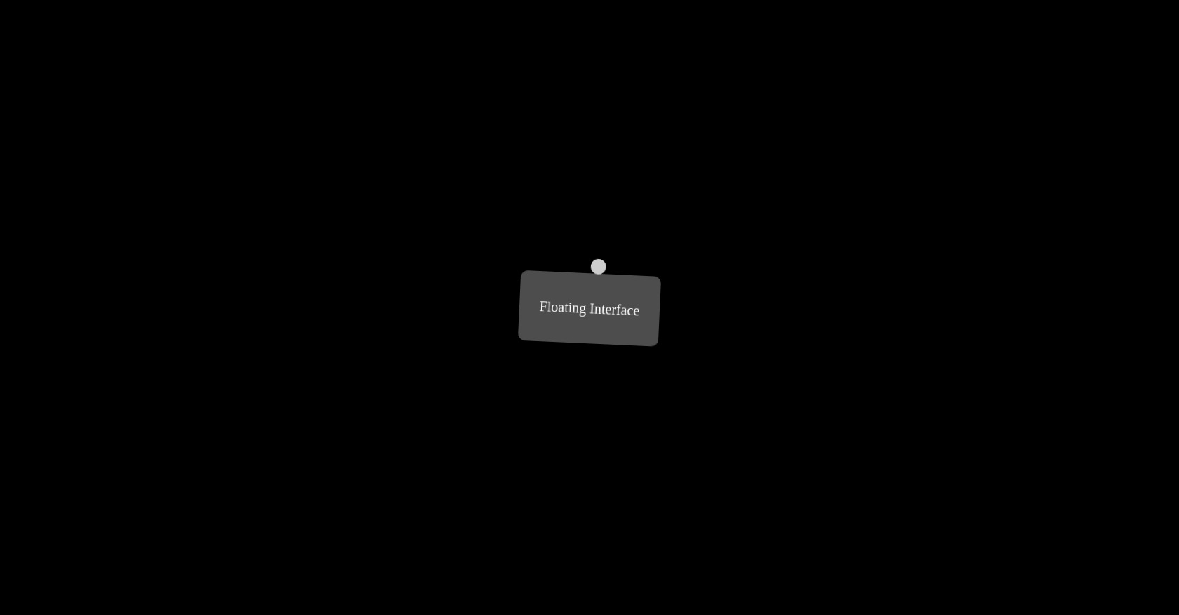
CSS Floating Interface Animation
396
ByBy.inc
Open In Editor
Publish Your Code
Recommended
30 September 2025
CSS Sphere Animation with Hover Effects
10 July 2023
CSS Dark Mode Toggle
7 November 2024
Text Hover Animation Effect
HTML
Copy
Floating Interface
CSS
Copy
* { margin: 0; padding: 0; box-sizing: border-box; } body { background-color: #000; display: flex; align-items: center; justify-content: center; height: 100vh; overflow: hidden; } .codigo { position: absolute; top: 0; left: 50%; transform: translateX(-50%); background: #272822; color: #F8F8F2; font-family: 'Consolas', 'Monaco', monospace; font-size: 18px; padding: 20px; border-radius: 8px; white-space: pre-line; text-align: left; line-height: 1.6; max-height: 50%; width: 100%; box-shadow: 0 4px 12px rgba(0, 0, 0, 0.3); } .selector { color: #F92672; } .property { color: #66D9EF; } .value-number { color: #AE81FF; } .value-string { color: #E6DB74; } .value-color { color: #A6E22E; } .brace { color: #F8F8F2; } .comment { color: #75715E; } .function { color: #A6E22E; } .animation-container { position: absolute; top: 50%; left: 50%; transform: translate(-50%, -50%); display: flex; align-items: center; justify-content: center; width: 100%; height: 50%; overflow: hidden; background-color: #000; } /* Interface Flutuante */ .interface { position: relative; width: 200px; height: 100px; background-color: rgba(255, 255, 255, 0.3); border-radius: 10px; display: flex; justify-content: center; align-items: center; font-size: 20px; color: #FFF; animation: float 5s ease-in-out infinite; } .interface::after, .interface::before { content: ""; position: absolute; top: -20px; left: 50%; transform: translateX(-50%); width: 20px; height: 20px; background-color: rgba(255, 255, 255, 0.7); border-radius: 50%; animation: pulsate 2s ease-in-out infinite; } @keyframes float { 0% { transform: translateY(0) rotate0deg; } 50% { transform: translateY(5px) rotate(10deg); } 100% { transform: translateY(0) rotate(0deg); } } @keyframes pulsate { 0% { transform: scale(1); opacity: 1; } 100% { transform: scale(1.2); opacity: 0.5; } }
JS
Copy
/* Replace with your JS Code (Leave empty if not needed) */