WEBLEB
Home
AI Editor
Login
Pro
English
English
Français
Español
Português
Deutsch
Italiano
हिंदी
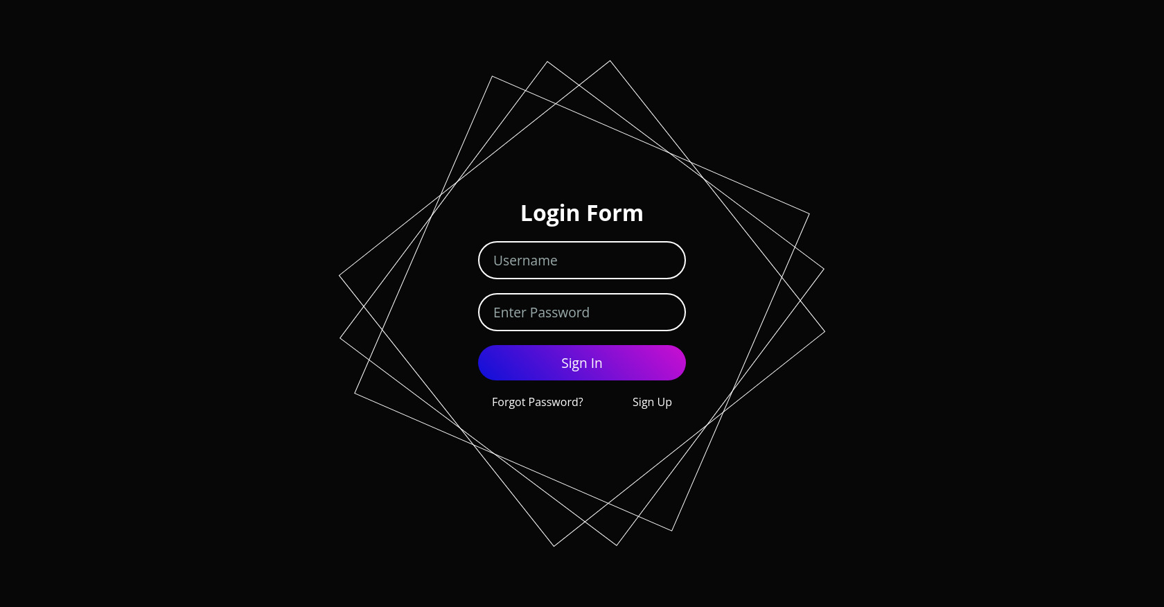
HTML Animated Login Form Example
1191
alejandrokundrah
Open In Editor
Video
Publish Your Code
1
Recommended
21 May 2024
Tela de Login
13 December 2025
Holographic Portfolio Website HTML Template
18 May 2024
Multicolor login form
HTML
Copy
Animated Form Login
Login Form
Forgot Password?
Sign Up
CSS
Copy
@import url('https://fonts.googleapis.com/css2?family=Open+Sans:ital,wght@0,300..800;1,300..800&display=swap'); *{ margin: 0; padding: 0; box-sizing: border-box; font-family: 'Open Sans', sans-serif; } body{ display: flex; justify-content: center; align-items: center; min-height: 100vh; background: #070707; } .container{ position: relative; width: 500px; height: 500px; display: flex; justify-content: center; align-items: center; } .container i{ position: absolute; inset: 0; border: 1.5px solid #fff; transition: .5s; } .container i:nth-child(1){ animation: animate 5s linear infinite;} .container i:nth-child(2){ animation: animate 7s linear infinite;} .container i:nth-child(3){ animation: animate 11s linear infinite;} .container:hover i{ border: 6px solid var(--clr); filter: drop-shadow(0 0 20px var(--clr)); } .login{ position: absolute; width: 300px; height: 100%; display: flex; justify-content: center; align-items: center; flex-direction: column; gap: 20px; } .login h2{ font-size: 2em; color: #fff; } .login .input-box{ position: relative; width: 100%; } .login .input-box input{ position: relative; width: 100%; padding: 12px 20px; background: transparent; border: 2px solid #fff; border-radius: 40px; font-size: 1.2em; color: #fff; box-shadow: none; outline: none; } .login .input-box input[type="submit"]{ width: 100%; background: #0078ff; background: linear-gradient(45deg, #0d10d8, #cb0fd1); border: none; cursor: pointer; } .login .input-box input::placeholder{ color: rgba(205, 225, 225, .75);} .login .links{ position: relative; width: 100%; display: flex; align-items: center; justify-content: space-between; padding: 0px 20px; } .login .links a{ color: #fff; text-decoration: none; } @keyframes animate{ 0% { transform: rotate(0deg);} 100%{ transform: rotate(360deg);} } @keyframes animate4{ 0% { transform: rotate(360deg);} 100%{ transform: rotate(0deg);} }
JS
Copy
/* Replace with your JS Code (Leave empty if not needed) */