WEBLEB
Home
Editor
Login
Pro
English
English
Français
Español
Português
Deutsch
Italiano
हिंदी
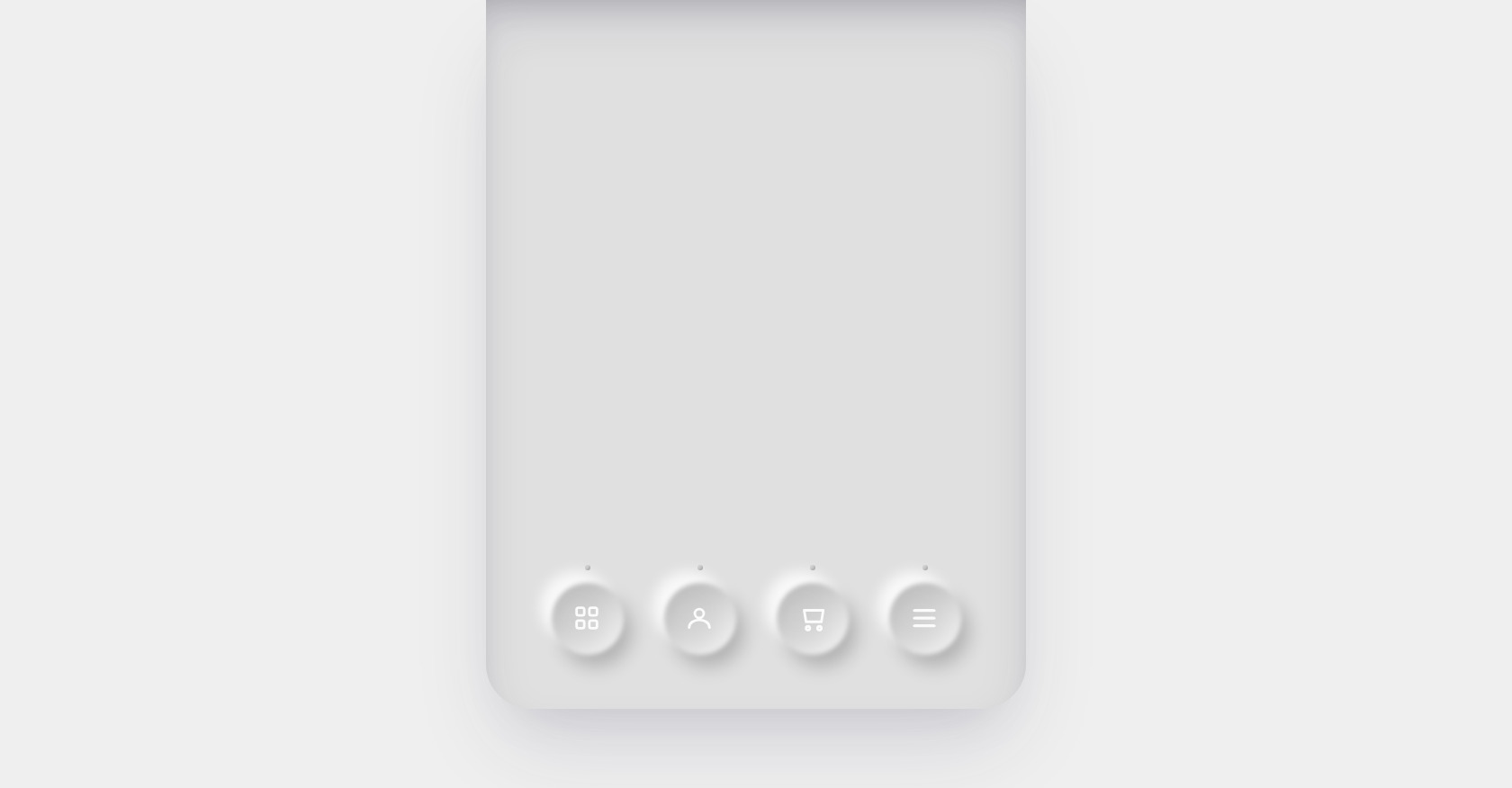
HTML SVG Navigation Bar Code
494
alejandrokundrah
Open In Editor
Publish Your Code
Recommended
22 August 2025
3D Lion Card Carousel HTML CSS & JavaScript
21 June 2025
HTML Light Effects Container with CSS
28 February 2025
Dating Website Landing Page HTML CSS
HTML
Copy
CSS
Copy
@import url('https://fonts.googleapis.com/css?family=Montserrat:400,700'); :root { --bg: #1111; } * { margin:0; padding:0; outline:none; list-style:none; text-decoration:none; box-sizing:border-box; background: transparent; border:none; } html, body { height: 100%; width: 100%; } body { background: var(--bg); color: #000; font-family: 'Montserrat', sans-serif; font-size: 16px; } h1, h2, h3 { font-weight: 700; } main { height: 90%; max-width: 600px; margin-left: auto; margin-right: auto; border-radius: 0 0 50px 50px; display: flex; align-items: flex-end; justify-content: center; background: var(--bg); box-shadow: rgba(50, 50, 93, 0.15) 0px 30px 60px -12px inset, rgba(0, 0, 0, 0.2) 0px 18px 36px -18px inset, rgba(50, 50, 93, 0.15) 0px 50px 100px -20px, rgba(0, 0, 0, 0.1) 0px 30px 60px -30px; } .nav { width: 90%; max-width: 500px; display: flex; justify-content: space-around; align-items: center; margin-bottom: 60px; } .nav__btn { width: 80px; height: 80px; border-radius: 50%; border: none; outline: none; cursor: pointer; display: flex; justify-content: center; align-items: center; position: relative; transition: transform 0.4s cubic-bezier(.47,1.64,.41,.8); &:before { content:""; filter: blur(2.5px); position: absolute; border-radius: 50%; z-index: 0; top: 0; left: 0; width: 100%; height: 100%; background: var(--bg); transition: box-shadow 0.4s ease-in-out, filter 0.4s ease-in-out; box-shadow: -13px -13px 14px 0px rgb(255 255 255 / 80%), 7px 20px 30px -12px rgb(0 0 0 / 12%) inset, rgb(255 255 255 / 80%) -20px -18px 36px -18px inset, 9px 13px 20px rgb(0 0 0 / 21%), inset -4px -4px 8px transparent, inset 4px 4px 8px transparent; } &:after { content:""; position: absolute; top: -20px; left: 50%; transform: translate(-50%); height: 6px; width: 6px; background-color: #CFCFCF; border-radius: 50%; box-shadow: -4px -4px 3px -4px rgb(0 0 0 / 20%) inset; transition: transform 0.4s cubic-bezier(.47,1.64,.41,.8), background-color 0.3s ease-in-out 0s; } } .nav__btn:active, .nav__btn:focus-visible, .nav__btn.active { transform: translateY(2px); &:before { filter: blur(2.5px); box-shadow: -9px -13px 26px rgb(0 0 0 / 16%), 9px 13px 20px 6px rgb(0 0 0 / 20%) inset, rgb(255 255 255 / 100%) -20px -30px 20px -8px inset, 15px 20px 20px rgb(255 255 255 / 5%), inset -4px -4px 8px transparent, inset 4px 4px 8px transparent; } &:after { transform: translateY(-2px) translateX(-50%); box-shadow: -4px -4px 3px -4px rgb(0 0 0 / 0) inset; background-color: rgb(22 180 255); transition: transform 0.4s cubic-bezier(.47,1.64,.41,.8), background-color 0.2s ease-in-out .2s; } } .icon { width: 34px; height: 34px; fill: none; stroke: #FFF; pointer-events: none; transition: fill 0.25s ease; stroke-width: 2; position: relative; left: -1px; top: -1px; z-index: 2; transition: transform 0.4s cubic-bezier(.47,1.64,.41,.8); path, circle, rect { stroke: rgba(255,255,255,0.9); stroke-width: 2; transition: stroke 0.3s ease-in-out 0s; } } .nav__btn:active, .nav__btn:focus-visible, .nav__btn.active { .icon { transform: scale(0.9); filter: drop-shadow(0px 0px 8px rgba(160,200,255,0.9)); path, circle, rect { stroke: rgb(22 180 255); transition: stroke 0.2s ease-in-out 0.2s; } } } .nav__btn { -webkit-tap-highlight-color: transparent; }
JS
Copy
const buttons = document.querySelectorAll('.nav__btn'); const inSound = new Audio('http://soundbible.com/grab.php?id=1280&type=mp3'); const outSound = new Audio('http://soundbible.com/grab.php?id=1294&type=mp3'); [inSound, outSound].forEach(a => { a.preload = 'auto'; a.volume = 0.03; }); buttons.forEach(btn => { // on click add active class & play sound effect btn.addEventListener('click', () => { if (btn.classList.contains('active')) { btn.classList.remove('active'); outSound.currentTime = 0; outSound.play().catch(() => {}); } else { const otherActiveButtons = [...buttons].filter(b => b !== btn && b.classList.contains('active')); btn.classList.add('active'); inSound.currentTime = 0; inSound.play().catch(() => {}); if (otherActiveButtons.length > 0) { setTimeout(() => { otherActiveButtons.forEach(b => b.classList.remove('active')); outSound.currentTime = 0; outSound.play().catch(() => {}); }, 240); } } }); // CSS focus only & play sound effect // btn.addEventListener('pointerdown', () => { // inSound.currentTime = 0; // inSound.play().catch(() => {}); // btn.classList.add('active'); // }); // btn.addEventListener('pointerup', () => { // outSound.currentTime = 0; // outSound.play().catch(() => {}); // }); });