WEBLEB
Home
Editor
Login
Pro
English
English
Français
Español
Português
Deutsch
Italiano
हिंदी
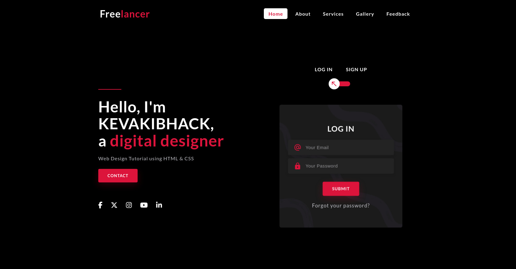
3D Login Signup Box HTML CSS
373
kamarasalifa
Open In Editor
Publish Your Code
Recommended
14 May 2025
Gradient Login Form HTML CSS
3 March 2025
HTML CSS Event Registration System Website
23 August 2025
Web Tasarım, Dijital Deneyim ve Podcast HTML Template
HTML
Copy
3D Rotation Login / Signup Box
Free
lancer
menu
Home
About
Services
Gallery
Feedback
Hello, I'm KEVAKIBHACK,
a
digital designer
Web Design Tutorial using HTML & CSS
Contact
Log In
Sign Up
Log In
alternate_email
lock
Submit
Forgot your password?
Sign Up
perm_identity
alternate_email
lock
Submit
CSS
Copy
@import url('https://fonts.googleapis.com/css2?family=Lato:ital,wght@0,100;0,300;0,400;0,700;0,900;1,100;1,300;1,400;1,700;1,900&display=swap'); :root { --mainColor: crimson; --black: #000000; --white: #FFFFFF; --whiteSmoke: #C4C3CA; --shadow: 0px 4px 8px 0 rgba(21, 21, 21, .2); } * { margin: 0; padding: 0; box-sizing: border-box; } ::before, ::after { box-sizing: border-box; } body { font-family: 'Lato', sans-serif; font-size: 16px; letter-spacing: 1px; font-weight: normal; background-color: var(--black); } a { text-decoration: none; } ul { list-style: none; } .container { max-width: 1080px; margin: auto; } .row { display: flex; flex-wrap: wrap; } .justify-content-between { justify-content: space-between; } .align-items-center { align-items: center; } .full-screen { min-height: 100vh; padding: 80px 0 0; } .text-center { text-align: center; } /*NAV*/ nav { width: 100%; background-color: var(--black); position: fixed; z-index: 999; padding: 25px; } nav .logo { color: var(--white); font-size: 32px; font-weight: 600; text-transform: capitalize; } nav .logo span { color: var(--mainColor); } nav .container { padding: 0 25px; } nav .menu-btn i { color: var(--white); font-size: 28px; cursor: pointer; display: none; } nav ul { display: flex; flex-wrap: wrap; } nav ul li { margin: 0 5px; } nav ul li a { color: var(--white); font-size: 16px; font-weight: 600; padding: 8px 15px; border-radius: 5px; transition: all .3s ease; } nav ul li a.active, nav ul li a:hover { color: var(--mainColor); background: var(--white); } /*MAIN*/ .left, .right { flex: 0 0 50%; max-width: 50%; padding: 20px; } .left .line { width: 15%; height: 2px; background-color: var(--mainColor); display: inline-block; } .left h2 { margin-top: 25px; font-size: 50px; color: var(--white); line-height: 55px; } .left h2 span { color: var(--mainColor); font-size: 52px; } .left p { color: var(--whiteSmoke); font-size: 16px; margin-top: 20px; margin-bottom: 10px; } .btn { height: 44px; padding: 0px 30px; background-color: var(--mainColor); border-radius: 4px; font-size: 13px; font-weight: 600; text-transform: uppercase; display: inline-flex; justify-content: center; align-items: center; color: var(--white); letter-spacing: 1px; border: none; margin-top: 15px; box-shadow: 0px 8px 24px 0 rgba(228, 10, 57, .2); transition: all .2s linear; } .btn:hover { background-color: var(--white); color: var(--mainColor); box-shadow: 0 8px 24px 0 rgba(138, 140, 146, .2); } .social-media { margin-top: 60px; } .social-media a { color: var(--white); margin-right: 22px; font-size: 22px; text-decoration: none; transition: all .2s linear; } .social-media a:hover { color: var(--mainColor); } .form {width: 100%; display: flex; justify-content: center; } .right h4 { font-weight: 600; color: var(--white); } .right h6 { color: var(--white); margin-bottom: 30px; } .right h6 span { padding: 0 20px; text-transform: uppercase; font-weight: 700; font-size: 16px; } input[type="checkbox"] { display: none; } .checkbox:checked + label, .checkbox:not(:checked) + label { position: relative; display: block; text-align: center; width: 60px; height: 16px; border-radius: 8px; background-color: var(--mainColor); padding: 0; margin: 10px auto; cursor: pointer; } .checkbox:checked + label::before, .checkbox:not(:checked) + label::before { position: absolute; display: block; width: 36px; height: 36px; border-radius: 50%; color: var(--mainColor); background-color: var(--white); font-family: 'Material Icons'; content: '\f1e2'; z-index: 20; top: -10px; left: -10px; line-height: 36px; text-align: center; font-size: 24px; transition: all .5s ease; } .checkbox:checked + label::before { transform: translateX(44px) rotate(-270deg); } .link { color: var(--whiteSmoke); margin-top: 20px; display: block; } .link:hover { color: var(--mainColor); } .card-3d-wrap { position: relative; width: 400px; max-width: 100%; height: 400px; margin-top: 60px; transform-style: preserve-3d; perspective: 800px; } .card-3d-wrapper { width: 100%; height: 100%; position: absolute; top: 0; left: 0; transform-style: preserve-3d; transition: all .6s ease-out; } .checkbox:checked ~ .card-3d-wrap .card-3d-wrapper { transform: rotateY(180deg); } .card-front, .card-back { width: 100%; height: 100%; background-color: #1B1B1B; background-image: url('https://i.postimg.cc/4dnZCH03/background.png'); background-position: bottom center; background-repeat: no-repeat; background-size: 300%; position: absolute; border-radius: 6px; left: 0; top: 0; transform-style: preserve-3d; } .card-back { transform: rotateY(180deg); } .center-wrap { position: absolute; width: 100%; padding: 0 35px; top: 50%; left: 0; transform: translate3d(0, -50%, 35px) perspective(100px); display: block; z-index: 20; } .heading { margin-bottom: 20px; font-size: 24px; text-transform: uppercase; } .form-group { position: relative; display: block; margin-bottom: 10px; } .form-group input::placeholder { color: var(--whiteSmoke); opacity: .7; transition: all .2s linear; } .form-group input:focus::placeholder { opacity: 0; transition: all .2s linear; } .form-style { padding: 13px 20px; padding-left: 55px; height: 48px; width: 100%; font-weight: 500; border-radius: 4px; font-size: 14px; line-height: 22px; letter-spacing: 0.5px; outline: none; color: var(--whiteSmoke); background-color: #242323; border: none; box-shadow: var(--shadow); } .form-style:focus, .form-style:active { border: none; outline: none; box-shadow: var(--shadow); } .input-icon { position: absolute; top: 12px; left: 18px; height: 48px; font-size: 24px; text-align: left; color: var(--mainColor); transition: all .2s linear; } /*MEDIA QUERIES*/ @media (max-width: 992px) { nav .menu-btn i { display: block; } nav .container { padding: 0; } nav ul { position: fixed; top: 85px; left: -100%; background-color: #1B1B1B; height: 320px; width: 100%; display: block; text-align: center; transition: all .3s ease; } #click:checked ~ ul { left: 0; } nav ul li { margin: 20px 0; } nav ul li a { display: block; font-size: 20px; } nav ul li a.active, nav ul li a:hover { background: none; color: var(--mainColor); } .left h2 { font-size: 40px; } .left h2 span { font-size: 42px; } .left p { font-size: 14px; } .card-3d-wrap { width: 350px; } } @media (max-width: 768px) { .left, .right { flex: 0 0 100%; max-width: 100%; } .left { display: grid; place-items: center; order: 2;} .right { order: 1; } .left h2 { text-align: center; } } @media (max-width: 400px) { .left h2 { font-size: 28px; } .left h2 span { font-size: 30px; } .card-3d-wrap { width: 300px; } }
JS
Copy
/* Replace with your JS Code (Leave empty if not needed) */