WEBLEB
Home
Editor
Login
Pro
English
English
Français
Español
Português
Deutsch
Italiano
हिंदी
HTML Neon Button Example
35
alejandrokundrah
Open In Editor
Publish Your Code
Recommended
27 June 2025
Portfolio Webpage Example
29 June 2025
Turkish Blog & Podcast HTML Template
17 July 2025
Error 404 Page HTML Template
HTML
Copy
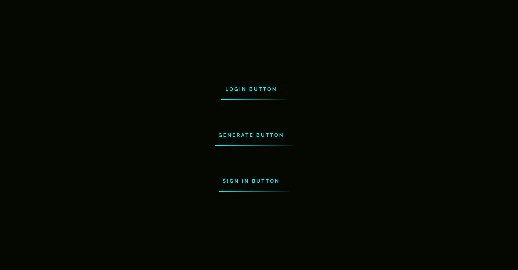
Neon Button |Mooncraft
Login button
Generate button
Sign In button
CSS
Copy
@import url('https://fonts.googleapis.com/css2?family=Raleway:wght@400;700&display=swap'); * { margin: 0; padding: 0; box-sizing: border-box; } body { display: flex; justify-content: center; align-items: center; flex-direction: column; height: 100vh; background: #050801; font-family: 'Raleway', sans-serif; font-weight: bold; } a { position: relative; display: inline-block; padding: 25px 30px; margin: 40px 0; color: #03e9f4; text-decoration: none; text-transform: uppercase; transition: 0.5s; letter-spacing: 4px; overflow: hidden; margin-right: 50px; } a:hover { background: #03e9f4; color: #050801; box-shadow: 0 0 5px #03e9f4, 0 0 25px #03e9f4, 0 0 50px #03e9f4, 0 0 200px #03e9f4; -webkit-box-reflect: below 1px linear-gradient(transparent, #0005); } a:nth-child(1) { filter: hue-rotate(270deg); } a:nth-child(2) { filter: hue-rotate(110deg); } a span { position: absolute; display: block; } a span:nth-child(1) { top: 0; left: 0; width: 100%; height: 2px; background: linear-gradient(90deg, transparent, #03e9f4); animation: animate1 1s linear infinite; } @keyframes animate1 { 0% { left: -100%; } 50%, 100% { left: 100%; } } a span:nth-child(2) { top: -100%; right: 0; width: 2px; height: 100%; background: linear-gradient(180deg, transparent, #03e9f4); animation: animate2 1s linear infinite; animation-delay: 0.25s; } @keyframes animate2 { 0% { top: -100%; } 50%, 100% { top: 100%; } } a span:nth-child(3) { bottom: 0; right: 0; width: 100%; height: 2px; background: linear-gradient(270deg, transparent, #03e9f4); animation: animate3 1s linear infinite; animation-delay: 0.50s; } @keyframes animate3 { 0% { right: -100%; } 50%, 100% { right: 100%; } } a span:nth-child(4) { bottom: -100%; left: 0; width: 2px; height: 100%; background: linear-gradient(360deg, transparent, #03e9f4); animation: animate4 1s linear infinite; animation-delay: 0.75s; } @keyframes animate4 { 0% { bottom: -100%; } 50%, 100% { bottom: 100%; } }
JS
Copy
/* Replace with your JS Code (Leave empty if not needed) */