WEBLEB
Home
Editor
Login
Pro
English
English
Français
Español
Português
Deutsch
Italiano
हिंदी
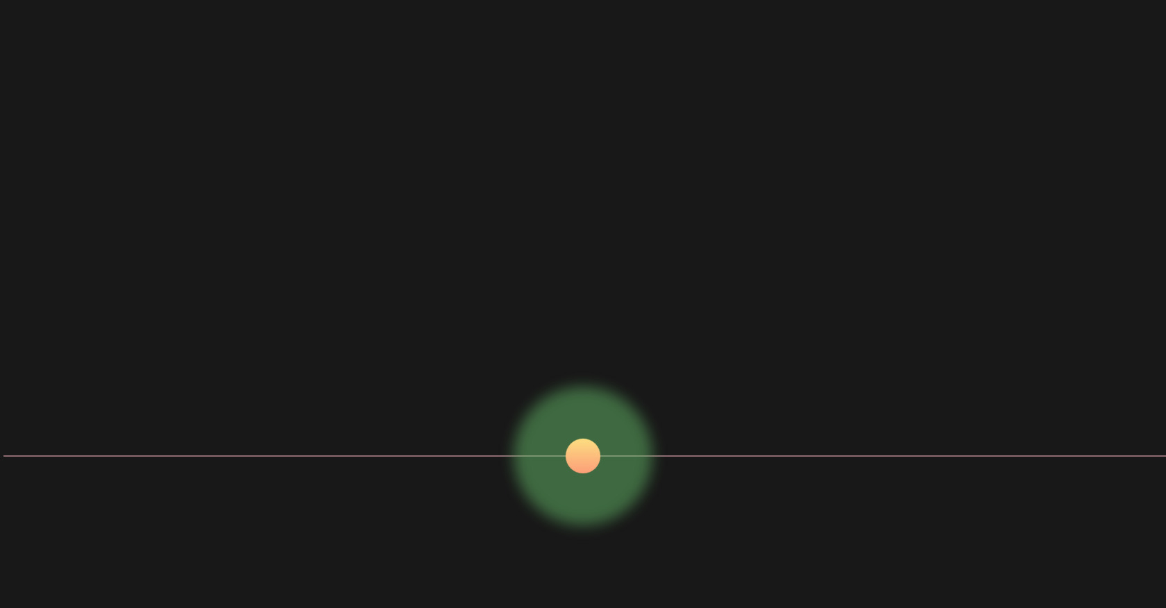
CSS Animation: Loading Blob with Pulse
168
ByBy.inc
Open In Editor
Publish Your Code
Recommended
21 July 2025
CSS Radio Button Navigation Menu
14 June 2024
social media icon with hover
30 March 2025
Navbar Pure CSS
HTML
Copy
CSS
Copy
* { margin: 0; padding: 0; box-sizing: border-box; } body { background-color: #181818; display: flex; align-items: center; justify-content: center; height: 100vh; overflow: hidden; } .codigo { position: absolute; top: 0; left: 50%; transform: translateX(-50%); background: #272822; color: #F8F8F2; font-family: 'Consolas', 'Monaco', monospace; font-size: 18px; padding: 20px; border-radius: 8px; white-space: pre-line; text-align: left; line-height: 1.6; max-height: 50%; width: 100%; box-shadow: 0 4px 12px rgba(0, 0, 0, 0.3); } .selector { color: #F92672; } .property { color: #66D9EF; } .value-number { color: #AE81FF; } .value-string { color: #E6DB74; } .value-color { color: #A6E22E; } .brace { color: #F8F8F2; } .comment { color: #75715E; } .function { color: #A6E22E; } .animation-container { position: absolute; top: 75%; left: 50%; transform: translate(-50%, -50%); display: flex; align-items: center; justify-content: center; width: 100%; height: 50%; overflow: hidden; background:transparent; /* Animação principal: 90s city grid, corrompido */ } /* Animação 1: Linhas de código pixeladas */ .codigo-linha { width: 100%; height: 2px; background: #FFC0CB; /* Pink pastel */ position: absolute; opacity: 0.5; animation: pixelate 2s linear infinite; } .codigo-linha:nth-child(odd) { animation-direction: reverse; } @keyframes pixelate { 0% { transform: translateX(0) } /* Inicia sem disjunção */ 50% { transform: translateX(5px) } /* Deslocamento para criar a "corrupção" */ 100% { transform: translateX(0) } /* Volta para a posição original */ } /* Animação 2: Blocos de cores distorcidos */ .blob { position: absolute; width: 200px; height: 200px; background: #66BB6A; /* Verde vibrante */ border-radius: 50%; animation: blurFade 2s ease-in-out infinite; } @keyframes blurFade { 0% { filter: blur(0px); opacity: 1; } /* Inicialmente claro */ 50% { filter: blur(10px); opacity: 0.5; } /* Blur aumenta, opacidade diminui */ 100% { filter: blur(0px); opacity: 1; } /* Volta ao estado original */ } /* Animação 3: Luz pulsante */ .light-pulse { position: absolute; width: 50px; height: 50px; background: linear-gradient(to bottom, #FFE082, #FFA07A); /* Laranja desvanecente */ border-radius: 50%; animation: pulse 1s ease-in-out infinite; } @keyframes pulse { 0% { transform: scale(1); opacity: 1; } /* Inicial: tamanho normal */ 50% { transform: scale(1.2); opacity: 0.5; } /* Aumenta e diminui opacidade */ 100% { transform: scale(1); opacity: 1; } /* Volta ao tamanho original */ }
JS
Copy
/* Replace with your JS Code (Leave empty if not needed) */