WEBLEB
Home
Editor
Login
Pro
English
English
Français
Español
Português
Deutsch
Italiano
हिंदी
CSS Grid Animation Example
38
ByBy.inc
Open In Editor
Publish Your Code
Recommended
10 February 2024
Button Hover Animation
30 March 2025
World Places (CSS 3d hover)
22 August 2025
CSS Heart Animation Code Snippet
HTML
Copy
CSS
Copy
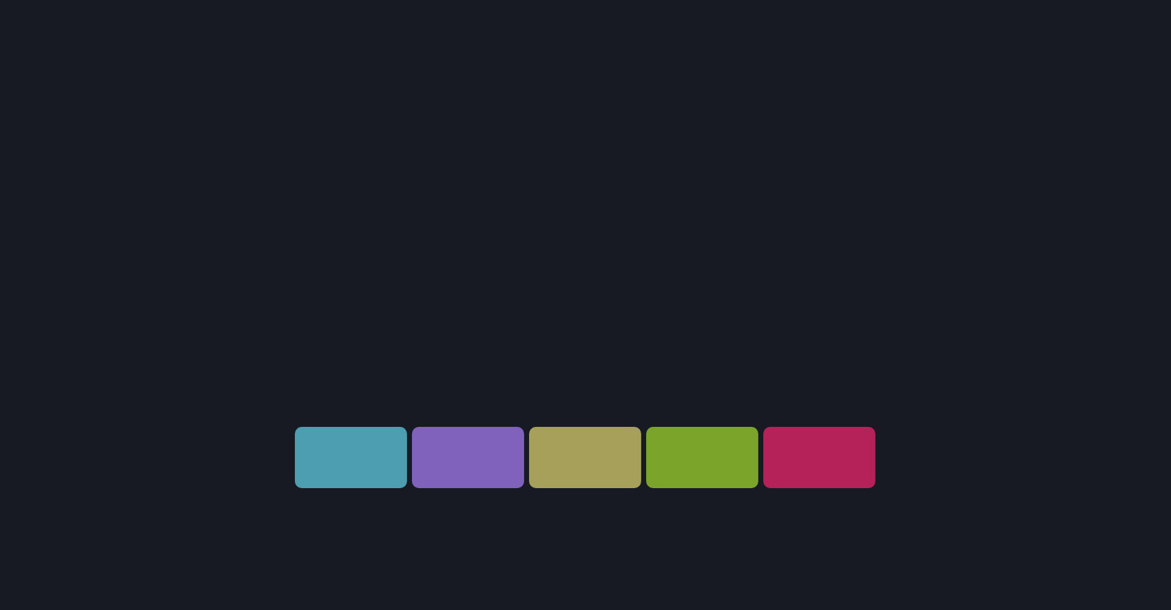
* { margin: 0; padding: 0; box-sizing: border-box; } body { background-color: #181A23; display: flex; align-items: center; justify-content: center; height: 100vh; overflow: hidden; } .codigo { position: absolute; top: 0; left: 50%; transform: translateX(-50%); background: #272822; color: #F8F8F2; font-family: 'Consolas', 'Monaco', monospace; font-size: 18px; padding: 20px; border-radius: 8px; white-space: pre-line; text-align: left; line-height: 1.6; max-height: 50%; width: 100%; box-shadow: 0 4px 12px rgba(0, 0, 0, 0.3); } .selector { color: #F92672; } .property { color: #66D9EF; } .value-number { color: #AE81FF; } .value-string { color: #E6DB74; } .value-color { color: #A6E22E; } .brace { color: #F8F8F2; } .comment { color: #75715E; } .function { color: #A6E22E; } .animation-container { position: absolute; top: 75%; left: 50%; transform: translate(-50%, -50%); display: flex; align-items: center; justify-content: center; width: 100%; height: 50%; overflow: hidden; background:transparent; } .cell { position: relative; width: 10vw; height: 10vh; background: #F8F8F2; border-radius: 10px; opacity: 0.7; transform-style: preserve-3d; animation: dream-weave 15s linear infinite alternate; } .cell.cell1 { background: #66D9EF; /* azul */ } .cell.cell2 { background: #AE81FF; /* roxo */ } .cell.cell3 { background: #E6DB74; /* amarelo */ } .cell.cell4 { background: #A6E22E; /* verde */ } .cell.cell5 { background: #F92672; /* vermelho */ } .code { position: absolute; top: 50%; left: 50%; transform: translate(-50%, -50%); font-size: 20px; color: #F8F8F2; animation: code-pulse 3s linear infinite alternate; } @keyframes dream-weave { 0% { transform: rotateY(0deg) translateZ(0px); } 50% { transform: rotateY(180deg) translateZ(-20px); } 100% { transform: rotateY(360deg) translateZ(0px); } } @keyframes code-pulse { 0%, 100% { opacity: 0.8; } 50% { opacity: 1; } }
JS
Copy
/* Replace with your JS Code (Leave empty if not needed) */