WEBLEB
Home
AI Editor
Chat
Login
Pro
English
English
Français
Español
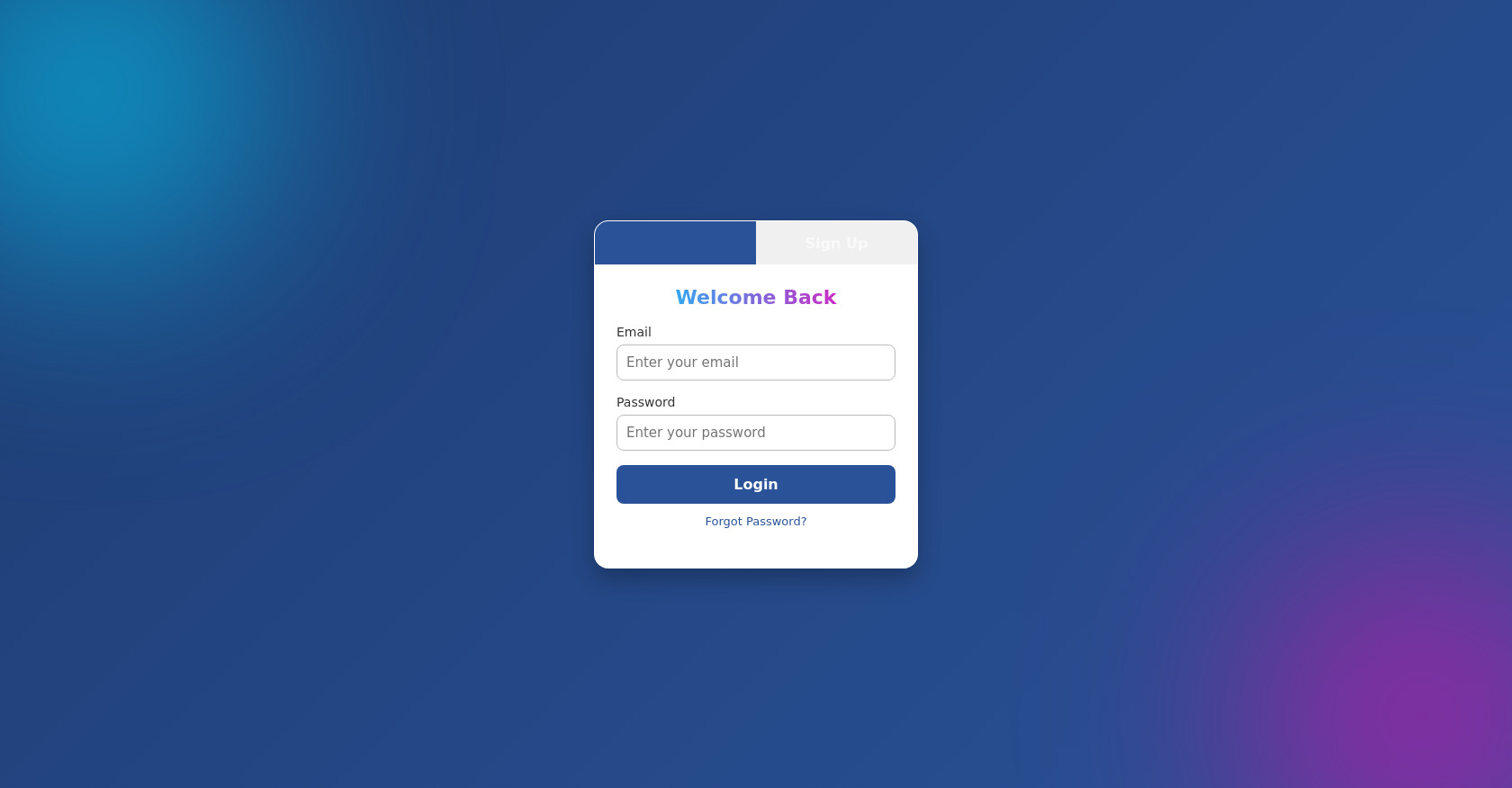
Login and Sign Up Form HTML/CSS Template
1,770
0
Forms
oliaa
Follow
0
Remix
Open In Editor
Fullscreen
Discuss
Publish Your Code
0
Recommended
14 October 2026
Cyberpunk 2D Fighting Game in HTML Canvas and CSS
27 October 2026
Fullscreen Iframe Game Loader in HTML and JavaScript
13 October 2026
Dil Heart Animation Effect with HTML and JavaScript
HTML
Copy
Login / Sign Up
Login
Sign Up
Welcome Back
Email
Password
Login
Forgot Password?
Create Account
Username
Email
Password
Sign Up
CSS
Copy
/* Reset */ * { box-sizing: border-box; margin: 0; padding: 0; font-family: "Poppins", system-ui, sans-serif; } /* Background with gradient + glow */ body { height: 100vh; display: flex; align-items: center; justify-content: center; background: linear-gradient(135deg, #0f2027, #203a43, #2c5364); overflow: hidden; } /* Decorative glowing orbs */ body::before, body::after { content: ""; position: absolute; border-radius: 50%; filter: blur(120px); z-index: 0; } body::before { width: 400px; height: 400px; top: -100px; left: -100px; background: rgba(0, 212, 255, 0.6); } body::after { width: 400px; height: 400px; bottom: -120px; right: -100px; background: rgba(255, 0, 180, 0.5); } /* Container (glass effect) */ .container { width: 380px; background: rgba(255, 255, 255, 0.08); border-radius: 20px; padding-bottom: 20px; box-shadow: 0 8px 32px rgba(0, 0, 0, 0.45); backdrop-filter: blur(14px); border: 1px solid rgba(255, 255, 255, 0.15); position: relative; z-index: 1; overflow: hidden; animation: fadeIn 0.8s ease; } /* Tabs */ .tabs { display: flex; } .tabs button { flex: 1; padding: 14px; border: none; background: transparent; font-size: 16px; font-weight: 600; color: rgba(255, 255, 255, 0.65); transition: all 0.3s ease; cursor: pointer; } .tabs button.active { color: #fff; background: linear-gradient(90deg, #00d4ff, #ff00b4); -webkit-background-clip: text; -webkit-text-fill-color: transparent; font-size: 17px; } /* Forms */ .form { padding: 24px; display: none; animation: slide 0.4s ease; } .form.active { display: block; } .form h2 { margin-bottom: 18px; font-size: 24px; text-align: center; background: linear-gradient(90deg, #00d4ff, #ff00b4); -webkit-background-clip: text; -webkit-text-fill-color: transparent; } /* Input groups */ .input-group { margin-bottom: 18px; } .input-group label { font-size: 13px; color: rgba(255, 255, 255, 0.7); display: block; margin-bottom: 6px; } .input-group input { width: 100%; padding: 12px; border: none; border-radius: 10px; font-size: 15px; background: rgba(255, 255, 255, 0.15); color: #fff; outline: none; transition: background 0.3s ease, box-shadow 0.3s ease; } .input-group input:focus { background: rgba(255, 255, 255, 0.2); box-shadow: 0 0 8px rgba(0, 212, 255, 0.8); } /* Buttons */ .form button { width: 100%; padding: 12px; background: linear-gradient(90deg, #00d4ff, #ff00b4); color: #fff; font-size: 16px; border: none; border-radius: 10px; cursor: pointer; font-weight: 600; transition: transform 0.2s ease, box-shadow 0.3s ease; } .form button:hover { transform: translateY(-3px); box-shadow: 0 0 20px rgba(0, 212, 255, 0.7), 0 0 30px rgba(255, 0, 180, 0.6); } /* Extra links */ .extra { margin-top: 14px; text-align: center; font-size: 13px; color: rgba(255, 255, 255, 0.6); } .extra a { color: #00d4ff; text-decoration: none; font-weight: 500; } .extra a:hover { text-decoration: underline; } /* Animations */ @keyframes fadeIn { from { opacity: 0; transform: scale(0.9);} to { opacity: 1; transform: scale(1);} } @keyframes slide { from { opacity: 0; transform: translateY(15px);} to { opacity: 1; transform: translateY(0);} }
JS
Copy
/* Replace with your JS Code (Leave empty if not needed) */
Comments
0
Log in to join the discussion
…