WEBLEB
Home
Editor
Login
Pro
English
English
Français
Español
Português
Deutsch
Italiano
हिंदी
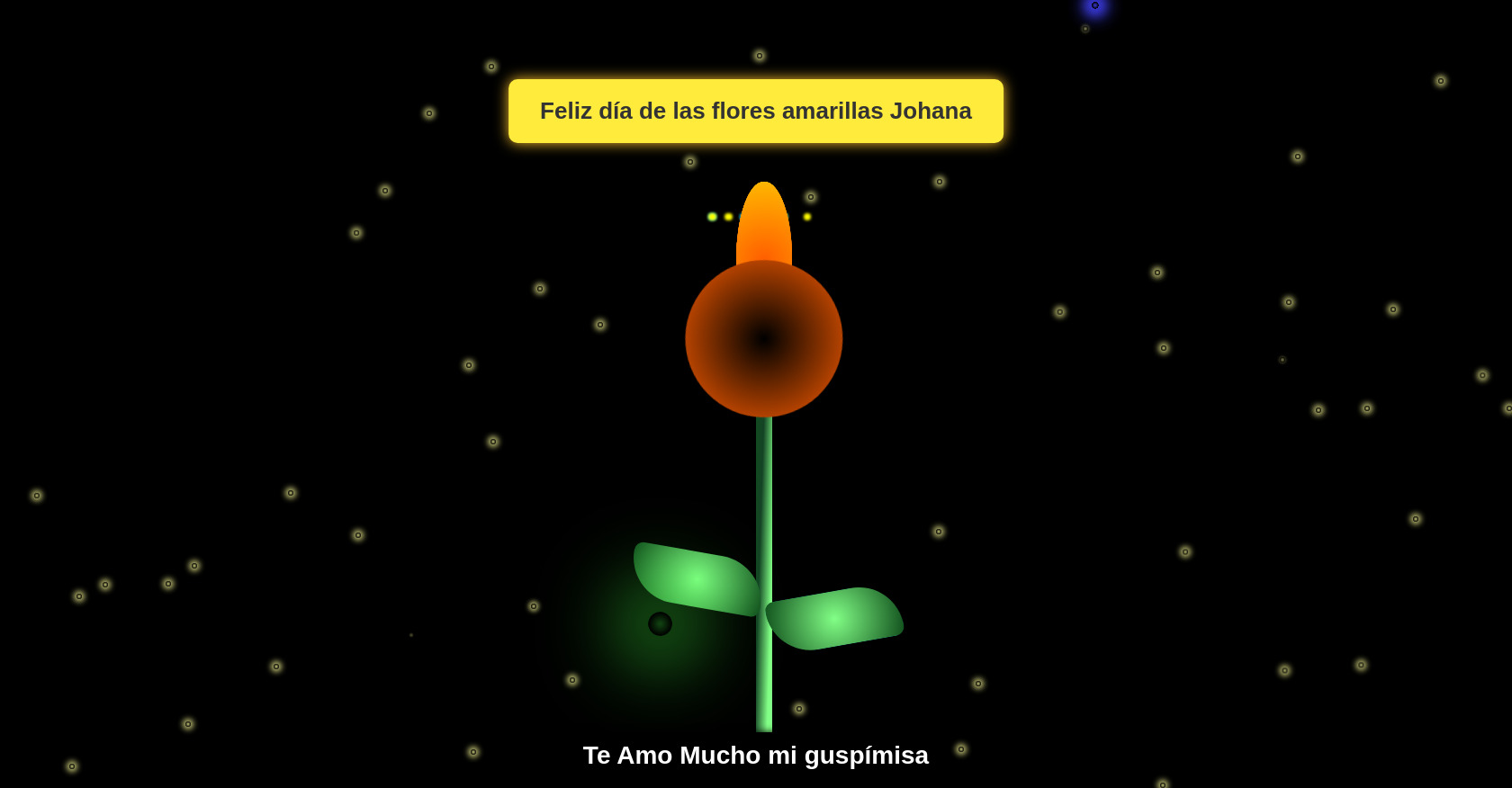
CSS Animated Fireworks Fireflies Sunflower Demo
254
Fernandx.
Open In Editor
Publish Your Code
Recommended
19 October 2024
Animated HTML and CSS Input
21 August 2025
Login & Registration Form (HTML, CSS, JS)
22 August 2025
3D Lion Card Carousel HTML CSS & JavaScript
HTML
Copy
Sunflower Night with Fireworks and Fireflies
Feliz día de las flores amarillas Johana
Te Amo Mucho mi guspímisa
CSS
Copy
* { padding: 0; margin: 0; box-sizing: border-box; } :root { --color-bg: linear-gradient(to top, #00d4ff, #000); --line-color: linear-gradient(to left top, #82ff86 20%, #144425, #104e1c); --flower-center: radial-gradient(circle, #000, #ff5e00); --leaf-color: radial-gradient(circle, #82ff86, #104e1c); --petal-color: radial-gradient(circle, #ff5e00, #ffbb00); } body{ background-image: var(--color-bg); min-height: 100vh; display: flex; align-items: flex-end; justify-content: center; overflow: hidden; } .flower_wrapper{ position: absolute; left: 50%; bottom: 2vmin; animation: moving-flower-1 4s linear infinite; } .flower_stem{ width: 2vmin; height: 65vmin; background-image: var(--line-color); border-radius: 4vmin; animation-delay: 0.3s; } .flower_center{ position: absolute; top: 0vmin; left: 50%; z-index: 5; transform: translateX(-50%) rotate(-10deg); width: 20vmin; height: 20vmin; border-radius: 50%; background: var(--flower-center); animation: open-flower-middle 2s 0.4s backwards; } .flower_petal{ position: absolute; left: 50%; z-index: 3; bottom: 55vmin; transform: translateX(-50%); width: 7vmin; height: 17vmin; height: 20vmin; background: var(--petal-color); clip-path: ellipse(50% 50% at 50% 50%); transform-origin: center bottom; animation: open-flower 2s 1s backwards; } .flower_petal-1{ border-radius: 50% 50% 50% / 80% 80% 20% 20%; background-image: none; background: var(--petal-color); animation: open-flower 1.4s 1s backwards; } .flower_petal-2{ transform: translateX(-50%) rotate(-30deg); } .flower_petal-3{ transform: translateX(-50%) rotate(-60deg); } .flower_petal-4{ transform: translateX(-50%) rotate(-90deg); } .flower_petal-5{ transform: translateX(-50%) rotate(-120deg); } .flower_petal-6{ transform: translateX(-50%) rotate(-150deg); } .flower_petal-7{ transform: translateX(-50%) rotate(30deg); } .flower_petal-8{ transform: translateX(-50%) rotate(60deg); } .flower_petal-9{ transform: translateX(-50%) rotate(90deg); } .flower_petal-10{ transform: translateX(-50%) rotate(120deg); } .flower_petal-11{ transform: translateX(-50%) rotate(150deg); } .flower_petal-12{ transform: translateX(-50%) rotate(180deg); } .flower_leaf{ position: absolute; left: 60%; bottom: 18vmin; transform: translateX(-45%) rotate(80deg); width: 7vmin; height: 17vmin; background: var(--leaf-color); clip-path: none; border-radius: 10vmin 2vmin 10vmin 2vmin; transform-origin: center bottom; } .flower_leaf-1{ bottom: 18vmin; transform: translateX(-45%) rotate(80deg); } .flower_leaf-2{ bottom: 23vmin; transform: translateX(-55%) rotate(-80deg); } .flower_light{ position: absolute; bottom: 70vmin; width: 1vmin; height: 1vmin; background-color: rgb(255, 251, 0); border-radius: 50%; filter: blur(0.2vmin); animation: light-ans 4s linear infinite backwards; } :nth-child(odd){ background-color: #23f0ff; } .flower_light-1{ left: -2vmin; animation-delay: 1s; } .flower_light-2{ left: 3vmin; animation-delay: 0.5s; } .flower_light-3{ left: -6vmin; animation-delay: 0.3s; } .flower_light-4{ left: 6vmin; animation-delay: 0.9s; } .flower_light-5{ left: -1vmin; animation-delay: 1.5s; } .flower_light-6{ left: -4vmin; animation-delay: 3s; } .flower_light-7{ left: 3vmin; animation-delay: 2s; } .flower_light-8{ left: -6vmin; animation-delay: 3.5s; } .light{ position: absolute; bottom: 0vmin; width: 1vmin; height: 1vmin; background-color: rgb(255, 251, 0); border-radius: 50%; filter: blur(0.2vmin); animation: light-ans-background 7s linear infinite backwards; } :nth-child(odd){ background-color: #23f0ff; } .light-1{ left: 10vmin; animation-delay: 1s; } .light-2{ left: 20vmin; animation-delay: 0.5s; } .light-3{ left: 60vmin; animation-delay: 0.3s; } .light-4{ left: 80vmin; animation-delay: 0.9s; } .light-5{ left: 45vmin; animation-delay: 1.5s; } .light-6{ left: 10vmin; animation-delay: 3s; } .light-7{ left: 90vmax; animation-delay: 2s; } .light-8{ left: 60vmax; animation-delay: 3.5s; } .light-9{ left: 70vmax; animation-delay: 2s; } .light-10{ left: 95vmax; animation-delay: 3.5s; } .light-11{ left: 75vmax; animation-delay: 3s; } .light-12{ left: 85vmax; animation-delay: 0.5s; } @keyframes open-flower-leaves{ 0%{ opacity: 0; transform: translateX(-50%) scale(0); } } @keyframes open-flower{ 0%{ transform: translateX(-50%) rotate(0); }
JS
Copy
/* Replace with your JS Code (Leave empty if not needed) */