WEBLEB
Home
Editor
Login
Pro
English
English
Français
Español
Português
Deutsch
Italiano
हिंदी
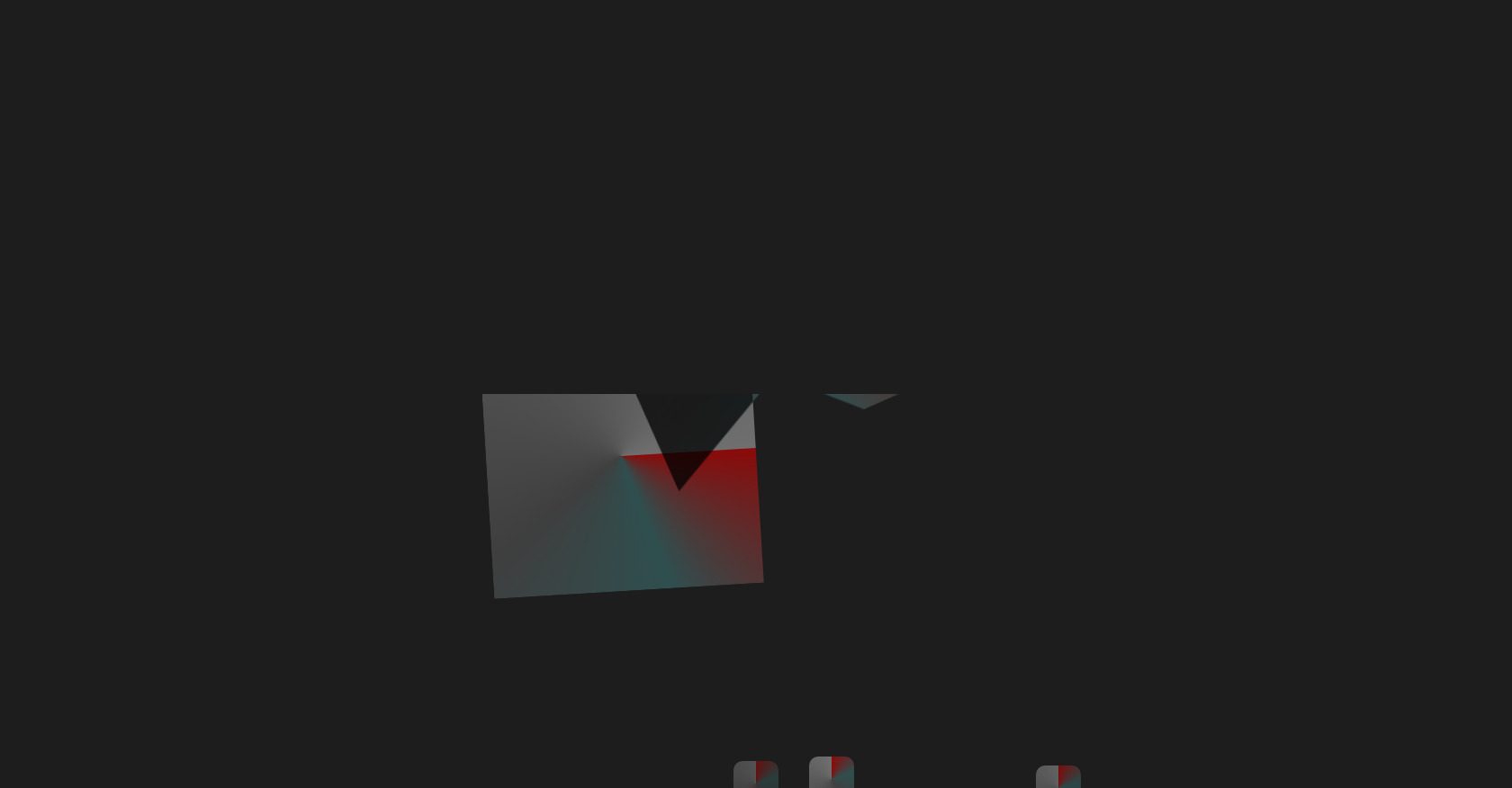
HTML Neuron Animation Snippet
13
ByBy.inc
Open In Editor
Publish Your Code
Recommended
23 August 2025
Web Tasarım, Dijital Deneyim ve Podcast HTML Template
28 April 2024
Animated HTML Button
10 February 2025
HTML CSS Login Form Code
HTML
Copy
CSS
Copy
* { margin: 0; padding: 0; box-sizing: border-box; } body { background-color: #1d1d1d; display: flex; align-items: center; justify-content: center; height: 100vh; overflow: hidden; } .codigo { /* Container para o código */ position: absolute; top: 0; left: 50%; transform: translateX(-50%); background: #272822; color: #F8F8F2; font-family: 'Consolas', 'Monaco', monospace; font-size: 18px; padding: 20px; border-radius: 8px; white-space: pre-line; text-align: left; line-height: 1.6; max-height: 25%; min-width: 100%; width: 100%; overflow-y: auto; box-shadow: 0 4px 12px rgba(0, 0, 0, 0.3); } /* Cores para highlighing de código */ .selector { color: #F92672; } .property { color: #66D9EF; } .value-number { color: #AE81FF; } .value-string { color: #E6DB74; } .value-color { color: #A6E22E; } .brace { color: #F8F8F2; } .comment { color: #75715E; } .function { color: #A6E22E; } .animation-container { /* Container para a animação */ position: absolute; top: 75%; left: 50%; transform: translate(-50%, -50%); display: flex; align-items: center; justify-content: center; width: 100%; height: 50%; overflow: hidden; background: transparent; } /* Animação - Glitch de Neurônio */ .mon_ticket_glitch { /* Pseudo-emente para a borda do neurônio */ &::after { content: ""; position: absolute; top: 50%; left: 50%; transform: translate(-50%, -50%); width: 80%; height: 80%; background: conic-gradient(#8B0A0A 0%, #2F4F4F 20%, #3F3F3F 40%, #4F4F4F 60%, #5F5F5F 80%, #6F6F6F 100%); mask-image: radial-gradient(circle, #000 10%, #333); mask-size: 100% 80%; mask-position: 50% 50%; clip-path: polygon(50% 0%, 100% 0%, 100% 25%, 75% 50%, 100% 100%, 50% 100%, 25% 75%, 0% 100%, 0% 25%, 25% 0%); } } @keyframes mon_ticket_glitch_anima { /* Primeira sequência de frames */ 0% { transform: translate(-50%, -50%) rotate(30deg); } 10% { transform: translate(-50%, -50%) rotate(60deg); } 20% { transform: translate(-50%, -50%) rotate(90deg); } 30% { transform: translate(-50%, -50%) rotate(120deg); } 40% { transform: translate(-50%, -50%) rotate(150deg); } 50% { transform: translate(-50%, -50%) rotate(180deg); } 60% { transform: translate(-50%, -50%) rotate(210deg); } 70% { transform: translate(-50%, -50%) rotate(240deg); } 80% { transform: translate(-50%, -50%) rotate(270deg); } 90% { transform: translate(-50%, -50%) rotate(300deg); } 100% { transform: translate(-50%, -50%) rotate(330deg); } } @keyframes mon_ticket_glitch_anima_2 { /* Segunda sequência de frames */ 0% { transform: translate(-50%, -50%) rotate(330deg); } 10% { transform: translate(-50%, -50%) rotate(360deg); } 20% { transform: translate(-50%, -50%) rotate(330deg); } 30% { transform: translate(-50%, -50%) rotate(300deg); } 40% { transform: translate(-50%, -50%) rotate(270deg); } 50% { transform: translate(-50%, -50%) rotate(240deg); } 60% { transform: translate(-50%, -50%) rotate(210deg); } 70% { transform: translate(-50%, -50%) rotate(180deg); } 80% { transform: translate(-50%, -50%) rotate(150deg); } 90% { transform: translate(-50%, -50%) rotate(120deg); } 100% { transform: translate(-50%, -50%) rotate(90deg); } } .neurônio-1 { /* Elemento principal da animação */ position: relative; width: 300px; height: 300px; background: conic-gradient(#8B0A0A 0%, #2F4F4F 20%, #3F3F3F 40%, #4F4F4F 60%, #5F5F5F 80%, #6F6F6F 100%); animation: mon_ticket_glitch_anima 5s infinite; animation-delay: 0.1s; animation-fill-mode: forwards; } .neurônio-1::after { /* Pseudo-lemente complementar para a borda do neurônio */ content: ""; position: absolute; top: 0; left: 0; width: 100%; height: 100%; background: conic-gradient(#8B0A0A 0%, #2F4F4F 20%, #3F3F3F 40%, #4F4F4F 60%, #5F5F5F 80%, #6F6F6F 100%); mask-image: radial-gradient(circle, #000 10%, #333); mask-size: 100% 80%; mask-position: 50% 50%; clip-path: polygon(50% 0%, 100% 0%, 100% 25%, 75% 50%, 100% 100%, 50% 100%, 25% 75%, 0% 100%, 0% 25%, 25% 0%); animation: mon_ticket_glitch_anima_2 5s infinite; animation-delay: 0.2s; animation-fill-mode: forwards; } @media (any-pointer: coarse), (pointer-device: pen) { .neurônio-1::after { mask-image: none; clip-path: none; } } @keyframes mon_ticket_glitch_anima_3 { /* Terceira sequência de frames */ 0% { opacity: 0; } 10% { opacity: 0.5; } 20% { opacity: 1; } 30% { opacity: 0.5; } 40% { opacity: 0; } 50% { opacity: 0.1; } 60% { opacity: 0; } 70% { opacity: 0.1; } 80% { opacity: 0; } 90% { opacity: 0.1; } 100% { opacity: 0; } } .pontas-1 { /* Elementos complementares para as pontas do neurônio */ position: absolute; bottom: -20px; left: 50%; transform: translateX(-50%); width: 50px; height: 50px; background: conic-gradient(#8B0A0A 0%, #2F4F4F 20%, #3F3F3F 40%, #4F4F4F 60%, #5F5F5F 80%, #6F6F6F 100%); border-radius: 10px; animation: mon_ticket_glitch_anima_3 5s infinite; animation-delay: -0.3s; animation-fill-mode: forwards; } .pontas-2 { position: absolute; bottom: -25px; left: 70%; transform: translate(-50%); width: 50px; height: 50px; background: conic-gradient(#8B0A0A 0%, #2F4F4F 20%, #3F3F3F 40%, #4F4F4F 60%, #5F5F5F 80%, #6F6F6F 100%); border-radius: 10px; animation: mon_ticket_glitch_anima_3 5s infinite; animation-delay: -0.2s; animation-fill-mode: forwards; } .pontas-3 { position: absolute; bottom: -15px; left: 55%; transform: translate(-50%); width: 50px; height: 50px; background: conic-gradient(#8B0A0A 0%, #2F4F4F 20%, #3F3F3F 40%, #4F4F4F 60%, #5F5F5F 80%, #6F6F6F 100%); border-radius: 10px; animation: mon_ticket_glitch_anima_3 5s infinite; animation-delay: -0.1s; animation-fill-mode: forwards; } @supports (mix-blend-mode: screen) { .neurônio-1 { mix-blend-mode: screen; } } @supports (mix-blend-mode: multiply) { .neurônio-1::after { mix-blend-mode: multiply; } }
JS
Copy
const canvas = document.getElementById('matrixCanvas'); const ctx = canvas.getContext('2d'); function resizeCanvas() { canvas.width = window.innerWidth; canvas.height = window.innerHeight; } resizeCanvas(); window.addEventListener('resize', resizeCanvas); const matrixChars = 'ABCDEFGHIJKLMNOPQRSTUVWXYZ123456789@#$%^&*()'; const fontSize = 16; const columns = canvas.width / fontSize; const drops = Array.from({ length: columns }).fill(1); function draw() { ctx.fillStyle = 'rgba(0, 0, 0, 0.05)'; ctx.fillRect(0, 0, canvas.width, canvas.height); ctx.fillStyle = '#0f0'; ctx.font = `${fontSize}px monospace`; drops.forEach((y, i) => { const text = matrixChars[Math.floor(Math.random() * matrixChars.length)]; const x = i * fontSize; ctx.fillText(text, x, y * fontSize); if (y * fontSize > canvas.height && Math.random() > 0.975) { drops[i] = 0; } drops[i]++; }); } setInterval(draw, 50);