WEBLEB
Home
Editor
Login
Pro
English
English
Français
Español
Português
Deutsch
Italiano
हिंदी
CSS Falling Loading Animation Snippet
645
byby.createsite
Open In Editor
Publish Your Code
Recommended
25 September 2025
Animated CSS Checkboxes with SVG & JavaScript
26 October 2024
HTML CSS Developer Portfolio Website Template
4 September 2025
CSS Room Door Animation HTML Snippet
HTML
Copy
CSS
Copy
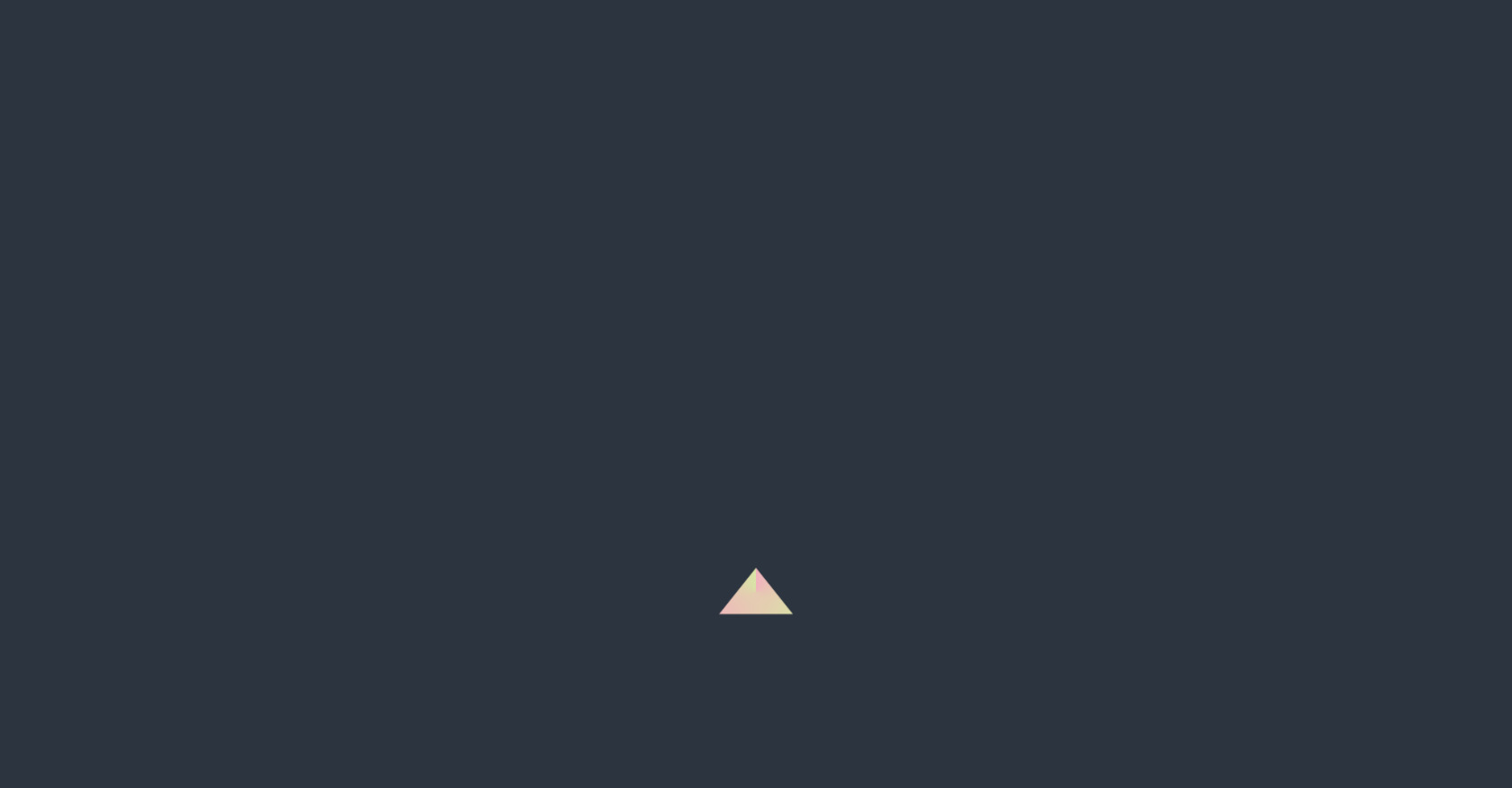
/* * CSS base */ * { margin: 0; padding: 0; box-sizing: border-box; } body { background-color: #2C343F; /* escuridão e um toque de azul escuro */ display: flex; align-items: center; justify-content: center; height: 100vh; overflow: hidden; } .codigo { position: absolute; top: 0; left: 50%; transform: translateX(-50%); background: #272822; color: #F8F8F2; font-family: 'Consolas', 'Monaco', monospace; font-size: 18px; padding: 20px; border-radius: 8px; white-space: pre-line; text-align: left; line-height: 1.6; max-height: 25%; min-width: 100%; width: 100%; overflow-y: auto; box-shadow: 0 4px 12px rgba(0, 0, 0, 0.3); } .selector { color: #F92672; } .property { color: #66D9EF; } .value-number { color: #AE81FF; } .value-string { color: #E6DB74; } .value-color { color: #A6E22E; } .brace { color: #F8F8F2; } .comment { color: #75715E; } .function { color: #A6E22E; } .animation-container { position: absolute; top: 75%; left: 50%; transform: translate(-50%, -50%); display: flex; align-items: center; justify-content: center; width: 100%; height: 50%; overflow: hidden; background: transparent; } /* * Desenho principal */ .tue_falling_loading::before, .tue_falling_loading::after { content: ''; position: absolute; top: 0; left: 0; width: 100%; height: 100%; } .tue_falling_loading { width: 50px; height: 50px; background: linear-gradient(to right, #ff99cc, #ccff99); clip-path: polygon(50% 0%, 100% 100%, 0% 100%); animation: tue_falling_loading 2s infinite; perspective: 200px; } .tue_falling_loading::before { background: conic-gradient(rgba(255, 153, 204, 0.5), rgba(204, 255, 153, 0.5)); } .tue_falling_loading::after { background: linear-gradient(to bottom, #33ccff, #ccff33); mask-image: radial-gradient(#fff, #000); clip-path: inset(100% 0px 0px -50px); } @keyframes tue_falling_loading { 0% { transform: translate3d(100px, 0px, 0px); } 30% { transform: scale(1, 2); } 70% { transform: scale(2, 0.5); } 100% { transform: translate3d(-50px, 50px, 0px); } } @keyframes tue_expanding_circle { 0% { transform: scale(10%); mix-blend-mode: screen; } 50% { transform: scale(150%); opacity: 0.5; } 100% { transform: scale(50%); } } .tue_falling_loading::after { animation: tue_expanding_circle 4s infinite, tue_falling_loading 2s infinite; }
JS
Copy
const canvas = document.getElementById('matrixCanvas'); const ctx = canvas.getContext('2d'); function resizeCanvas() { canvas.width = window.innerWidth; canvas.height = window.innerHeight; } resizeCanvas(); window.addEventListener('resize', resizeCanvas); const matrixChars = 'ABCDEFGHIJKLMNOPQRSTUVWXYZ123456789@#$%^&*()'; const fontSize = 16; const columns = canvas.width / fontSize; const drops = Array.from({ length: columns }).fill(1); function draw() { ctx.fillStyle = 'rgba(0, 0, 0, 0.05)'; ctx.fillRect(0, 0, canvas.width, canvas.height); ctx.fillStyle = '#0f0'; ctx.font = `${fontSize}px monospace`; drops.forEach((y, i) => { const text = matrixChars[Math.floor(Math.random() * matrixChars.length)]; const x = i * fontSize; ctx.fillText(text, x, y * fontSize); if (y * fontSize > canvas.height && Math.random() > 0.975) { drops[i] = 0; } drops[i]++; }); } setInterval(draw, 50);