WEBLEB
Home
Editor
Login
Pro
English
English
Français
Español
Português
Deutsch
Italiano
हिंदी
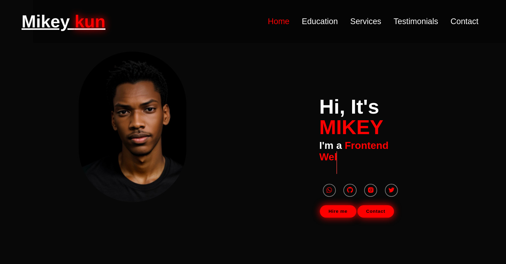
Personal Portfolio HTML Template
215
kmahamadou009
Open In Editor
Publish Your Code
Recommended
28 April 2024
Animated HTML Button
23 August 2025
Login & Register Form HTML CSS Template
5 July 2025
Glitch Effect Homepage: HTML, CSS, Tailwind
HTML
Copy
Portfolio
Mikey
kun
Home
Education
Services
Testimonials
Contact
Hi, It's
MIKEY
I'm a
Hire me
Contact
CSS
Copy
*{ margin: 0; padding: 0; box-sizing: border-box; border: none; outline: none; font-family: 'Poppins' , sans-serif; } :root { --bg-color:#080808; --second-bg-color:#131313; --text-color:white; --main-color:#00ffee; } html{ font-size: 60%; overflow-x: hidden; } body{ background-color: var(--bg-color); color: var(--text-color); } .header{ position: fixed; top: 0; left: 0; width: 100%; padding: 4rem 12% 4rem; background: rgba(0, 0, 0, 0.3) ; display: flex; justify-content: space-between; align-items: center; z-index: 5; margin-left: 110px; text-decoration: none; } .logo{ font-size: 6rem; color: white; font-weight: 800; cursor: pointer; transition: 0.3s ease; margin-left: -240px } .logo:hover{ transform: scale(1.1); } .logo span{ text-shadow: 0 0 25px red;} .profile{ display: flex; height: 300px; width: 300px; margin-left:-380px ; margin-bottom:-500px ; } .profile img{ width: 400px; height: 500px; display: flex; border-radius: 1550px } .navbar a{ font-size: 2.8rem; color: white; margin-left: 4rem; font-weight:500; transition: 0.3s ease; border-bottom: 3px solid transparent; text-decoration: none; } .navbar a:hover, .navbar a.active{ color: red; border-bottom: 3px red; } #menu-icon{ font-size: 3.6rem; color: var(--main-color); display: none; } section{ min-height: 100vh; padding: 10rem 12% 10rem; } .home{ display: flex; align-items: center; justify-content: center; margin: 15rem; } .home-content{ display: flex; flex-direction: column; align-items: baseline; text-align: left; justify-content: center; margin-top: 3rem; margin-left:700px; margin-top:-120px; } span{ color: red; } .logo span{ color: red; } .home-content h3{ margin-bottom: 2rem; margin-top: 1rem; font-size: 3.5rem; } .home-content h1{ font-size: 7rem; font-weight: 700; margin-top: 1.5rem; line-height: 1; } .home-img{ border-radius: 50%; } .home-img img{ position: relative; top: 3rem; width: 32vw; border-radius: 50%; box-shadow: 0 0 25px var(--main-color); cursor: pointer; transition: 0.4s ease-in-out; } .home-img img:hover{ box-shadow: 0 0 25px var(--main-color), 0 0 50px var(--main-color), 0 0 100px var(--main-color); } .home-content p{ font-size:1.5rem ; font-weight: 500; line-height: 1.8; max-width: 1000px; } .social-icons a { display: inline-flex; justify-content: center; align-items: center; width: 4.5rem; height: 4.5rem; background: transparent; border: 2px solid gray; font-size: 2.5rem; border-radius: 50%; color: red; margin:1.2rem; transition: 0.3s ease-in-out; text-decoration: none; margin-top: 50px; } .social-icons a:hover{ color: brown; transform: scale(1.3) translateY(-5px) ; box-shadow: 0 0 25px red; background-color:red; } .btn{ display: inline-block; padding: 1rem 2.8rem; background: red; box-shadow: 0 0 25px red; border-radius: 4rem; font-size: 1.6rem; color: black; border: 2px solid transparent; letter-spacing: 0.1rem; font-weight: 600; transition: 0.3s ease-in-out; cursor: pointer; text-decoration: none; margin: .2rem; } .btn:hover{ transform: scale(1.05); box-shadow: 0 0 50px red; } .btn-group{ display: flex; align-items: center; margin: 1.5rem; } .btn-group a:nth-of-type(2){ background-color: red; color: black; border: 2px solid red; box-shadow: 0 0 25px red; text-decoration: none; } .btn-group a:nth-of-type(2):hover{ box-shadow: 0 0 25px red; background-color: red; color: black; } .text-animation{ font-size: 34px ; font-weight: 600; min-width: 280px; } .text-animation span{ position: relative; } .text-animation span::before{ content: 'Web Developer'; color: red; animation: words 20s infinite; } .text-animation span::after{ content: ""; background-color: var(--bg-color); position: absolute; width: calc(100% + 80px); height: 100%; border-left: 3px solid red; right: -8px; animation: cursor 0.6s infinite, typing 20s steps(14) infinite; } @keyframes cursor{ to{ border-left: 2px solid var(--main-color); } } @keyframes words{ 0%, 20%{ content: 'Frontend Web Developer'; } 21%, 40%{ content: 'App Developer'; } 41%, 60%{ content: 'UI / Ux Designer'; } 61%, 80%{ content: 'Flutter Developer'; } 81%, 100%{ content: ''; } } @keyframes typing{ 10%, 15%, 30%, 35%, 50%, 55%, 70%, 75%, 90%, 95%{ width: 0; } 5%, 20%, 25%, 40%, 45%, 60%, 65%, 80%, 85%{ width: calc(100% + 8px); } }
JS
Copy
/* Replace with your JS Code (Leave empty if not needed) */