WEBLEB
Home
Editor
Login
Pro
English
English
Français
Español
Português
Deutsch
Italiano
हिंदी
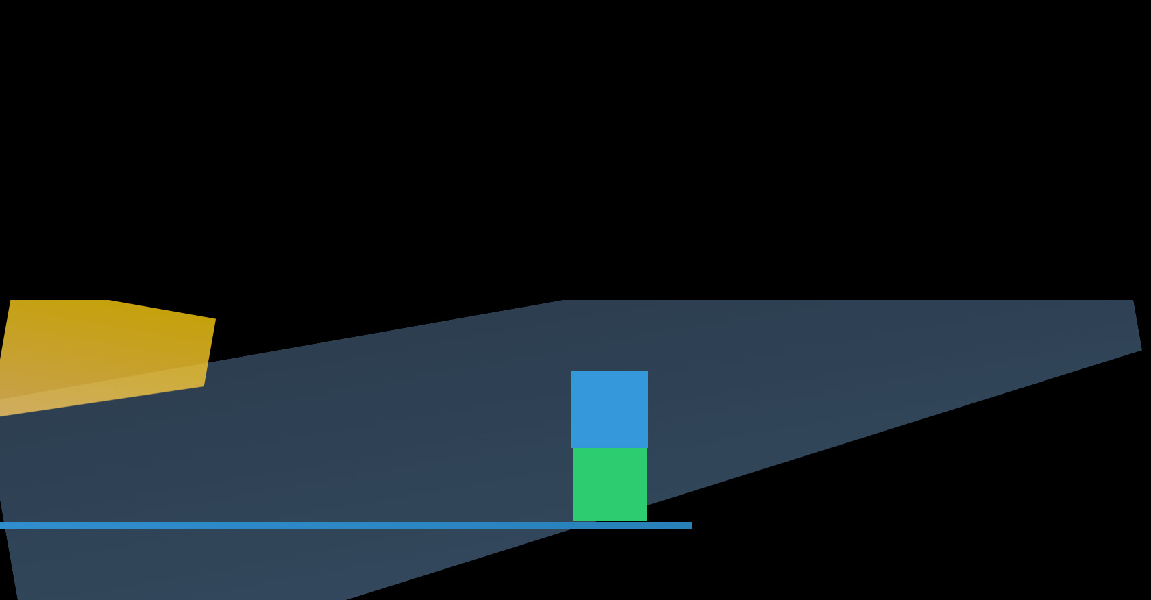
CSS Animation Container HTML Structure
496
ByBy.inc
Open In Editor
Publish Your Code
Recommended
24 July 2025
CSS Loading Animation Snippet
10 August 2024
HTML Login Form Code
29 October 2025
HTML CSS Button Animation Example
HTML
Copy
CSS
Copy
* { margin: 0; padding: 0; box-sizing: border-box; } body { background:url("./thumb.jpg") no-repeat center center; background-color: black; background-size: cover; display: flex; align-items: center; justify-content: center; height: 100vh; overflow: hidden; } .codigo { position: absolute; top: 0; left: 50%; transform: translateX(-50%); background: #272822; color: #F8F8F2; font-family: 'Consolas', 'Monaco', monospace; font-size: 18px; padding: 20px; border-radius: 8px; white-space: pre-line; text-align: left; line-height: 1.6; max-height: 25%; max-width: 75%; width: 75%; height: 25%; top:15%; overflow-y: hidden; box-shadow: -8px 10px 18px rgba(0, 0, 0, 0.55); } .selector { color: #F92672; } .property { color: #66D9EF; } .value-number { color: #AE81FF; } .value-string { color: #E6DB74; } .value-color { color: #A6E22E; } .function { color: #A6E22E; } .animation-container { position: absolute; top: 75%; left: 50%; transform: translate(-50%, -50%); display: flex; align-items: center; justify-content: center; width: 100%; height: 50%; overflow: hidden; background: transparent; } /** * O primeiro bloco, uma tela cheia de dados, é a representação da "realidade digital". */ .tela-dados { position: absolute; top: 0; left: 0; width: 100%; height: 100%; background: linear-gradient(to bottom, #2c3e50, #34495e); clip-path: polygon(0 0, 100% 0, 100% 50%, 0 100%); transform: rotate(-10deg); } /** * A segunda camada, as telas de computador, é uma referência ao excesso de informação e à perda de foco. */ .tela-computador::before { content: ''; position: absolute; top: 0; left: 0; width: 300px; height: 200px; background: linear-gradient(to bottom, #f1c40f, #f2c464); clip-path: polygon(0 0, 100% 0, 100% 50%, 0 100%); transform: rotate(10deg); animation: fade-out 2s linear infinite; } /** * A terceira camada, os fragmentos de tela, é uma representação da "sensação de confusão" ou "digital derealização". */ .fragmento-tela { position: absolute; top: 50%; left: 50%; transform: translate(-50%, -50%); width: 100px; height: 100px; background: #2ecc71; animation: pulse 1.5s ease-in-out infinite; } /** * A quarta camada, a linha de código, é uma representação da tentativa de encontrar um sentido no caos. */ .linha-codigo { position: absolute; top: 75%; left: 50%; transform: translate(-50%, -50%); width: 100%; height: 10px; background: linear-gradient(to right, #3498db, #2980b9); animation: scroll 1.5s ease-in-out infinite; } /** * E a quinta camada, a luz azul, é uma representação da busca por uma conexão humana em um mundo digital. */ .luz-azul { position: absolute; top: 25%; left: 50%; transform: translate(-50%, -50%); width: 100px; height: 100px; background: #3498db; animation: pulsar 2s ease-in-out infinite; } @keyframes fade-out { 0% { opacity: 1; } 100% { opacity: 0; } } @keyframes pulse { 0% { transform: scale(1); } 50% { transform: scale(1.2); } 100% { transform: scale(1); } } @keyframes scroll { 0% { left: 0; } 100% { left: 100%; } } @keyframes pulsar { 0% { transform: scale(1); } 50% { transform: scale(1.5); } 100% { transform: scale(1); } } .codigo { position: absolute; top: 0; left: 50%; transform: translateX(-50%); background: #272822; color: #F8F8F2; font-family: 'Consolas', 'Monaco', monospace; font-size: 18px; padding: 20px; border-radius: 8px; white-space: pre-line; text-align: left; line-height: 1.6; max-height: 25%; max-width: 75%; width: 75%; height: 25%; top:15%; overflow-y: hidden; box-shadow: -8px 10px 18px rgba(0, 0, 0, 0.55); } .selector { color: #F92672; } .property { color: #66D9EF; } .value-number { color: #AE81FF; } .value-string { color: #E6DB74; } .value-color { color: #A6E22E; } .function { color: #A6E22E; } .animation-container { position: absolute; top: 75%; left: 50%; transform: translate(-50%, -50%); display: flex; align-items: center; justify-content: center; width: 100%; height: 50%; overflow: hidden; background: transparent; } .loading-element { position: absolute; top: 50%; left: 50%; transform: translate(-50%, -50%); width: 200px; height: 200px; background: linear-gradient(to bottom, #8e44ad, #7a288a); border-radius: 50%; animation: loading-animation 1s linear infinite; } @keyframes loading-animation { 0% { transform: rotate(0deg); } 100% { transform: rotate(360deg); } }
JS
Copy
/* Replace with your JS Code (Leave empty if not needed) */