WEBLEB
Home
Editor
Login
Pro
English
English
Français
Español
Português
Deutsch
Italiano
हिंदी
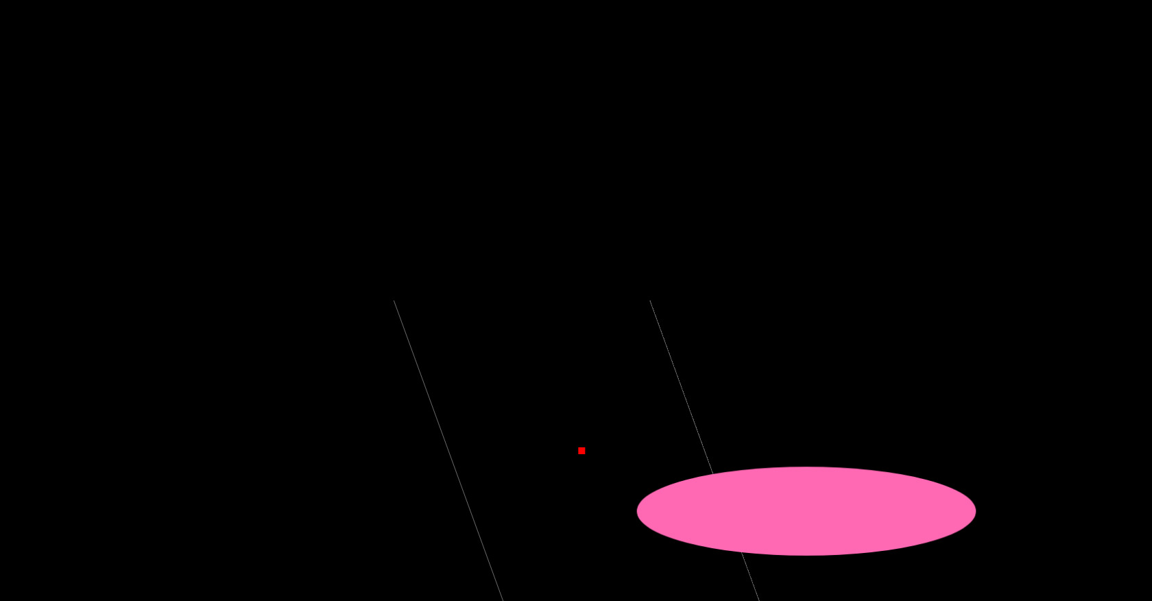
CSS Maze Animation Code Snippet
544
ByBy.inc
Open In Editor
Publish Your Code
Recommended
28 August 2025
Woodworking Website Template | Tailwind CSS, Artisan Design
11 August 2025
CSS Circle Animation Collection
4 September 2025
CSS Room Door Animation HTML Snippet
HTML
Copy
CSS
Copy
/* css_foundation */ * { margin: 0; padding: 0; box-sizing: border-box; } body { background:url("./thumb.jpg") no-repeat center center; background-color: black; background-size: cover; display: flex; align-items: center; justify-content: center; height: 100vh; overflow: hidden; } .codigo { position: absolute; top: 0; left: 50%; transform: translateX(-50%); background: #272822; color: #F8F8F2; font-family: 'Consolas', 'Monaco', monospace; font-size: 18px; padding: 20px; border-radius: 8px; white-space: pre-line; text-align: left; line-height: 1.6; max-height: 25%; max-width: 75%; width: 75%; height: 25%; top:15%; overflow-y: hidden; box-shadow: -8px 10px 18px rgba(0, 0, 0, 0.55); } .selector { color: #F92672; } .property { color: #66D9EF; } .value-number { color: #AE81FF; } .value-string { color: #E6DB74; } .value-color { color: #A6E22E; } .function { color: #A6E22E; } .animation-container { position: absolute; top: 75%; left: 50%; transform: translate(-50%, -50%); display: flex; align-items: center; justify-content: center; width: 100%; height: 50%; overflow: hidden; background: transparent; } /* Lost in Code Maze Animation */ .maze { position: relative; width: 100%; height: 100%; } .maze::before { content: ''; position: absolute; top: 10%; left: 10%; width: 80%; height: 80%; border: 1px solid #666; transform: rotate(45deg); animation: rotate 3s linear infinite; } .maze::after { content: ''; position: absolute; top: 60%; left: 60%; width: 20%; height: 20%; border-radius: 50%; background-color: #ff69b4; animation: pulse 2s ease-in-out infinite; } @keyframes rotate { 0% { transform: rotate(45deg); } 50% { transform: rotate(90deg); } 100% { transform: rotate(45deg); } } @keyframes pulse { 0% { transform: scale(1); } 50% { transform: scale(1.5); } 100% { transform: scale(1); } } /* Lost in Code Maze Pseudo-elements */ .maze .point { position: absolute; top: 50%; left: 50%; width: 10px; height: 10px; background-color: #ff0000; animation: bounce 2s linear infinite; } @keyframes bounce { 0% { transform: translateY(-50%) translateX(-50%); } 50% { transform: translateY(-50%) translateX(50%); } 100% { transform: translateY(-50%) translateX(-50%); } } .maze .line { position: absolute; top: 50%; left: 50%; width: 50%; height: 20px; background-color: #000; animation: move 2s linear infinite; } @keyframes move { 0% { transform: translateX(-50%); } 50% { transform: translateX(50%); } 100% { transform: translateX(-50%); } } /* Example CSS snippet */ .loading-element { border-radius: 50%; animation: loading-animation 1s linear infinite; }
JS
Copy
/* Replace with your JS Code (Leave empty if not needed) */