WEBLEB
Home
Editor
Login
Pro
English
English
Français
Español
Português
Deutsch
Italiano
हिंदी
CSS Loading Animation Snippet
33
ByBy.inc
Open In Editor
Publish Your Code
Recommended
12 September 2025
CSS Animation: "Fake It Till You Make It
30 March 2025
Challenge 01-1 Multi-Button Animation
2 September 2025
CSS Animation Container: Upvote & Rewards
HTML
Copy
CSS
Copy
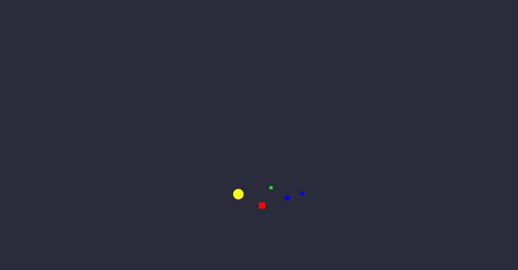
* { margin: 0; padding: 0; box-sizing: border-box; } body { background:url("./thumb.jpg") no-repeat center center; background-size: cover; background-color:#2a2c3b; display: flex; align-items: center; justify-content: center; height: 100vh; overflow: hidden; } .codigo { position: absolute; top: 0; left: 50%; transform: translateX(-50%); background: #272822; color: #F8F8F2; font-family: 'Consolas', 'Monaco', monospace; font-size: 18px; padding: 20px; border-radius: 8px; white-space: pre-line; text-align: left; line-height: 1.6; max-height: 25%; max-width: 75%; width: 75%; height: 25%; top:15%; overflow-y: hidden; box-shadow: -8px 10px 18px rgba(0, 0, 0, 0.55); } .selector { color: #F92672; } .property { color: #66D9EF; } .value-number { color: #AE81FF; } .value-string { color: #E6DB74; } .value-color { color: #A6E22E; } .function { color: #A6E22E; } .animation-container { position: absolute; top: 75%; left: 50%; transform: translate(-50%, -50%); display: flex; align-items: center; justify-content: center; width: 100%; height: 50%; overflow: hidden; background: transparent; } @keyframes loading-animation { 0% { transform: scale(0.5); } 25% { transform: scale(1.1); } 50% { transform: scale(1.2); } 75% { transform: scale(1.1); } 100% { transform: scale(0.5); } } .loading-element { /* Desenho representando a frustração e a sensação de estourar a cabeça */ border-radius: 50%; animation: loading-animation 2s linear infinite; } .fragmento { /* Fragmento de código representando a confusão e a sensação de estar perdido */ width: 20px; height: 20px; background: #f00; position: absolute; top: 50%; left: 50%; animation: float-right 3s linear infinite; } @keyframes float-right { 0% { transform: translateX(-5px); } 25% { transform: translateX(0px); } 50% { transform: translateX(5px); } 75% { transform: translateX(0px); } 100% { transform: translateX(-5px); } } .fragmento2 { /* Outro fragmento de código representando a sensação de desconectar */ width: 15px; height: 15px; background: #00f; position: absolute; top: 45%; left: 55%; animation: float-left 3s linear infinite; } @keyframes float-left { 0% { transform: translateX(5px); } 25% { transform: translateX(0px); } 50% { transform: translateX(-5px); } 75% { transform: translateX(0px); } 100% { transform: translateX(5px); } } /* Camada de luz representando a iluminação e a conscientização */ .light { width: 30px; height: 30px; border-radius: 50%; background: #ff0; position: absolute; top: 40%; left: 45%; animation: pulse 2s linear infinite; } @keyframes pulse { 0% { width: 30px; height: 30px; } 50% { width: 35px; height: 35px; } 100% { width: 30px; height: 30px; } } /* Fragmentos de código flutuantes representando a busca por solução */ .fragmento3 { width: 10px; height: 10px; background: #0f0; position: absolute; top: 38%; left: 52%; animation: float-right-3 3s linear infinite; } @keyframes float-right-3 { 0% { transform: translateX(-2px); } 25% { transform: translateX(0px); } 50% { transform: translateX(2px); } 75% { transform: translateX(0px); } 100% { transform: translateX(-2px); } } /* Fragmentos de código flutuantes representando a ansiedade e a incerteza */ .fragmento4 { width: 12px; height: 12px; background: #00f; position: absolute; top: 42%; left: 58%; animation: float-left-3 3s linear infinite; } @keyframes float-left-3 { 0% { transform: translateX(2px); } 25% { transform: translateX(0px); } 50% { transform: translateX(-2px); } 75% { transform: translateX(0px); } 100% { transform: translateX(2px); } }
JS
Copy
/* Replace with your JS Code (Leave empty if not needed) */