WEBLEB
Home
Editor
Login
Pro
English
English
Français
Español
Português
Deutsch
Italiano
हिंदी
CSS Animation Layers Example
42
ByBy.inc
Open In Editor
Publish Your Code
Recommended
28 August 2025
Woodworking Website Template | Tailwind CSS, Artisan Design
14 May 2024
Animation title
12 August 2025
CSS Heart Animation Code Snippet
HTML
Copy
CSS
Copy
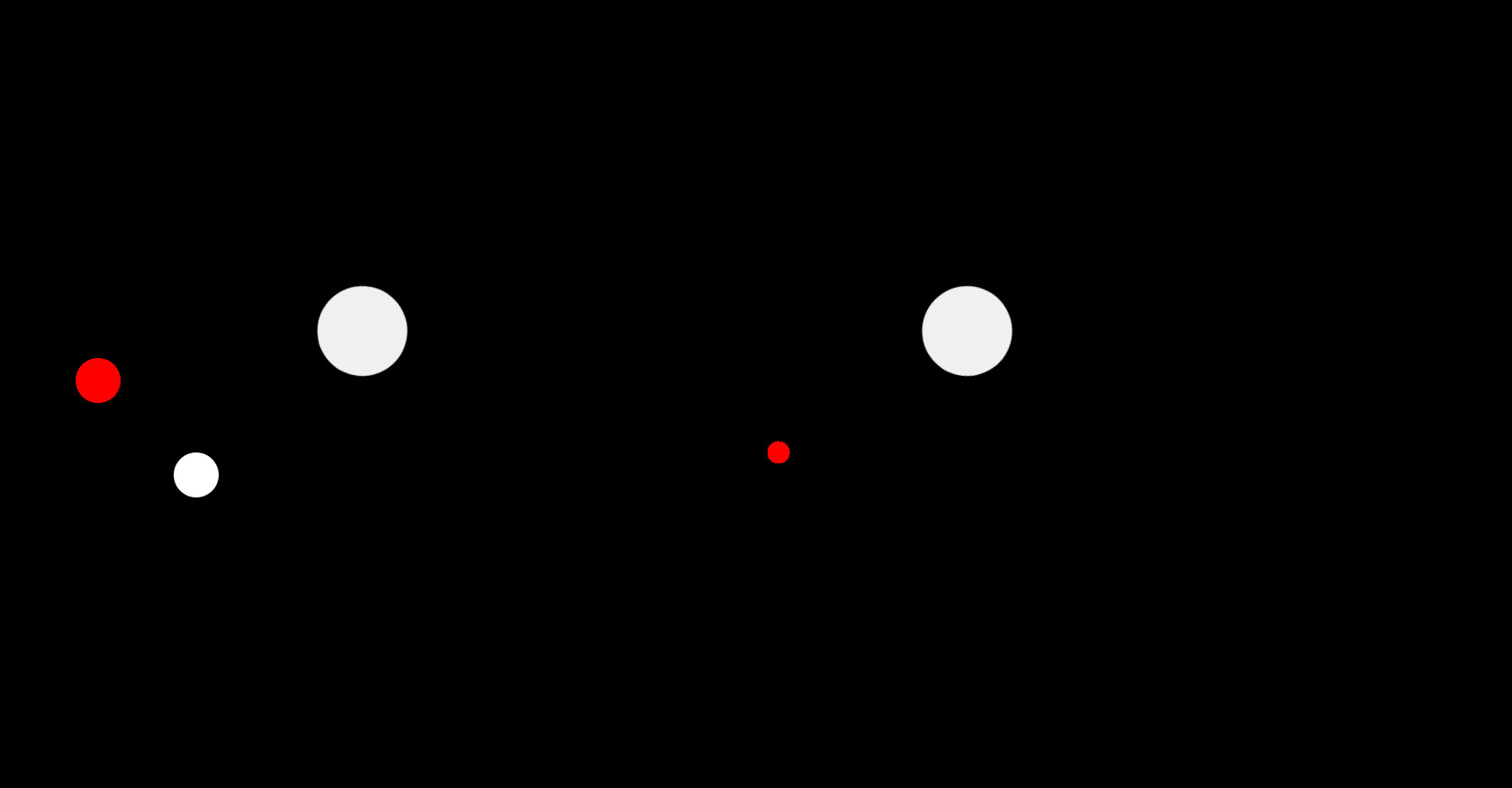
/* css_foundation block */ * { margin: 0; padding: 0; box-sizing: border-box; } body { background: no-repeat fixed center center url("./thumb.jpg"); background-color: black; background-size: cover; display: flex; align-items: center; justify-content: center; height: 100vh; overflow: hidden; } .codigo { position: absolute; top: 15%; left: 50%; transform: translateX(-50%); background: #272822; color: #F8F8F2; font-family: 'Consolas', 'Monaco', monospace; font-size: 18px; padding: 20px; border-radius: 8px; white-space: pre-line; text-align: left; line-height: 1.6; max-height: 25%; max-width: 75%; width: 75%; height: 25%; overflow-y: hidden; box-shadow: -8px 10px 18px rgba(0, 0, 0, 0.55); } .selector { color: #F92672; } .property { color: #66D9EF; } .value-number { color: #AE81FF; } .value-string { color: #E6DB74; } .value-color { color: #A6E22E; } .function { color: #A6E22E; } .animacao { position: absolute; top: 50%; left: 50%; transform: translate(-50%, -50%); display: flex; align-items: center; justify-content: center; width: 100%; height: 400px; overflow: hidden; } .camada { width: 100px; height: 100px; border-radius: 50%; background-color: #fff; position: absolute; animation: animar-circulos 4s ease-out; animation-fill-mode: forwards; } .camada-1 { top: 20%; left: 60%; animation-delay: .5s; } .camada-2 { top: 60%; left: 10%; transform: scale(0.5); animation-delay: 1s; } .camada-3 { top: 20%; left: 20%; transform: rotate(45deg); animation-delay: .5s; } /* Camada com animação de transição */ .transicao { width: 50px; height: 50px; border-radius: 50%; background-color: red; position: absolute; animation: animar-transicao 4s ease-out; animation-fill-mode: forwards; } .transicao-1 { top: 40%; left: 5%; animation-delay: 1s; } .transicao-2 { top: 60%; left: 50%; transform: scale(0.5); animation-delay: 1.5s; } .camada:hover { cursor: pointer } /* CSS da animação */ @keyframes animar-circulos { 100% { transform: translateX(300%) rotate(180deg); opacity: 0; } } @keyframes animar-transicao { 0% { transform: translateX(-200%) scale(1); opacity: 1; } 100% { transform: translateX(200%) scale(4); opacity: 0; } }
JS
Copy
/* Replace with your JS Code (Leave empty if not needed) */