WEBLEB
Home
Editor
Login
Pro
English
English
Français
Español
Português
Deutsch
Italiano
हिंदी
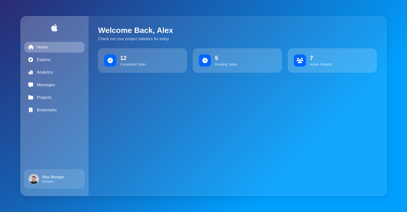
Glassmorphism Sidebar HTML CSS Apple Style
56
zegarkidawida
Open In Editor
Publish Your Code
Recommended
13 July 2025
Pac-Man Game HTML CSS JavaScript Code
19 May 2025
WEB SİT FROM APPLE
5 October 2025
CSS Loading Animation Snippet
HTML
Copy
Apple-Style Glassmorphism Sidebar
Welcome Back, Alex
Check out your project statistics for today
12
Completed Tasks
5
Pending Tasks
7
Active Projects
CSS
Copy
@import url('https://fonts.googleapis.com/css2?family=SF+Pro+Display:wght@300;400;500;600&display=swap'); :root { --primary-color: #0066ff; --sidebar-width: 280px; --sidebar-collapsed-width: 80px; --transition-speed: 0.3s; } * { margin: 0; padding: 0; box-sizing: border-box; } body { font-family: 'SF Pro Display', -apple-system, BlinkMacSystemFont, sans-serif; background: linear-gradient(135deg, #2a2a72 0%, #009ffd 74%); min-height: 100vh; display: flex; align-items: center; justify-content: center; color: #fff; overflow: hidden; } .container { display: flex; width: 90%; height: 85vh; background: rgba(255, 255, 255, 0.08); backdrop-filter: blur(30px); -webkit-backdrop-filter: blur(30px); border-radius: 24px; box-shadow: 0 8px 32px rgba(0, 0, 0, 0.1); border: 1px solid rgba(255, 255, 255, 0.18); overflow: hidden; } .sidebar { width: var(--sidebar-width); height: 100%; padding: 30px 15px; background: rgba(255, 255, 255, 0.1); backdrop-filter: blur(20px); -webkit-backdrop-filter: blur(20px); border-right: 1px solid rgba(255, 255, 255, 0.08); display: flex; flex-direction: column; transition: width var(--transition-speed) ease; position: relative; } .logo { text-align: center; margin-bottom: 40px; } .logo i { font-size: 36px; color: #fff; opacity: 0.9; } .menu ul { list-style: none; padding: 0; margin: 0; } .menu li { margin-bottom: 8px; border-radius: 16px; transition: all 0.2s ease; position: relative; } .menu li:hover { background: rgba(255, 255, 255, 0.2); } .menu li.active { background: rgba(255, 255, 255, 0.25); } .menu li.active::before { content: ''; position: absolute; left: -15px; top: 50%; transform: translateY(-50%); width: 4px; height: 20px; background: var(--primary-color); border-radius: 0 4px 4px 0; } .menu a { display: flex; align-items: center; color: #fff; padding: 12px 16px; text-decoration: none; font-weight: 500; letter-spacing: 0.3px; } .menu a i { font-size: 20px; margin-right: 14px; min-width: 22px; text-align: center; } .profile { margin-top: auto; display: flex; align-items: center; padding: 16px; background: rgba(255, 255, 255, 0.12); border-radius: 16px; border: 1px solid rgba(255, 255, 255, 0.08); } .avatar { width: 45px; height: 45px; border-radius: 50%; overflow: hidden; margin-right: 12px; border: 2px solid rgba(255, 255, 255, 0.3); } .avatar img { width: 100%; height: 100%; object-fit: cover; } .user-info h3 { font-size: 16px; font-weight: 500; margin-bottom: 2px; } .user-info p { font-size: 12px; opacity: 0.8; } .content { flex: 1; padding: 40px; overflow-y: auto; } header { margin-bottom: 30px; } header h1 { font-size: 32px; font-weight: 600; margin-bottom: 8px; } header p { font-size: 16px; opacity: 0.8; } .card-container { display: grid; grid-template-columns: repeat(auto-fit, minmax(240px, 1fr)); gap: 24px; margin-top: 30px; } .card { background: rgba(255, 255, 255, 0.1); backdrop-filter: blur(10px); -webkit-backdrop-filter: blur(10px); border-radius: 20px; padding: 24px; display: flex; align-items: center; border: 1px solid rgba(255, 255, 255, 0.1); transition: transform 0.3s ease, box-shadow 0.3s ease; } .card:hover { transform: translateY(-5px); box-shadow: 0 10px 30px rgba(0, 0, 0, 0.15); } .card-icon { width: 50px; height: 50px; background: var(--primary-color); border-radius: 14px; display: flex; align-items: center; justify-content: center; margin-right: 16px; } .card-icon i { font-size: 22px; } .card-info h3 { font-size: 24px; font-weight: 600; margin-bottom: 4px; } .card-info p { font-size: 14px; opacity: 0.8; } /* Apple-style liquid effects */ .menu li::after { content: ''; position: absolute; top: 0; left: 0; right: 0; bottom: 0; border-radius: 16px; box-shadow: inset 0 0 0 1px rgba(255, 255, 255, 0); transition: box-shadow 0.3s ease; } .menu li:hover::after { box-shadow: inset 0 0 0 1px rgba(255, 255, 255, 0.3); } @media (max-width: 1024px) { .sidebar { width: var(--sidebar-collapsed-width); } .menu a span, .user-info { display: none; } .profile { justify-content: center; } .avatar { margin-right: 0; } .content { padding: 30px; } .card-container { grid-template-columns: repeat(2, 1fr); } } @media (max-width: 768px) { .container { width: 95%; height: 90vh; } .card-container { grid-template-columns: 1fr; } }
JS
Copy
document.addEventListener('DOMContentLoaded', () => { const menuItems = document.querySelectorAll('.menu li'); menuItems.forEach(item => { item.addEventListener('click', () => { menuItems.forEach(i => i.classList.remove('active')); item.classList.add('active'); const icon = item.querySelector('i'); icon.style.transform = 'scale(1.2)'; setTimeout(() => { icon.style.transform = 'scale(1)'; }, 200); }); }); menuItems.forEach(item => { item.addEventListener('mouseenter', (e) => { const highlight = document.createElement('div'); highlight.classList.add('highlight'); highlight.style.position = 'absolute'; highlight.style.top = '0'; highlight.style.left = '0'; highlight.style.width = '100%'; highlight.style.height = '100%'; highlight.style.borderRadius = '16px'; highlight.style.background = 'radial-gradient(circle at ' + (e.offsetX) + 'px ' + (e.offsetY) + 'px, rgba(255,255,255,0.2) 0%, rgba(255,255,255,0) 70%)'; highlight.style.pointerEvents = 'none'; item.appendChild(highlight); setTimeout(() => { highlight.style.opacity = '0'; setTimeout(() => { item.removeChild(highlight); }, 300); }, 500); }); }); const cards = document.querySelectorAll('.card'); cards.forEach(card => { card.addEventListener('mousemove', (e) => { const rect = card.getBoundingClientRect(); const x = e.clientX - rect.left; const y = e.clientY - rect.top; const rotateY = (x / rect.width - 0.5) * 10; const rotateX = (y / rect.height - 0.5) * -10; card.style.transform = `perspective(1000px) rotateX(${rotateX}deg) rotateY(${rotateY}deg) scale(1.05)`; }); card.addEventListener('mouseleave', () => { card.style.transform = 'translateY(0) scale(1)'; card.style.transition = 'transform 0.5s ease'; }); }); });