WEBLEB
Home
AI Editor
Login
Pro
English
English
Français
Español
Português
Deutsch
Italiano
हिंदी
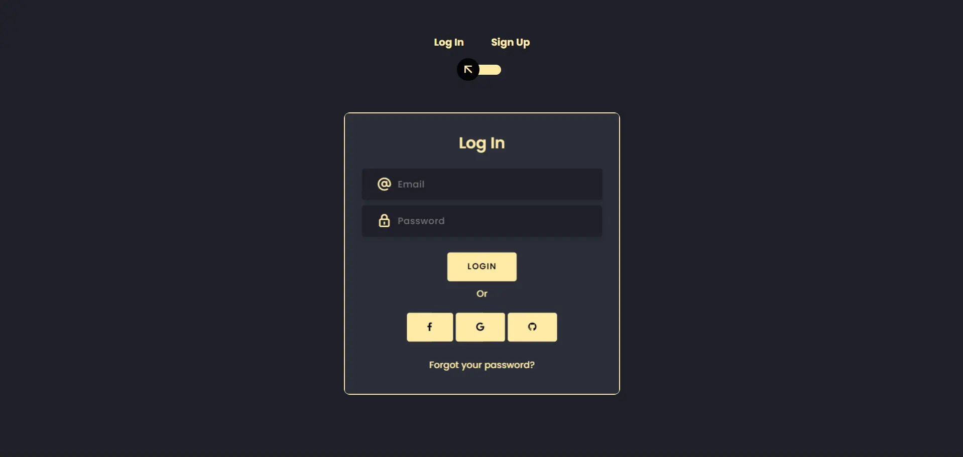
HTML Login Form Template V2
9458
Devtools_7
Open In Editor
Video
Publish Your Code
9
Recommended
23 July 2024
Folded paper login form
28 October 2025
HTML Button Hover Effects Example
26 December 2025
Modèle de formulaire de connexion HTML réseaux sociaux Français
HTML
Copy
Webleb
Log In
Sign Up
Log In
Login
Or
Forgot your password?
Sign Up
Register
CSS
Copy
@import url('https://fonts.googleapis.com/css?family=Poppins:400,500,600,700,800,900'); body{ font-family: 'Poppins', sans-serif; font-weight: 300; line-height: 1.7; color: #ffeba7; background-color: #1f2029; overflow: hidden; } a:hover { text-decoration: none; } .link { color: #ffeba7; } .link:hover { color: #c4c3ca; } p { font-weight: 500; font-size: 14px; } h4 { font-weight: 600; } h6 span{ padding: 0 20px; font-weight: 700; } .section{ position: relative; width: 100%; display: block; } .full-height{ min-height: 100vh; } [type="checkbox"]:checked, [type="checkbox"]:not(:checked){ display: none; } .checkbox:checked + label, .checkbox:not(:checked) + label{ position: relative; display: block; text-align: center; width: 60px; height: 16px; border-radius: 8px; padding: 0; margin: 10px auto; cursor: pointer; background-color: #ffeba7; } .checkbox:checked + label:before, .checkbox:not(:checked) + label:before{ position: absolute; display: block; width: 36px; height: 36px; border-radius: 50%; color: #ffeba7; background-color: #020305; font-family: 'unicons'; content: '\eb4f'; z-index: 20; top: -10px; left: -10px; line-height: 36px; text-align: center; font-size: 24px; transition: all 0.5s ease; } .checkbox:checked + label:before { transform: translateX(44px) rotate(-270deg); } .card-3d-wrap { position: relative; width: 440px; max-width: 100%; height: 450px; -webkit-transform-style: preserve-3d; transform-style: preserve-3d; perspective: 800px; margin-top: 60px; } .card-3d-wrapper { width: 100%; height: 100%; position:absolute; -webkit-transform-style: preserve-3d; transform-style: preserve-3d; transition: all 600ms ease-out; border: 2px solid #ffeba7; border-radius: 10px; } .card-front, .card-back { width: 100%; height: 100%; background-color: #2b2e38; background-image: url('/img/pattern_japanese-pattern-2_1_2_0-0_0_1__ffffff00_000000.png'); position: absolute; border-radius: 6px; -webkit-transform-style: preserve-3d; } .card-back { transform: rotateY(180deg); } .checkbox:checked ~ .card-3d-wrap .card-3d-wrapper { transform: rotateY(180deg); } .center-wrap{ position: absolute; width: 100%; padding: 0 35px; top: 50%; left: 0; transform: translate3d(0, -50%, 35px) perspective(100px); z-index: 20; display: block; } .form-group{ position: relative; display: block; margin: 0; padding: 0; } .form-style { padding: 13px 20px; padding-left: 55px; height: 48px; width: 100%; font-weight: 500; border-radius: 4px; font-size: 14px; line-height: 22px; letter-spacing: 0.5px; outline: none; color: #c4c3ca; background-color: #1f2029; border: none; -webkit-transition: all 200ms linear; transition: all 200ms linear; box-shadow: 0 4px 8px 0 rgba(21,21,21,.2); } .form-style:focus, .form-style:active { border: none; outline: none; box-shadow: 0 4px 8px 0 rgba(21,21,21,.2); } .input-icon { position: absolute; top: 0; left: 18px; height: 48px; font-size: 24px; line-height: 48px; text-align: left; -webkit-transition: all 200ms linear; transition: all 200ms linear; } .btn{ border-radius: 4px; height: 44px; font-size: 13px; font-weight: 600; text-transform: uppercase; -webkit-transition : all 200ms linear; transition: all 200ms linear; padding: 0 30px; letter-spacing: 1px; display: -webkit-inline-flex; display: -ms-inline-flexbox; display: inline-flex; align-items: center; background-color: #ffeba7; color: #000000; } .btn:hover{ background-color: #000000; color: #ffeba7; box-shadow: 0 8px 24px 0 rgba(16,39,112,.2); }
JS
Copy
/* Replace with your JS Code (Leave empty if not needed) */