WEBLEB
Home
Editor
Login
Pro
English
English
Français
Español
Português
Deutsch
Italiano
हिंदी
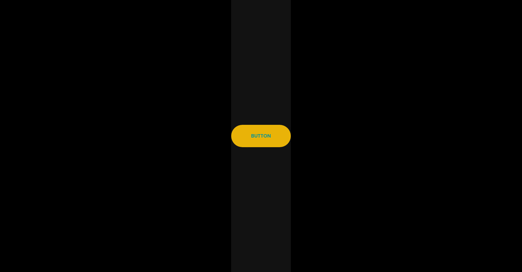
Firefly Button HTML CSS Tailwind
8
focrus1990
Open In Editor
Publish Your Code
Recommended
5 May 2025
Portfolio Website HTML CSS
20 August 2025
Modern Design Blog HTML Template
23 October 2025
Hide Div, Start Animation on Button Click
HTML
Copy
Fireflies Button
Button
CSS
Copy
html, body { background: black; height: 100%; display: flex; align-items: center; justify-content: center; } .circle { width: 8px; height: 8px; border-radius: 50%; position: absolute; top: 50%; left: 50%; margin: -4px 0 0 -4px; pointer-events: none; mix-blend-mode: screen; z-index: 10; box-shadow: 0px 0px 8px 0px #FDFCA9 inset, 0px 0px 24px 0px #FFEB3B, 0px 0px 8px 0px #FFFFFF42; } .button-wrapper { position: relative; } .button { z-index: 1; position: relative; text-decoration: none; text-align: center; appearance: none; display: inline-block; cursor: pointer; } .button::before { content: ""; box-shadow: 0px 0px 24px 0px #FFEB3B; mix-blend-mode: screen; transition: opacity 0.3s; position: absolute; top: 0; right: 0; left: 0; bottom: 0; border-radius: 999px; opacity: 0; } .button::after { content: ""; box-shadow: 0px 0px 23px 0px #FDFCA9 inset, 0px 0px 8px 0px #FFFFFF42; transition: opacity 0.3s; position: absolute; top: 0; right: 0; left: 0; bottom: 0; border-radius: 999px; opacity: 0; } .button-wrapper:hover { .button::before, .button::after { opacity: 1; } .dot { transform: translate(0, 0) rotate(var(--rotatation)); } .dot::after { animation-play-state: running; } } .dot { display: block; position: absolute; transition: transform calc(var(--speed) / 12) ease; width: var(--size); height: var(--size); transform: translate(var(--starting-x), var(--starting-y)) rotate(var(--rotatation)); } .dot::after { content: ""; animation: hoverFirefly var(--speed) infinite, dimFirefly calc(var(--speed) / 2) infinite calc(var(--speed) / 3); animation-play-state: paused; display: block; border-radius: 100%; background: yellow; width: 100%; height: 100%; box-shadow: 0px 0px 6px 0px #FFEB3B, 0px 0px 4px 0px #FDFCA9 inset, 0px 0px 2px 1px #FFFFFF42; } .dot-1 { --rotatation: 0deg; --speed: 14s; --size: 6px; --starting-x: 30px; --starting-y: 20px; top: 2px; left: -16px; opacity: 0.7; } .dot-2 { --rotatation: 122deg; --speed: 16s; --size: 3px; --starting-x: 40px; --starting-y: 10px; top: 1px; left: 0px; opacity: 0.7; } .dot-3 { --rotatation: 39deg; --speed: 20s; --size: 4px; --starting-x: -10px; --starting-y: 20px; top: -8px; right: 14px; } .dot-4 { --rotatation: 220deg; --speed: 18s; --size: 2px; --starting-x: -30px; --starting-y: -5px; bottom: 4px; right: -14px; opacity: 0.9; } .dot-5 { --rotatation: 190deg; --speed: 22s; --size: 5px; --starting-x: -40px; --starting-y: -20px; bottom: -6px; right: -3px; } .dot-6 { --rotatation: 20deg; --speed: 15s; --size: 4px; --starting-x: 12px; --starting-y: -18px; bottom: -12px; left: 30px; opacity: 0.7; } .dot-7 { --rotatation: 300deg; --speed: 19s; --size: 3px; --starting-x: 6px; --starting-y: -20px; bottom: -16px; left: 44px; } @keyframes dimFirefly { 0% { opacity: 1; } 25% { opacity: 0.4; } 50% { opacity: 0.8; } 75% { opacity: 0.5; } 100% { opacity: 1; } } @keyframes hoverFirefly { 0% { transform: translate(0, 0); } 12% { transform: translate(3px, 1px); } 24% { transform: translate(-2px, 3px); } 37% { transform: translate(2px, -2px); } 55% { transform: translate(-1px, 0); } 74% { transform: translate(0, 2px); } 88% { transform: translate(-3px, -1px); } 100% { transform: translate(0, 0); } }
JS
Copy
/* Replace with your JS Code (Leave empty if not needed) */