WEBLEB
Home
Editor
Login
Pro
English
English
Français
Español
Português
Deutsch
Italiano
हिंदी
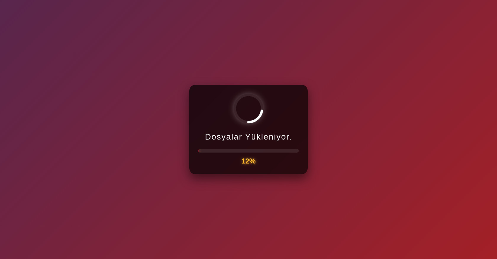
Loading Page HTML with Progress Bar
5757
cvroon
Open In Editor
Publish Your Code
Recommended
29 August 2024
Animated Continuous Sections with GSAP Observer
9 June 2025
Side bar
22 May 2025
Big bang html
HTML
Copy
Yükleniyor...
Yükleniyor
0%
CSS
Copy
* { margin: 0; padding: 0; box-sizing: border-box; } body { font-family: 'Segoe UI', Tahoma, Geneva, Verdana, sans-serif; background: linear-gradient(135deg, #1a2a6c, #b21f1f, #fdbb2d); background-size: 400% 400%; animation: gradientBG 10s ease infinite; height: 100vh; display: flex; justify-content: center; align-items: center; overflow: hidden; color: white; } @keyframes gradientBG { 0% { background-position: 0% 50%; } 50% { background-position: 100% 50%; } 100% { background-position: 0% 50%; } } .loading-container { text-align: center; max-width: 400px; width: 90%; padding: 30px; background-color: rgba(0, 0, 0, 0.7); border-radius: 20px; box-shadow: 0 15px 35px rgba(0, 0, 0, 0.5); backdrop-filter: blur(10px); } .loader { margin: 0 auto 30px; width: 100px; height: 100px; position: relative; } .spinner { width: 100%; height: 100%; border: 8px solid rgba(255, 255, 255, 0.1); border-top: 8px solid #ffffff; border-radius: 50%; animation: spin 1.5s linear infinite; box-shadow: 0 0 20px rgba(255, 255, 255, 0.3); } @keyframes spin { 0% { transform: rotate(0deg); } 100% { transform: rotate(360deg); } } .loading-text { font-size: 28px; font-weight: 300; margin-bottom: 25px; letter-spacing: 2px; position: relative; display: inline-block; } .loading-text::after { content: ''; animation: dots 1.5s steps(4, end) infinite; } @keyframes dots { 0%, 20% { content: ''; } 40% { content: '.'; } 60% { content: '..'; } 80%, 100% { content: '...'; } } .progress-container { width: 100%; height: 12px; background-color: rgba(255, 255, 255, 0.1); border-radius: 10px; overflow: hidden; margin-bottom: 15px; } .progress-bar { height: 100%; width: 0%; background: linear-gradient(90deg, #1a2a6c, #b21f1f, #fdbb2d); border-radius: 10px; transition: width 0.3s ease; box-shadow: 0 0 10px rgba(253, 187, 45, 0.5); } .percentage { font-size: 24px; font-weight: 600; color: #fdbb2d; text-shadow: 0 0 10px rgba(253, 187, 45, 0.7); }
JS
Copy
document.addEventListener('DOMContentLoaded', function() { const progressBar = document.querySelector('.progress-bar'); const percentageText = document.querySelector('.percentage'); const loadingText = document.querySelector('.loading-text'); let progress = 0; let speed = 30; // Yükleme hızı (ms) // Rastgele yükleme simülasyonu function simulateLoading() { if (progress >= 100) { loadingText.textContent = "Yükleme Tamamlandı!"; // Tamamlandıktan 1 saniye sonra yönlendirme veya mesaj setTimeout(() => { document.body.innerHTML = ` <div class="completion-message"> <h1>✅ Yükleme Tamamlandı!</h1> <p>Sayfaya yönlendiriliyorsunuz...</p> </div> `; // Gerçek bir senaryoda burada yönlendirme yapılır: // window.location.href = "ana-sayfa.html"; }, 1000); return; } // Rastgele ilerleme artışı (daha gerçekçi hissettirmek için) let increment = Math.random() * 5 + 1; progress = Math.min(progress + increment, 100); // İlerlemeyi güncelle progressBar.style.width = `${progress}%`; percentageText.textContent = `${Math.round(progress)}%`; // Yükleme yüzdesine göre metin güncelleme if (progress < 30) { loadingText.textContent = "Dosyalar Yükleniyor"; } else if (progress < 60) { loadingText.textContent = "İşleniyor"; } else if (progress < 90) { loadingText.textContent = "Son Hazırlıklar"; } else { loadingText.textContent = "Neredeyse Hazır"; } // Hızı yavaş yavaş arttır (sona yaklaştıkça yavaşlasın) if (progress > 80) { speed = 50; } else if (progress > 95) { speed = 100; } setTimeout(simulateLoading, speed); } // Yükleme simülasyonunu başlat setTimeout(simulateLoading, 500); // Tamamlanma mesajı için CSS ekle const style = document.createElement('style'); style.textContent = ` .completion-message { text-align: center; padding: 40px; background-color: rgba(0, 0, 0, 0.8); border-radius: 20px; max-width: 500px; width: 90%; box-shadow: 0 15px 35px rgba(0, 0, 0, 0.5); animation: fadeIn 1s ease; } .completion-message h1 { font-size: 32px; margin-bottom: 20px; color: #4CAF50; } .completion-message p { font-size: 20px; color: white; } @keyframes fadeIn { from { opacity: 0; transform: translateY(20px); } to { opacity: 1; transform: translateY(0); } } `; document.head.appendChild(style); });