WEBLEB
Home
Editor
Login
Pro
English
English
Français
Español
Português
Deutsch
Italiano
हिंदी
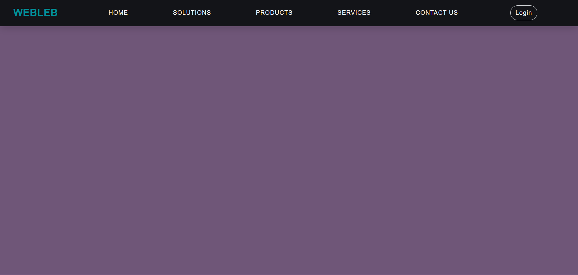
Responsive CSS Navbar
17237
webleb
Publish Your Code
Recommended
20 August 2024
Pure CSS Bike Card
15 October 2024
Navbar
25 November 2024
web data mahasiswa responsive
index.html
Copy
Webleb
WEBLEB
Home
Solutions
Products
Services
Contact Us
Login
styles.css
Copy
*{ margin: 0; padding: 0; color: #f2f5f7; font-family: sans-serif; letter-spacing: 1px; font-weight: 300; } body{ overflow-x: hidden; } nav{ height: 4.5rem; width: 100vw; background-color: #131418; box-shadow: 0 3px 20px rgba(0, 0, 0, 0.2); display: flex; position: fixed; z-index: 10; } /*Styling logo*/ .logo{ padding:1vh 1vw; text-align: center; } .logo img { height: 5rem; width: 5rem; } /*Styling Links*/ .nav-links{ display: flex; list-style: none; width: 88vw; padding: 0 0.7vw; justify-content: space-evenly; align-items: center; text-transform: uppercase; } .nav-links li a{ text-decoration: none; margin: 0 0.7vw; } .nav-links li a:hover { color: #61DAFB; } .nav-links li { position: relative; } .nav-links li a:hover::before{ width: 80%; } /*Styling Buttons*/ .login-button{ background-color: transparent; border: 1.5px solid #f2f5f7; border-radius: 2em; padding: 0.6rem 0.8rem; margin-left: 2vw; font-size: 1rem; cursor: pointer; } .login-button:hover { color: #131418; background-color: #f2f5f7; border:1.5px solid #f2f5f7; transition: all ease-in-out 350ms; } .join-button{ color: #131418; background-color: #61DAFB; border: 1.5px solid #61DAFB; border-radius: 2em; padding: 0.6rem 0.8rem; font-size: 1rem; cursor: pointer; } .join-button:hover { color: #f2f5f7; background-color: transparent; border:1.5px solid #f2f5f7; transition: all ease-in-out 350ms; } /*Styling Hamburger Icon*/ .hamburger div{ width: 30px; height:3px; background: #f2f5f7; margin: 5px; transition: all 0.3s ease; } .hamburger{ display: none; } /*Stying for small screens*/ @media screen and (max-width: 800px){ nav{ position: fixed; z-index: 3; } .hamburger{ display:block; position: absolute; cursor: pointer; right: 5%; top: 50%; transform: translate(-5%, -50%); z-index: 2; transition: all 0.7s ease; } .nav-links{ position: fixed; background: #131418; height: 100vh; width: 100%; flex-direction: column; clip-path: circle(50px at 90% -20%); -webkit-clip-path: circle(50px at 90% -10%); transition: all 1s ease-out; pointer-events: none; } .nav-links.open{ clip-path: circle(1000px at 90% -10%); -webkit-clip-path: circle(1000px at 90% -10%); pointer-events: all; } .nav-links li{ opacity: 0; } .nav-links li:nth-child(1){ transition: all 0.5s ease 0.2s; } .nav-links li:nth-child(2){ transition: all 0.5s ease 0.4s; } .nav-links li:nth-child(3){ transition: all 0.5s ease 0.6s; } .nav-links li:nth-child(4){ transition: all 0.5s ease 0.7s; } .nav-links li:nth-child(5){ transition: all 0.5s ease 0.8s; } .nav-links li:nth-child(6){ transition: all 0.5s ease 0.9s; margin: 0; } .nav-links li:nth-child(7){ transition: all 0.5s ease 1s; margin: 0; } li.fade{ opacity: 1; } } /*Animating Hamburger Icon on Click*/ .toggle .line1{ transform: rotate(-45deg) translate(-5px,6px); } .toggle .line2{ transition: all 0.7s ease; width:0; } .toggle .line3{ transform: rotate(45deg) translate(-5px,-6px); }
main.js
Copy
const hamburger = document.querySelector(".hamburger"); const navLinks = document.querySelector(".nav-links"); const links = document.querySelectorAll(".nav-links li"); hamburger.addEventListener('click', ()=>{ //Animate Links navLinks.classList.toggle("open"); links.forEach(link => { link.classList.toggle("fade"); }); //Hamburger Animation hamburger.classList.toggle("toggle"); });