WEBLEB
Home
Editor
Login
Pro
English
English
Français
Español
Português
Deutsch
Italiano
हिंदी
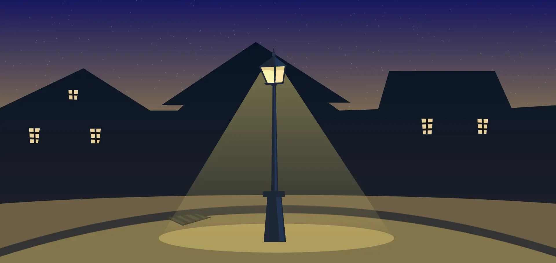
Interactive Street Lamp
1359
Andev.web
Open In Editor
Publish Your Code
Recommended
21 August 2024
Lamp light
18 August 2024
Interactive Title Animation
21 May 2025
Animated lamp
HTML
Copy
Andev Web
CSS
Copy
:root { --pole-dark: #1e2635; --pole-light: #233451; --sewer-dark: #3a392f; --sewer-light: #4a4a3d; --ground-light: #83744b; --ground-dark: #6d5f45; } body { margin: 0; padding: 0; width: 100vw; height: 100vh; overflow: hidden; display: flex; align-items: center; justify-content: center; background: linear-gradient(180deg, #17175f, #ffd844); } body:before { content: ""; position: absolute; width: 100%; height: 100%; background: repeating-conic-gradient(#FFF9 0%, #fff0 .000075%, #fff0 .0005%, #fff0 .12345%); filter: blur(0.5px) drop-shadow(0 0 1px #fff) drop-shadow(0 0 1px #fff); } .content { width: 100vw; height: 100vh; display: flex; align-items: center; justify-content: center; } .buildings { width: 100vw; height: 100vh; background: linear-gradient(180deg, #021023, #222329); clip-path: polygon(0% 41%, 15% 26%, 27% 42%, 32% 42%, 33% 40%, 29% 40%, 46% 16%, 63% 39%, 59% 39%, 61% 42%, 68% 41.5%, 70% 27%, 89% 27%, 92% 41%, 100% 40%, 100% 100%, 0% 100%); display: flex; align-items: center; justify-content: center; } .window { background: linear-gradient(88deg, #fff0 0 calc(50% - 0.2vw), #111 calc((50% - 0.2vw) + 1px) calc(50% + 0.2vw), #fff0 calc((50% + 0.2vw) + 1px) 100%), repeating-linear-gradient(182deg, #fff0 0 calc(30% - 0.2vw), #111 calc((30% - 0.2vw) + 1px) calc(30% + 0.2vw), #fff0 calc((30% + 0.2vw) + 1px) 37%), #e7d09a; width: 5vmin; height: 7vmin; position: absolute; left: 5vw; transform: scale(0.8); margin-top: 3vmin; clip-path: polygon(0 0, 100% 0, 85% 100%, 10% 100%); } .window:nth-child(2) { left: 16vw; margin-top: 3.25vmin; } .window:nth-child(3) { left: 12vw; margin-top: -26vmin; clip-path: polygon(5% 0%, 97% 1%, 85% 65%, 10% 63%); } .window:nth-child(4) { right: 12vw; margin-top: -4vmin; left: inherit; } .window:nth-child(5) { right: 22vw; margin-top: -4vmin; left: inherit; transform: scale(0.85) rotateY(180deg); } .ground { background: radial-gradient(circle at 50% 350vh, var(--ground-light) 0 343vh, #333 calc(343vh + 2px) 346vh, var(--ground-dark) calc(346vh + 2px) 100%); position: absolute; width: 150vw; height: 26vh; bottom: 0; border-radius: 100% 100% 0 0; display: flex; align-items: center; justify-content: center; opacity: 0.5; } .sewer { position: absolute; width: 130px; height: 50px; margin-left: -500px; margin-top: -50px; clip-path: polygon(0% 33%, 65% 10%, 100% 35%, 40% 80%); background: linear-gradient(-188deg, var(--sewer-dark) 0 19px, #fff0 20px 100%), linear-gradient(-16deg, var(--sewer-dark) 0 34px, #fff0 35px 100%), linear-gradient(-163deg, var(--sewer-dark) 0 19px, #fff0 20px 100%), linear-gradient(25deg, var(--sewer-dark) 0 33px, var(--sewer-light) 34px 39px, var(--sewer-dark) 40px 46px, var(--sewer-light) 47px 52px, var(--sewer-dark) 53px 59px, var(--sewer-light) 60px 67px, var(--sewer-dark) 68px 73px, var(--sewer-light) 74px 90px, #fff0 0 100%); } .streetlamp { width: 80px; height: 72vh; position: absolute; top: 20vh; margin-left: -4vmin; max-width: 80px; min-width: 80px; } .base { bottom: 0; right: 0; position: absolute; width: 81%; height: 24%; background: linear-gradient(-94deg, var(--pole-dark) 0 23%, #fff0 calc(23% + 1px) 100%), linear-gradient(-1deg, var(--pole-dark) 0 3.65%, #fff0 calc(1.65% + 1px) 100%), linear-gradient(85deg, var(--pole-dark) 0 58%, var(--pole-light) calc(58% + 1px) 100%); border-radius: 2px; clip-path: polygon(15% 0, 76% 0, 95% 99%, 0% 99%); z-index: 1; } .basetop { background: #1e2634; width: 75%; height: 3%; position: absolute; bottom: 24%; left: 16%; border-radius: 2px; z-index: 2; transform: rotate(-0.5deg); } .pole { position: absolute; width: 25%; height: 56.5%; background: linear-gradient(-1deg, var(--pole-dark) 0 1.65%, #fff0 calc(1.65% + 1px) 100%), linear-gradient(-91deg, var(--pole-dark) 0 35%, #fff0 calc(35% + 1px) 100%), linear-gradient(89.5deg, var(--pole-dark) 0 40%, var(--pole-light) calc(40% + 1px) 100%); bottom: 26.25%; left: 45%; clip-path: polygon(17% 0, 60% 0, 95% 99%, 0% 99%); z-index: 1; } .poletop { width: 20%; height: 1.5%; background: var(--pole-dark); position: absolute; bottom: 82%; left: 44%; z-index: 1; clip-path: polygon(0% 0, 100% 0, 95% 65%, 10% 72%); } .head { position: absolute; width: 100%; height: 100px; bottom: 83%; z-index: 1; } .head .top { background: conic-gradient(from 131deg at 55% 0, var(--pole-light) 0 12%, var(--pole-dark) 13% 29.5%, #fff0 0 100%); width: 100%; height: 30%; top: 20%; position: absolute; transform: rotate(-3deg); } .head .bot { width: 75%; height: 5%; background: linear-gradient(45deg, #fff0 12%, var(--pole-dark) 0 65%, #fff0 0 100%), linear-gradient(-50deg, #fff0 8%, var(--pole-dark) 0 65%, #fff0 0 100%); left: 17%; position: absolute; bottom: 1%; transform: rotate(-3deg); } .glass { background: linear-gradient(-79deg, #fff0 0 12%, var(--pole-dark) 13% 16%, #fff0 17% 100%), conic-gradient(from -46deg at 53% 200%, #fff0 0 13%, var(--pole-dark) 13.2% 14%, #fff0 14.2% 100%), linear-gradient(70deg, #fff0 0 21%, var(--pole-dark) 22% 25%, #fff0 26% 100%), radial-gradient(circle at 37% 250%, #fff0 0 73%, #e4ce8b 75% 100%), radial-gradient(circle at 37% 300%, #fff0 0 73%, #e4ce8b 75% 100%), conic-gradient(from -46deg at 53% 200%, #fff0 0 7%, #f5f3b0 0 13%, var(--pole-dark) 13.2% 14%, #fff0 14.2% 100%), linear-gradient(-79deg, #fff0 0 12%, var(--pole-dark) 13% 16%, #ffe5ad 17% 50%, #fff0 17% 100%); background-repeat: no-repeat; background-size: 100% 100%, 100% 100%, 100% 100%, 33% 42%, 50% 35%, 100% 100%; background-position: 0 0, 0 0, 0 0, 90% 0, 20% 0, 0 0; width: 100%; height: 45%; top: 50%; position: absolute; transform: rotate(-3deg); opacity: 0.5; } .light { background: linear-gradient(180deg, #dac47080, #dac47020 90%, #fff0 100%); width: 650px; height: 64vh; position: absolute; left: -274px; bottom: 1.5%; clip-path: polygon(43% 1%, 53% 0.35%, 100% 100%, 0 100%); opacity: 0; } .ground-light { background: #dac47080; width: 650px; left: -275px; position: absolute; bottom: -28px; height: 80px; border-radius: 100%; z-index: 0; opacity: 0; } .top:before { content: ""; position: absolute; background: var(--pole-light); width: 8px; height: 12px; border-radius: 100%; left: 48%; top: -40%; border: 3px solid var(--pole-dark); border-left-width: 0; } .top:after { content: ""; position: absolute; background: var(--pole-dark); width: 4px; height: 12px; border-radius: 100%; left: 52%; top: -70%; } #btn { display: none; } label[for=btn] { position: absolute; width: 80%; height: 55%; z-index: 5; top: 45%; left: 11%; border-radius: 50% 50% 100% 150%; cursor: pointer; } #btn:checked + .content .light, #btn:checked + .content .ground, #btn:checked + .content .ground-light, #btn:checked + .content .head .glass { animation: turn-on 2s ease 0s 1; opacity: 1; } @keyframes turn-on { 0%, 10%, 25% { opacity: 0; } 5%, 15%, 35%, 100% { opacity: 1; } } @media screen and (orientation:landscape) and (max-width: 767px) { .light { bottom: 11%; } .ground-light { bottom: -9px; } }
JS
Copy