WEBLEB
Home
Editor
Login
Pro
English
English
Français
Español
Português
Deutsch
Italiano
हिंदी
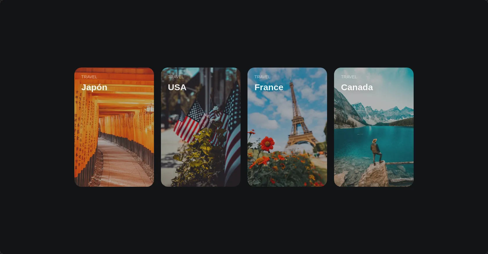
Gallery of sites with hover and blur effect
2314
Andev.web
Open In Editor
Publish Your Code
Recommended
26 June 2025
E-Ticaret Sitesi HTML, Tailwind CSS, Alışveriş
12 July 2025
CSS Card Glow Effect
20 June 2025
Apple Liquid Glass HTML CSS Effect
HTML
Copy
Andev Web
Travel
Japón
Travel
USA
Travel
France
Travel
Canada
CSS
Copy
* { margin: 0; padding: 0; box-sizing: border-box; border: 0; } body { background: #131416; display: flex; align-items: center; justify-content: center; height: 100vh; padding: 0; } .cards { display: grid; grid-template-columns: repeat(1, 1fr); margin: auto; width: 100%; max-width: 1200px; grid-gap: 24px; padding: 16px; } @media (min-width: 540px) { .cards { grid-template-columns: repeat(2, 1fr); } } @media (min-width: 960px) { .cards { grid-template-columns: repeat(4, 1fr); } } .card { position: relative; padding-bottom: 150%; } .card-background { background-size: cover; background-position: center; position: absolute; left: 0; top: 0; right: 0; bottom: 0; border-radius: 24px; filter: brightness(.75) saturate(1.2) contrast(.85); transition: .3s; } .card-content { position: absolute; padding: 24px; font-family: arial, sans-serif; color: white; } .card-content p { color: rgba(255, 255, 255, .6); margin-bottom: 10px; text-transform: uppercase; font-size: .9rem; } .card-content h3 { font-size: 1.9rem; color: rgba(255, 255, 255, .9); text-shadow: 2px 2px 20px rgba(0, 0, 0, .2); } .card:hover .card-background { transform: scale(1.05); } .cards:hover > .card:not(:hover) > .card-background { filter: brightness(.5) saturate(0) contrast(1.2) blur(20px); }
JS
Copy
//This code does not use javascript:)