WEBLEB
Home
Editor
Login
Pro
English
English
Français
Español
Português
Deutsch
Italiano
हिंदी
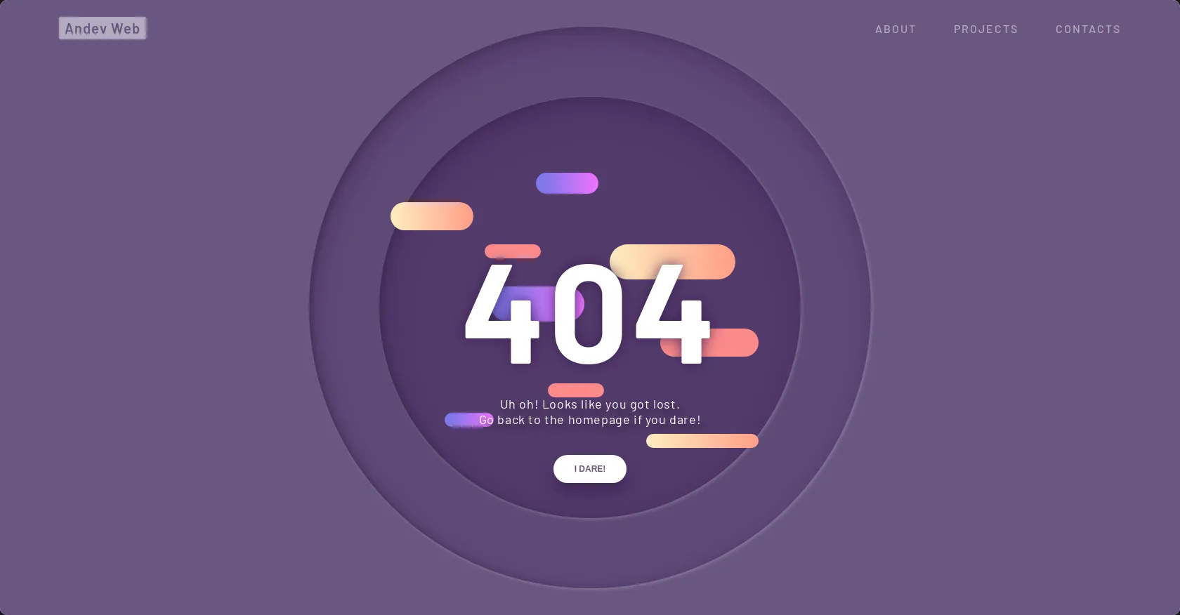
404 Page with Parallax
1080
Andev.web
Open In Editor
Publish Your Code
Need a Website?
Recommended
7 March 2025
Crossy Road with three.js
14 October 2024
Payment - Form With Notification
22 August 2024
Animated card with 3d hover effect
HTML
Copy
Andev Web
Andev Web
about
projects
contacts
404
404
Uh oh! Looks like you got lost.
Go back to the homepage if you dare!
i dare!
CSS
Copy
@import url("https://fonts.googleapis.com/css?family=Barlow+Condensed:300,400,500,600,700,800,900|Barlow:300,400,500,600,700,800,900&display=swap"); h1, h2, h3, h4, h5, h6, p, ul, li, button, a, i, input, body { margin: 0; padding: 0; list-style: none; border: 0; -webkit-tap-highlight-color: transparent; text-decoration: none; color: inherit; } h1:focus, h2:focus, h3:focus, h4:focus, h5:focus, h6:focus, p:focus, ul:focus, li:focus, button:focus, a:focus, i:focus, input:focus, body:focus { outline: 0; } body { margin: 0; padding: 0; height: auto; font-family: "Barlow", sans-serif; background: #695681; } .logo { position: fixed; z-index: 5; bottom: 10px; right: 10px; width: 40px; height: 40px; border-radius: 100%; display: flex; justify-content: center; align-items: center; background: rgba(0, 0, 0, 0.1); border-radius: 100%; backdrop-filter: blur(5px); } .logo img { width: 55%; height: 55%; transform: translateY(-1px); opacity: 0.8; } nav .menu { width: 100%; height: 80px; position: absolute; display: flex; align-items: center; justify-content: space-between; padding: 0 5%; box-sizing: border-box; z-index: 3; } nav .menu .website_name { color: #695681; font-weight: 600; font-size: 20px; letter-spacing: 1px; background: white; padding: 4px 8px; border-radius: 2px; opacity: 0.5; transition: all 0.4s ease; cursor: pointer; } nav .menu .website_name:hover { opacity: 1; } nav .menu .menu_links { transition: all 0.4s ease; opacity: 0.5; } nav .menu .menu_links:hover { opacity: 1; } @media screen and (max-width: 799px) { nav .menu .menu_links { display: none; } } nav .menu .menu_links .link { color: white; text-transform: uppercase; font-weight: 500; margin-right: 50px; letter-spacing: 2px; position: relative; transition: all 0.3s 0.2s ease; } nav .menu .menu_links .link:last-child { margin-right: 0; } nav .menu .menu_links .link:before { content: ""; position: absolute; width: 0px; height: 4px; background: linear-gradient(90deg, #FFEDC0 0%, #FF9D87 100%); bottom: -10px; border-radius: 4px; transition: all 0.4s cubic-bezier(0.82, 0.02, 0.13, 1.26); left: 100%; } nav .menu .menu_links .link:hover { opacity: 1; color: #FB8A8A; } nav .menu .menu_links .link:hover:before { width: 40px; left: 0; } nav .menu .menu_icon { width: 40px; height: 40px; position: relative; display: none; justify-content: center; align-items: center; cursor: pointer; } @media screen and (max-width: 799px) { nav .menu .menu_icon { display: flex; } } nav .menu .menu_icon .icon { width: 24px; height: 2px; background: white; position: absolute; } nav .menu .menu_icon .icon:before, nav .menu .menu_icon .icon:after { content: ""; width: 100%; height: 100%; background: inherit; position: absolute; transition: all 0.3s cubic-bezier(0.49, 0.04, 0, 1.55); } nav .menu .menu_icon .icon:before { transform: translateY(-8px); } nav .menu .menu_icon .icon:after { transform: translateY(8px); } nav .menu .menu_icon:hover .icon { background: #FFEDC0; } nav .menu .menu_icon:hover .icon:before { transform: translateY(-10px); } nav .menu .menu_icon:hover .icon:after { transform: translateY(10px); } .wrapper { display: grid; grid-template-columns: 1fr; justify-content: center; align-items: center; height: 100vh; overflow-x: hidden; } .wrapper .container { margin: 0 auto; transition: all 0.4s ease; display: flex; justify-content: center; align-items: center; position: relative; } .wrapper .container .scene { position: absolute; width: 100vw; height: 100vh; vertical-align: middle; } .wrapper .container .one, .wrapper .container .two, .wrapper .container .three, .wrapper .container .circle, .wrapper .container .p404 { width: 60%; height: 60%; top: 20% !important; left: 20% !important; min-width: 400px; min-height: 400px; } .wrapper .container .one .content, .wrapper .container .two .content, .wrapper .container .three .content, .wrapper .container .circle .content, .wrapper .container .p404 .content { width: 600px; height: 600px; display: flex; justify-content: center; align-items: center; position: absolute; top: 50%; left: 50%; transform: translate(-50%, -50%); animation: content 0.8s cubic-bezier(1, 0.06, 0.25, 1) backwards; } @keyframes content { 0% { width: 0; } } .wrapper .container .one .content .piece, .wrapper .container .two .content .piece, .wrapper .container .three .content .piece, .wrapper .container .circle .content .piece, .wrapper .container .p404 .content .piece { width: 200px; height: 80px; display: flex; position: absolute; border-radius: 80px; z-index: 1; animation: pieceLeft 8s cubic-bezier(1, 0.06, 0.25, 1) infinite both; } @keyframes pieceLeft { 50% { left: 80%; width: 10%; } } @keyframes pieceRight { 50% { right: 80%; width: 10%; } } @media screen and (max-width: 799px) { .wrapper .container .one, .wrapper .container .two, .wrapper .container .three, .wrapper .container .circle, .wrapper .container .p404 { width: 90%; height: 90%; top: 5% !important; left: 5% !important; min-width: 280px; min-height: 280px; } } @media screen and (max-height: 660px) { .wrapper .container .one, .wrapper .container .two, .wrapper .container .three, .wrapper .container .circle, .wrapper .container .p404 { min-width: 280px; min-height: 280px; width: 60%; height: 60%; top: 20% !important; left: 20% !important; } } .wrapper .container .text { width: 60%; height: 40%; min-width: 400px; min-height: 500px; position: absolute; margin: 40px 0; animation: text 0.6s 1.8s ease backwards; } @keyframes text { 0% { opacity: 0; transform: translateY(40px); } } @media screen and (max-width: 799px) { .wrapper .container .text { min-height: 400px; height: 80%; } } .wrapper .container .text article { width: 400px; position: absolute; bottom: 0; z-index: 4; display: flex; flex-direction: column; justify-content: center; align-items: center; text-align: center; bottom: 0; left: 50%; transform: translateX(-50%); } @media screen and (max-width: 799px) { .wrapper .container .text article { width: 100%; } } .wrapper .container .text article p { color: white; font-size: 18px; letter-spacing: 0.6px; margin-bottom: 40px; text-shadow: 6px 6px 10px #32243E; } .wrapper .container .text article button { height: 40px; padding: 0 30px; border-radius: 50px; cursor: pointer; box-shadow: 0px 15px 20px rgba(54, 24, 79, 0.5); z-index: 3; color: #695681; background-color: white; text-transform: uppercase; font-weight: 600; font-size: 12px; transition: all 0.3s ease; } .wrapper .container .text article button:hover { box-shadow: 0px 10px 10px -10px rgba(54, 24, 79, 0.5); transform: translateY(5px); background: #FB8A8A; color: white; } .wrapper .container .p404 { font-size: 200px; font-weight: 700; letter-spacing: 4px; color: white; display: flex !important; justify-content: center; align-items: center; position: absolute; z-index: 2; animation: anime404 0.6s cubic-bezier(0.3, 0.8, 1, 1.05) both; animation-delay: 1.2s; } @media screen and (max-width: 799px) { .wrapper .container .p404 { font-size: 100px; } } @keyframes anime404 { 0% { opacity: 0; transform: scale(10) skew(20deg, 20deg); } } .wrapper .container .p404:nth-of-type(2) { color: #36184F; z-index: 1; animation-delay: 1s; filter: blur(10px); opacity: 0.8; } .wrapper .container .circle { position: absolute; } .wrapper .container .circle:before { content: ""; position: absolute; width: 800px; height: 800px; background-color: rgba(54, 24, 79, 0.2); border-radius: 100%; top: 50%; left: 50%; transform: translate(-50%, -50%); box-shadow: inset 5px 20px 40px rgba(54, 24, 79, 0.25), inset 5px 0px 5px rgba(50, 36, 62, 0.3), inset 5px 5px 20px rgba(50, 36, 62, 0.25), 2px 2px 5px rgba(255, 255, 255, 0.2); animation: circle 0.8s cubic-bezier(1, 0.06, 0.25, 1) backwards; } @keyframes circle { 0% { width: 0; height: 0; } } @media screen and (max-width: 799px) { .wrapper .container .circle:before { width: 400px; height: 400px; } } .wrapper .container .one .content:before { content: ""; position: absolute; width: 600px; height: 600px; background-color: rgba(54, 24, 79, 0.3); border-radius: 100%; box-shadow: inset 5px 20px 40px rgba(54, 24, 79, 0.25), inset 5px 0px 5px rgba(50, 36, 62, 0.3), inset 5px 5px 20px rgba(50, 36, 62, 0.25), 2px 2px 5px rgba(255, 255, 255, 0.2); animation: circle 0.8s 0.4s cubic-bezier(1, 0.06, 0.25, 1) backwards; } @media screen and (max-width: 799px) { .wrapper .container .one .content:before { width: 300px; height: 300px; } } .wrapper .container .one .content .piece { background: linear-gradient(90deg, #8077EA 13.7%, #EB73FF 94.65%); } .wrapper .container .one .content .piece:nth-child(1) { right: 15%; top: 18%; height: 30px; width: 120px; animation-delay: 0.5s; animation-name: pieceRight; } .wrapper .container .one .content .piece:nth-child(2) { left: 15%; top: 45%; width: 150px; height: 50px; animation-delay: 1s; animation-name: pieceLeft; } .wrapper .container .one .content .piece:nth-child(3) { left: 10%; top: 75%; height: 20px; width: 70px; animation-delay: 1.5s; animation-name: pieceLeft; } .wrapper .container .two .content .piece { background: linear-gradient(90deg, #FFEDC0 0%, #FF9D87 100%); } .wrapper .container .two .content .piece:nth-child(1) { left: 0%; top: 25%; height: 40px; width: 120px; animation-delay: 2s; animation-name: pieceLeft; } .wrapper .container .two .content .piece:nth-child(2) { right: 15%; top: 35%; width: 180px; height: 50px; animation-delay: 2.5s; animation-name: pieceRight; } .wrapper .container .two .content .piece:nth-child(3) { right: 10%; top: 80%; height: 20px; width: 160px; animation-delay: 3s; animation-name: pieceRight; } .wrapper .container .three .content .piece { background: #FB8A8A; } .wrapper .container .three .content .piece:nth-child(1) { left: 25%; top: 35%; height: 20px; width: 80px; animation-name: pieceLeft; animation-delay: 3.5s; } .wrapper .container .three .content .piece:nth-child(2) { right: 10%; top: 55%; width: 140px; height: 40px; animation-name: pieceRight; animation-delay: 4s; } .wrapper .container .three .content .piece:nth-child(3) { left: 40%; top: 68%; height: 20px; width: 80px; animation-name: pieceLeft; animation-delay: 4.5s; }
JS
Copy
// Parallax Code var scene = document.getElementById('scene'); var parallax = new Parallax(scene);