WEBLEB
Home
Editor
Login
Pro
English
English
Français
Español
Português
Deutsch
Italiano
हिंदी
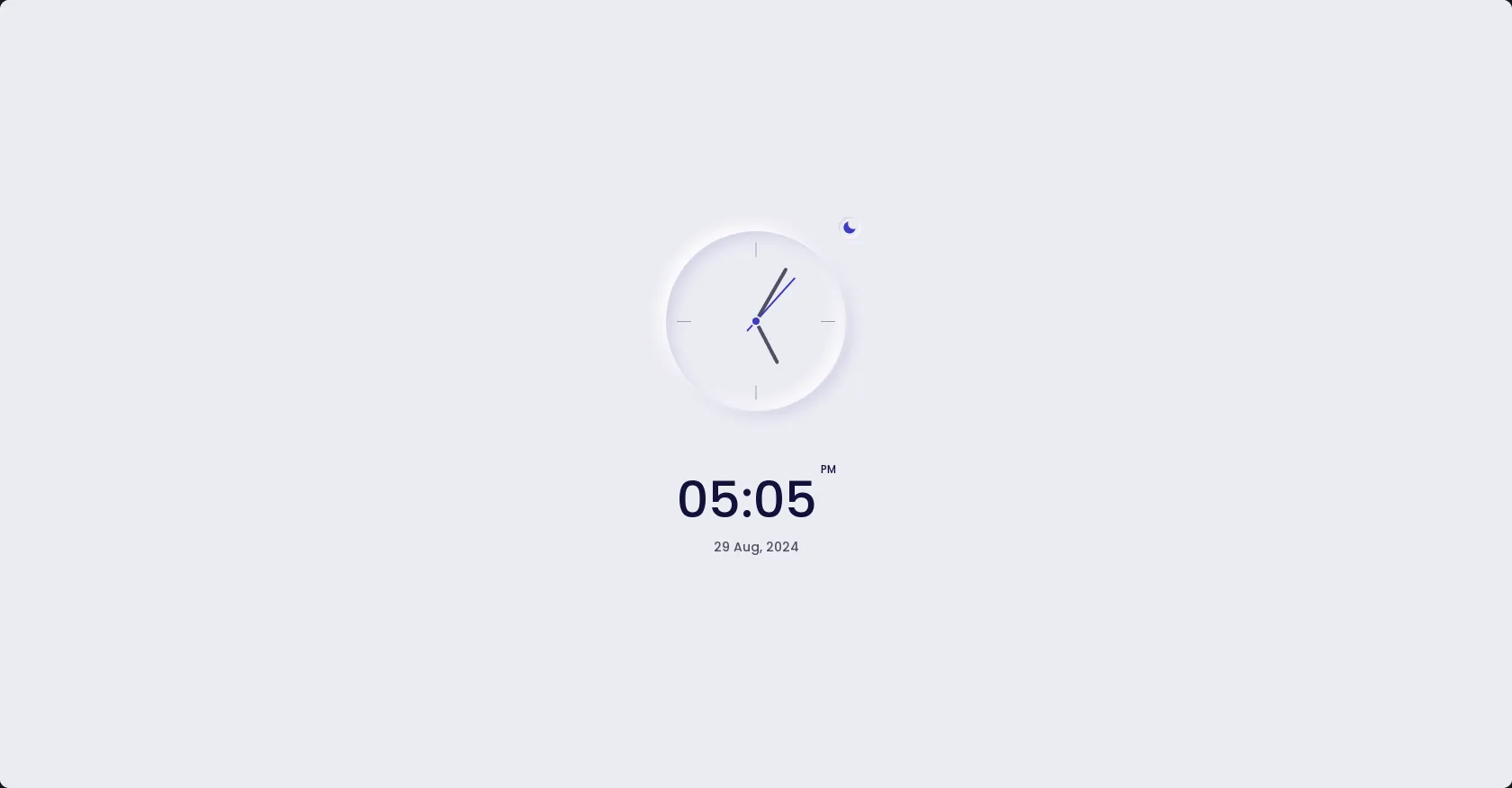
Clock Ui-Dark/light button
1491
Andev.web
Open In Editor
Publish Your Code
Recommended
8 May 2025
scan button
10 February 2025
button
10 February 2024
Button Hover Animation
HTML
Copy
Andev Web
CSS
Copy
/*=============== GOOGLE FONTS ===============*/ @import url("https://fonts.googleapis.com/css2?family=Poppins:wght@400;500&display=swap"); /*=============== VARIABLES CSS ===============*/ :root { /*========== Colors ==========*/ --hue-color: 240; --first-color: hsl(var(--hue-color), 53%, 49%); --title-color: hsl(var(--hue-color), 53%, 15%); --text-color: hsl(var(--hue-color), 12%, 35%); --text-color-light: hsl(var(--hue-color), 12%, 65%); --white-color: #FFF; --body-color: hsl(var(--hue-color), 24%, 94%); /*========== Font and typography ==========*/ --body-font: 'Poppins', sans-serif; --biggest-font-size: 3rem; --small-font-size: .813rem; --smaller-font-size: .75rem; --tiny-font-size: .625rem; /*========== Font weight ==========*/ --font-medium: 500; /*========== Margenes Bottom ==========*/ --mb-0-25: .25rem; --mb-1: 1rem; --mb-1-5: 1.5rem; --mb-2-5: 2.5rem; /*========== z index ==========*/ --z-normal: 1; --z-tooltip: 10; } @media screen and (min-width: 968px) { :root { --biggest-font-size: 3.5rem; --small-font-size: .875rem; --smaller-font-size: .813rem; --tiny-font-size: .75rem; } } /*========== Variables Dark theme ==========*/ body.dark-theme { --title-color: hsl(var(--hue-color), 12%, 95%); --text-color: hsl(var(--hue-color), 12%, 75%); --body-color: hsl(var(--hue-color), 10%, 16%); } /*========== Button Dark/Light ==========*/ .clock__theme { position: absolute; top: -1rem; right: -1rem; display: flex; padding: .25rem; border-radius: 50%; box-shadow: inset -1px -1px 1px hsla(var(--hue-color), 0%, 100%, 1), inset 1px 1px 1px hsla(var(--hue-color), 30%, 86%, 1); color: var(--first-color); cursor: pointer; transition: .4s; // For dark mode animation } /*========== Box shadow Dark theme ==========*/ .dark-theme .clock__circle { box-shadow: 6px 6px 16px hsla(var(--hue-color), 8%, 12%, 1), -6px -6px 16px hsla(var(--hue-color), 8%, 20%, 1), inset -6px -6px 16px hsla(var(--hue-color), 8%, 20%, 1), inset 6px 6px 12px hsla(var(--hue-color), 8%, 12%, 1); } .dark-theme .clock__theme { box-shadow: inset -1px -1px 1px hsla(var(--hue-color), 8%, 20%, 1), inset 1px 1px 1px hsla(var(--hue-color), 8%, 12%, 1); } /*=============== BASE ===============*/ * { box-sizing: border-box; padding: 0; margin: 0; } body { margin: 0; font-family: var(--body-font); background-color: var(--body-color); color: var(--text-color); transition: .4s; // For dark mode animation } a { text-decoration: none; } /*=============== REUSABLE CSS CLASSES ===============*/ .container { max-width: 968px; margin-left: var(--mb-1); margin-right: var(--mb-1); } .grid { display: grid; } /*=============== CLOCK ===============*/ .clock__container { height: 100vh; grid-template-rows: 1fr max-content; } .clock__circle { position: relative; width: 200px; height: 200px; box-shadow: -6px -6px 16px var(--white-color), 6px 6px 16px hsla(var(--hue-color), 30%, 86%, 1), inset 6px 6px 16px hsla(var(--hue-color), 30%, 86%, 1), inset -6px -6px 16px var(--white-color); border-radius: 50%; justify-self: center; display: flex; justify-content: center; align-items: center; transition: .4s; // For dark mode animation } .clock__content { align-self: center; row-gap: 3.5rem; } .clock__twelve, .clock__three, .clock__six, .clock__nine { position: absolute; width: 1rem; height: 1px; background-color: var(--text-color-light); } .clock__twelve, .clock__six { transform: translateX(-50%) rotate(90deg); } .clock__twelve { top: 1.25rem; left: 50%; } .clock__three { top: 50%; right: .75rem; } .clock__six { bottom: 1.25rem; left: 50%; } .clock__nine { left: .75rem; top: 50%; } .clock__rounder { width: .75rem; height: .75rem; background-color: var(--first-color); border-radius: 50%; border: 2px solid var(--body-color); z-index: var(--z-tooltip); } .clock__hour, .clock__minutes, .clock__seconds { position: absolute; display: flex; justify-content: center; } .clock__hour { width: 105px; height: 105px; } .clock__hour::before { content: ''; position: absolute; background-color: var(--text-color); width: .25rem; height: 3rem; border-radius: .75rem; z-index: var(--z-normal); } .clock__minutes { width: 136px; height: 136px; } .clock__minutes::before { content: ''; position: absolute; background-color: var(--text-color); width: .25rem; height: 4rem; border-radius: .75rem; z-index: var(--z-normal); } .clock__seconds { width: 130px; height: 130px; } .clock__seconds::before { content: ''; position: absolute; background-color: var(--first-color); width: .125rem; height: 5rem; border-radius: .75rem; z-index: var(--z-normal); } .clock__logo { width: max-content; justify-self: center; margin-bottom: var(--mb-2-5); font-size: var(--smaller-font-size); font-weight: var(--font-medium); color: var(--text-color-light); transition: .3s; } .clock__logo:hover { color: var(--first-color); } .clock__text { display: flex; justify-content: center; } .clock__text-hour, .clock__text-minutes { font-size: var(--biggest-font-size); font-weight: var(--font-medium); color: var(--title-color); } .clock__text-ampm { font-size: var(--tiny-font-size); color: var(--title-color); font-weight: var(--font-medium); margin-left: var(--mb-0-25); } .clock__date { text-align: center; font-size: var(--small-font-size); font-weight: var(--font-medium); } /*=============== MEDIA QUERIES ===============*/ /* For large devices */ @media screen and (min-width: 968px) { .container { margin-left: auto; margin-right: auto; } .clock__logo { margin-bottom: 3rem; } }
JS
Copy
/*==================== CLOCK ====================*/ const hour = document.getElementById('clock-hour'), minutes = document.getElementById('clock-minutes'), seconds = document.getElementById('clock-seconds') const clock = () =>{ let date = new Date() let hh = date.getHours() * 30, mm = date.getMinutes() * 6, ss = date.getSeconds() * 6 // We add a rotation to the elements hour.style.transform = `rotateZ(${hh + mm / 12}deg)` minutes.style.transform = `rotateZ(${mm}deg)` seconds.style.transform = `rotateZ(${ss}deg)` } setInterval(clock, 1000) // 1000 = 1s /*==================== CLOCK & DATE TEXT ====================*/ const textHour = document.getElementById('text-hour'), textMinutes = document.getElementById('text-minutes'), textAmPm = document.getElementById('text-ampm'), // dateWeek = document.getElementById('date-day-week'), dateDay = document.getElementById('date-day'), dateMonth = document.getElementById('date-month'), dateYear = document.getElementById('date-year') const clockText = () =>{ let date = new Date() let hh = date.getHours(), ampm, mm = date.getMinutes(), day = date.getDate(), // dayweek = date.getDay(), month = date.getMonth(), year = date.getFullYear() // We change the hours from 24 to 12 hours and establish whether it is AM or PM if(hh >= 12){ hh = hh - 12 ampm = 'PM' }else{ ampm = 'AM' } // We detect when it's 0 AM and transform to 12 AM if(hh == 0){hh = 12} // Show a zero before hours if(hh < 10){hh = `0${hh}`} // Show time textHour.innerHTML = `${hh}:` // Show a zero before the minutes if(mm < 10){mm = `0${mm}`} // Show minutes textMinutes.innerHTML = mm // Show am or pm textAmPm.innerHTML = ampm // If you want to show the name of the day of the week // let week = ['Sun', 'Mon', 'Tues', 'Wed', 'Thurs', 'Fri', 'Sat'] // We get the months of the year and show it let months = ['Jan', 'Feb', 'Mar', 'Apr', 'May', 'Jun', 'Jul', 'Aug', 'Sep', 'Oct', 'Nov', 'Dec'] // We show the day, the month and the year dateDay.innerHTML = day // dateWeek.innerHTML = `${week[dayweek]}` dateMonth.innerHTML = `${months[month]},` dateYear.innerHTML = year } setInterval(clockText, 1000) // 1000 = 1s /*==================== DARK/LIGHT THEME ====================*/ const themeButton = document.getElementById('theme-button') const darkTheme = 'dark-theme' const iconTheme = 'bxs-sun' // Previously selected topic (if user selected) const selectedTheme = localStorage.getItem('selected-theme') const selectedIcon = localStorage.getItem('selected-icon') // We obtain the current theme that the interface has by validating the dark-theme class const getCurrentTheme = () => document.body.classList.contains(darkTheme) ? 'dark' : 'light' const getCurrentIcon = () => themeButton.classList.contains(iconTheme) ? 'bxs-moon' : 'bxs-sun' // We validate if the user previously chose a topic if (selectedTheme) { // If the validation is fulfilled, we ask what the issue was to know if we activated or deactivated the dark document.body.classList[selectedTheme === 'dark' ? 'add' : 'remove'](darkTheme) themeButton.classList[selectedIcon === 'bxs-moon' ? 'add' : 'remove'](iconTheme) } // Activate / deactivate the theme manually with the button themeButton.addEventListener('click', () => { // Add or remove the dark / icon theme document.body.classList.toggle(darkTheme) themeButton.classList.toggle(iconTheme) // We save the theme and the current icon that the user chose localStorage.setItem('selected-theme', getCurrentTheme()) localStorage.setItem('selected-icon', getCurrentIcon()) })