WEBLEB
Home
Editor
Login
Pro
English
English
Français
Español
Português
Deutsch
Italiano
हिंदी
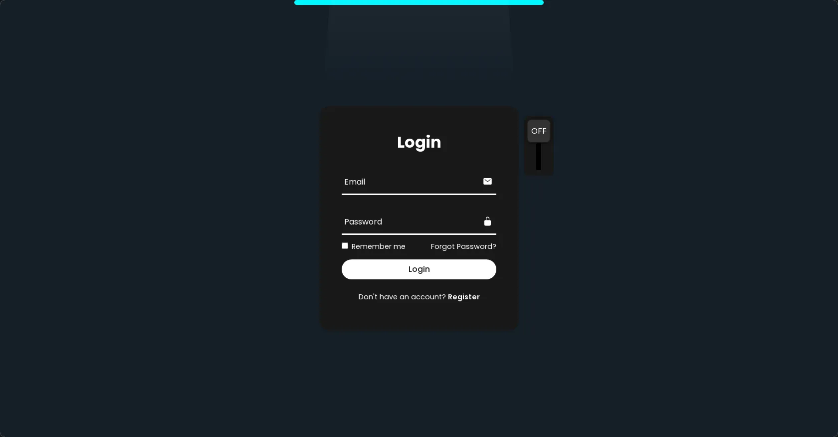
Glowing Light Login Form
2029
Andev.web
Open In Editor
Publish Your Code
Recommended
19 October 2024
Animated HTML Login Form
22 August 2024
A Simple Login Page
10 November 2024
HTML CSS OTP Form
HTML
Copy
Andev Web
off
on
Login
Email
Password
Remember me
Forgot Password?
Login
Don't have an account?
Register
CSS
Copy
@import url('https://fonts.googleapis.com/css2?family=Poppins:wght@300;400;500;600;700;800;900&display=swap'); * { margin: 0; padding: 0; box-sizing: border-box; font-family: 'Poppins', sans-serif; } body { display: flex; justify-content: center; align-items: center; min-height: 100vh; background: #151f28; overflow: hidden; } .login-box { position: relative; width: 400px; height: 450px; background: #191919; border-radius: 20px; display: flex; justify-content: center; align-items: center; } h2 { font-size: 2em; color: #fff; text-align: center; transition: .5s ease; } .input-check:checked~h2 { color: #00f7ff; text-shadow: 0 0 15px #00f7ff, 0 0 30px #00f7ff; } .input-box { position: relative; width: 310px; margin: 30px 0; } .input-box .input-line { position: absolute; bottom: -2px; left: 0; width: 100%; height: 2.5px; background: #fff; transition: .5s ease; } .input-check:checked~.input-box .input-line { background: #00f7ff; box-shadow: 0 0 10px #00f7ff; } .input-box label { position: absolute; top: 50%; left: 5px; transform: translateY(-50%); font-size: 1em; color: #fff; pointer-events: none; transition: .5s ease; } .input-box input:focus~label, .input-box input:valid~label { top: -5px; } .input-check:checked~.input-box label { color: #00f7ff; text-shadow: 0 0 10px #00f7ff; } .input-box input { width: 100%; height: 50px; background: transparent; border: none; outline: none; font-size: 1em; color: #fff; padding: 0 35px 0 5px; transition: .5s ease; } .input-check:checked~.input-box input { color: #00f7ff; text-shadow: 0 0 5px #00f7ff; } .input-box .icon { position: absolute; right: 8px; color: #fff; font-size: 1.2em; line-height: 57px; transition: .5s ease; } .input-check:checked~.input-box .icon { color: #00f7ff; filter: drop-shadow(0 0 5px #00f7ff); } .remember-forgot { color: #fff; font-size: .9em; margin: -15px 0 15px; display: flex; justify-content: space-between; transition: .5s ease; } .input-check:checked~.remember-forgot { color: #00f7ff; text-shadow: 0 0 10px #00f7ff; } .remember-forgot label input { accent-color: #fff; margin-right: 3px; transition: .5s ease; } .input-check:checked~.remember-forgot label input { accent-color: #00f7ff; } .remember-forgot a { color: #fff; text-decoration: none; transition: color .5s ease; } .remember-forgot a:hover { text-decoration: underline; } .input-check:checked~.remember-forgot a { color: #00f7ff; } button { width: 100%; height: 40px; background: #fff; border: none; outline: none; border-radius: 40px; cursor: pointer; font-size: 1em; color: #191919; font-weight: 500; transition: .5s ease; } .glowing-light { position: absolute; top: 0; left: 50%; transform: translateX(-50%); width: 500px; height: 10px; background: #00f7ff; border-radius: 20px; } .input-check:checked~button { background: #00f7ff; box-shadow: 0 0 15px #00f7ff, 0 0 15px #00f7ff; } .register-link { color: #fff; font-size: .9em; text-align: center; margin: 25px 0 10px; transition: .5s ease; } .input-check:checked~.register-link { color: #00f7ff; text-shadow: 0 0 10px #00f7ff; } .register-link p a { color: #fff; text-decoration: none; font-weight: 600; transition: color .5s ease; } .register-link p a:hover { text-decoration: underline; } .input-check:checked~.register-link p a { color: #00f7ff; } .light { position: absolute; top: -200%; left: 0; width: 100%; height: 950px; background: linear-gradient(to bottom, rgba(255, 255, 255, .3) -50%, rgba(255, 255, 255, 0) 90%); clip-path: polygon(20% 0, 80% 0, 100% 100%, 0 100%); pointer-events: none; transition: .5s ease; } .input-check:checked~.light { top: -90%; } .toggle { position: absolute; top: 20px; right: -70px; width: 60px; height: 120px; background: #191919; border-radius: 10px; } .toggle::before { content: ''; position: absolute; top: 50%; left: 50%; transform: translate(-50%, -50%); width: 10px; height: 80%; background: #000; } .toggle::after { content: ''; position: absolute; top: 5px; left: 50%; transform: translateX(-50%); width: 45px; height: 45px; background: #333; border: 2px solid #191919; border-radius: 10px; cursor: pointer; box-shadow: 0 0 10px rgba(0, 0, 0, .5); transition: .5s ease; } .input-check:checked~.toggle::after { top: 65px; } .input-check { position: absolute; right: -70px; z-index: 1; opacity: 0; } .toggle .text { position: absolute; top: 17px; left: 50%; transform: translateX(-50%); color: #fff; font-size: 1em; z-index: 1; text-transform: uppercase; pointer-events: none; transition: .5s ease; } .toggle .text.off { opacity: 1; } .input-check:checked~.toggle .text.off { top: 76px; opacity: 0; } .toggle .text.on { opacity: 0; } .input-check:checked~.toggle .text.on { top: 76px; opacity: 1; color: #00f7ff; text-shadow: 0 0 15px #00f7ff, 0 0 30px #00f7ff, 0 0 45px #00f7ff, 0 0 60px #00f7ff; }
JS
Copy