WEBLEB
Home
Editor
Login
Pro
English
English
Français
Español
Português
Deutsch
Italiano
हिंदी
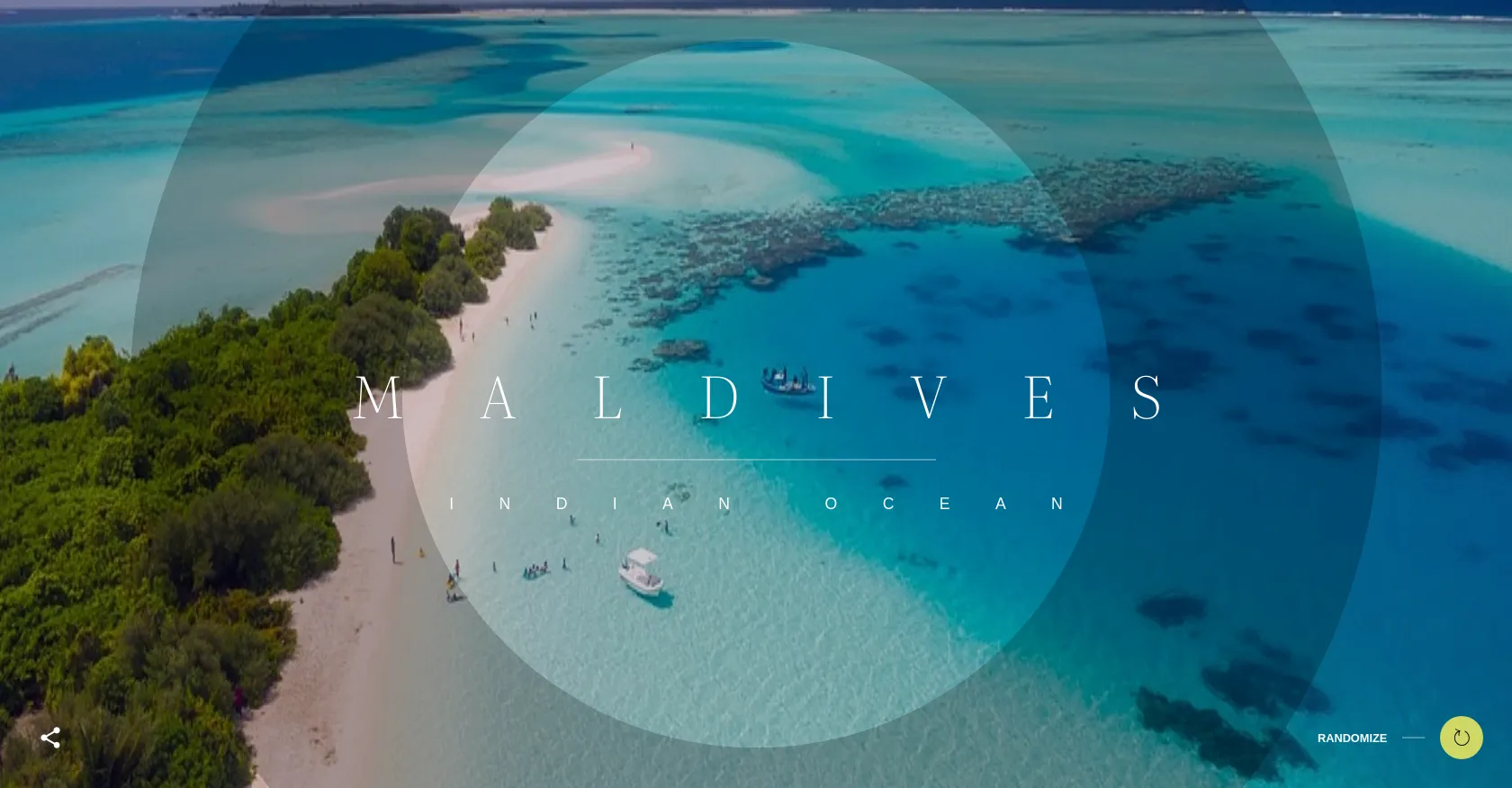
Rotational Travel Slider
3065
Andev.web
Open In Editor
Publish Your Code
Recommended
17 November 2025
Animated Jelly Slider
12 December 2024
Image Slider for Blogspot CSS3
30 November 2024
Creative Photography Showcase Slider | Swiper Slider
HTML
Copy
Andev Web
CSS
Copy
@import url("https://fonts.googleapis.com/css2?family=Literata:opsz,wght@7..72,200&display=swap"); :root { --img-current: url(https://cdn.pixabay.com/photo/2021/11/26/17/26/dubai-desert-safari-6826298_1280.jpg); --img-next: url(https://cdn.pixabay.com/photo/2017/01/20/00/30/maldives-1993704_1280.jpg); --text-current-title: "Sahara"; --text-next-title: "Maldives"; --text-current-subtitle: "Marrakech"; --text-next-subtitle: "Indian Ocean"; } * { box-sizing: border-box; } body { margin: 0; font-family: sans-serif; text-transform: uppercase; font-weight: 700; font-size: clamp(0.7rem, 1vw, 0.8rem); color: #fff; } a { color: inherit; text-decoration: none; } header, footer { position: fixed; z-index: 50; display: flex; justify-content: space-between; align-items: center; width: 100%; } header > *, footer > * { flex: 1 1 100%; padding: 2rem; } header { top: 0; } footer { bottom: 0; } header > *:nth-child(2), footer > *:nth-child(2) { text-align: center; } header > *:nth-child(3), footer > *:nth-child(3) { text-align: right; } main { position: relative; width: 100vw; height: 100vh; overflow: hidden; } h1, h2 { display: block; text-wrap: nowrap; margin: 0; overflow: hidden; clip-path: inset(0 0 0 0); } h1::before, h2::before { transition-delay: 0.5s; transform: translate(-50%, 0%); } h1 { font-family: "Literata"; font-weight: 200; height: clamp(2rem, 8vw, 4rem); font-size: clamp(2rem, 8vw, 4rem); letter-spacing: clamp(0.5rem, 5vw, 10rem); margin-left: clamp(0.5rem, 5vw, 10rem); } h1::before, h1::after { content: var(--text-current-title); position: absolute; line-height: 1; } h1::after { content: var(--text-next-title); transition-delay: 0.5s; transform: translate(-50%, 100%); } h2 { height: clamp(0.9rem, 2vw, 1.1rem); font-size: clamp(0.9rem, 2vw, 1.1rem); letter-spacing: clamp(0.5rem, 3vw, 5rem); margin-left: clamp(0.5rem, 3vw, 5rem); font-weight: 400; } h2::before, h2::after { content: var(--text-current-subtitle); position: absolute; line-height: 1; } h2::after { content: var(--text-next-subtitle); transition-delay: 0.5s; transform: translate(-50%, -100%); } hr { opacity: 0.3; border: none; height: 2px; background: #fff; } .logo { width: 30px; height: 30px; border-radius: 50%; } .background { position: absolute; top: 50%; left: 50%; width: max(180vw, 180vh); aspect-ratio: 1/1; transform: translate(-50%, -50%); filter: brightness(0.8); } .background::before, .background::after { content: ""; position: absolute; inset: 0; background-size: max(110vw, 110vh) max(110vw, 110vh); background-position: 50%; transition: all 1.5s; transition-timing-function: ease-in-out; } .background::before { background-image: var(--img-current); } .background::after { background-image: var(--img-next); opacity: 0; } .background--2::after { transition-delay: 0.2s; } .background--3::after { transition-delay: 0.4s; } .background--2::before, .background--2::after { clip-path: circle(23%); filter: brightness(0.8); } .background--3::before, .background--3::after { clip-path: circle(13%); } .body--animated .background::before, .body--animated .background::after { animation: rotate ease-in-out 1s forwards; animation-delay: 0.4s; transition-delay: 0.4s; } .body--animated .background--2::before, .body--animated .background--2::after { animation-delay: 0.2s; transition-delay: 0.2s; } .body--animated .background--3::before, .body--animated .background--3::after { animation-delay: 0s; transition-delay: 0s; } .body--animated .background::after { opacity: 1; } .body--animated h1::before, .body--animated h2::before, .body--animated h1::after, .body--animated h2::after { transition-delay: 0.5s; transition-duration: 0.5s; } .body--animated h1:before { transform: translate(-50%, -100%); } .body--animated h1:after { transform: translate(-50%, 0%); } .body--animated h2:before { transform: translate(-50%, 100%); } .body--animated h2:after { transform: translate(-50%, 0%); } .content { position: absolute; top: 50%; left: 50%; width: 95%; text-align: center; transform: translate(-50%, clamp(-2rem, -4vw, -1rem)); } .content hr { max-width: 400px; margin: clamp(1rem, 5vw, 2.5rem) auto; } .randomize { display: flex; justify-content: end; align-items: center; flex-wrap: wrap; cursor: pointer; } .randomize hr { display: inline-block; width: 25px; margin: 0 1vw; } .randomize button { background: #cfd865; width: clamp(2rem, 4vw, 3rem); aspect-ratio: 1/1; border: none; border-radius: 50%; font-size: clamp(1rem, 2vw, 1.5rem); cursor: pointer; } /* animation */ @keyframes rotate { 0% { transform: rotate(0) translateZ(0); background-size: max(110vw, 110vh) max(110vw, 110vh); } 50% { background-size: max(160vw, 160vh) max(160vw, 160vh); } 100% { transform: rotate(360deg) translateZ(0); background-size: max(110vw, 110vh) max(110vw, 110vh); } } /* sharethis */ footer #st-1.sharethis-inline-share-buttons { text-align: left; } footer #st-1.sharethis-inline-share-buttons .st-btn { border: none; background: rgba(0, 0, 0, 0); } footer #st-1.sharethis-inline-share-buttons .st-btn img { filter: brightness(5); }
JS
Copy
const r = document.querySelector(":root"); const bodyElement = document.body; const randomizeElement = document.querySelector(".randomize"); const destinations = [ { name: "Sahara", location: "Marrakech", img: "https://cdn.pixabay.com/photo/2021/11/26/17/26/dubai-desert-safari-6826298_1280.jpg" }, { name: "Maldives", location: "Indian Ocean", img: "https://cdn.pixabay.com/photo/2017/01/20/00/30/maldives-1993704_1280.jpg" }, { name: "Dolomites", location: "Italy", img: "https://cdn.pixabay.com/photo/2020/03/29/09/24/pale-di-san-martino-4979964_1280.jpg" }, { name: "Highland", location: "Scotland", img: "https://cdn.pixabay.com/photo/2014/11/21/03/26/neist-point-540119_1280.jpg" }, { name: "Kleifarvatn", location: "Iceland", img: "https://cdn.pixabay.com/photo/2017/03/02/16/54/iceland-2111811_1280.jpg" }, { name: "Taj Mahal", location: "India", img: "https://cdn.pixabay.com/photo/2023/08/19/13/26/ai-generated-8200484_1280.jpg" }, { name: "Colorado", location: "Arizona", img: "https://cdn.pixabay.com/photo/2016/11/29/03/13/desert-1867005_1280.jpg" }, { name: "Santorin", location: "Greece", img: "https://cdn.pixabay.com/photo/2017/01/30/07/54/church-2020258_1280.jpg" }, { name: "Petra", location: "Jordan", img: "https://cdn.pixabay.com/photo/2019/07/20/19/12/petra-4351361_1280.jpg" }, { name: "Fundy", location: "Canada", img: "https://cdn.pixabay.com/photo/2020/11/22/07/11/river-5765785_1280.jpg" }, { name: "Fuji", location: "Japan", img: "https://cdn.pixabay.com/photo/2016/12/12/22/31/japan-1902834_1280.jpg" }, { name: "Ha Long Bay", location: "Vietnam", img: "https://cdn.pixabay.com/photo/2022/10/21/10/00/marvel-7536676_1280.jpg" } ]; let nextDestination = destinations[1]; const getRandomDestination = () => { const randomId = Math.floor(Math.random() * destinations.length); return destinations[randomId]; }; const displayNextContent = () => { if (bodyElement.classList.contains("body--animated")) { return; } bodyElement.classList.add("body--animated"); setTimeout(() => { r.style.setProperty("--img-current", `url(${nextDestination.img})`); r.style.setProperty("--text-current-title", `"${nextDestination.name}"`); r.style.setProperty( "--text-current-subtitle", `"${nextDestination.location}"` ); setTimeout(() => { bodyElement.classList.remove("body--animated"); setTimeout(() => { nextDestination = getRandomDestination(); r.style.setProperty("--img-next", `url(${nextDestination.img})`); r.style.setProperty("--text-next-title", `"${nextDestination.name}"`); r.style.setProperty( "--text-next-subtitle", `"${nextDestination.location}"` ); }, 1000); }, 1000); }, 1000); }; randomizeElement.addEventListener("click", displayNextContent); // start on fist load only for CodePen Animation ;) displayNextContent();