WEBLEB
Home
Editor
Accedi
Pro
Italiano
English
Français
Español
Português
Deutsch
Italiano
हिंदी
18624
webleb
Video
Pubblica il Tuo Codice
10
Consigliato
10 December 2025
Codice sorgente JavaScript del gioco HTML Canvas Snake
16 December 2024
Un codice di meriem
25 July 2025
Piattaforma di trading minerario: negozia metalli e minerali
index.html
Copy
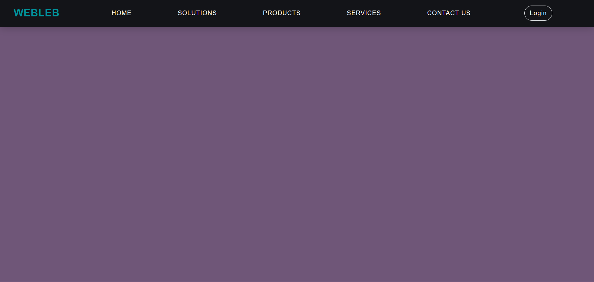
<!DOCTYPE html> <html lang="en"> <head> <meta charset="UTF-8"> <meta name="viewport" content="width=device-width, initial-scale=1.0"> <meta http-equiv="X-UA-Compatible" content="ie=edge"> <link rel="stylesheet" href="/css/styles.css"/> <title>Webleb</title> </head> <body> <nav> <div class="logo" style="display: flex;align-items: center;"> <span style="color:#01939c; font-size:26px; font-weight:bold; letter-spacing: 1px;margin-left: 20px;">WEBLEB</span> </div> <div class="hamburger"> <div class="line1"></div> <div class="line2"></div> <div class="line3"></div> </div> <ul class="nav-links"> <li><a href="https://www.web-leb.com/code">Home</a></li> <li><a href="https://www.web-leb.com/code">Solutions</a></li> <li><a href="https://www.web-leb.com/code">Products</a></li> <li><a href="https://www.web-leb.com/code">Services</a></li> <li><a href="https://www.web-leb.com/code">Contact Us</a></li> <li><button class="login-button" href="https://www.web-leb.com/code">Login</button></li> </ul> </nav> <script src="/js/main.js"></script> </body> </html>
styles.css
Copy
*{ margin: 0; padding: 0; color: #f2f5f7; font-family: sans-serif; letter-spacing: 1px; font-weight: 300; } body{ overflow-x: hidden; } nav{ height: 4.5rem; width: 100vw; background-color: #131418; box-shadow: 0 3px 20px rgba(0, 0, 0, 0.2); display: flex; position: fixed; z-index: 10; } /*Styling logo*/ .logo{ padding:1vh 1vw; text-align: center; } .logo img { height: 5rem; width: 5rem; } /*Styling Links*/ .nav-links{ display: flex; list-style: none; width: 88vw; padding: 0 0.7vw; justify-content: space-evenly; align-items: center; text-transform: uppercase; } .nav-links li a{ text-decoration: none; margin: 0 0.7vw; } .nav-links li a:hover { color: #61DAFB; } .nav-links li { position: relative; } .nav-links li a:hover::before{ width: 80%; } /*Styling Buttons*/ .login-button{ background-color: transparent; border: 1.5px solid #f2f5f7; border-radius: 2em; padding: 0.6rem 0.8rem; margin-left: 2vw; font-size: 1rem; cursor: pointer; } .login-button:hover { color: #131418; background-color: #f2f5f7; border:1.5px solid #f2f5f7; transition: all ease-in-out 350ms; } .join-button{ color: #131418; background-color: #61DAFB; border: 1.5px solid #61DAFB; border-radius: 2em; padding: 0.6rem 0.8rem; font-size: 1rem; cursor: pointer; } .join-button:hover { color: #f2f5f7; background-color: transparent; border:1.5px solid #f2f5f7; transition: all ease-in-out 350ms; } /*Styling Hamburger Icon*/ .hamburger div{ width: 30px; height:3px; background: #f2f5f7; margin: 5px; transition: all 0.3s ease; } .hamburger{ display: none; } /*Stying for small screens*/ @media screen and (max-width: 800px){ nav{ position: fixed; z-index: 3; } .hamburger{ display:block; position: absolute; cursor: pointer; right: 5%; top: 50%; transform: translate(-5%, -50%); z-index: 2; transition: all 0.7s ease; } .nav-links{ position: fixed; background: #131418; height: 100vh; width: 100%; flex-direction: column; clip-path: circle(50px at 90% -20%); -webkit-clip-path: circle(50px at 90% -10%); transition: all 1s ease-out; pointer-events: none; } .nav-links.open{ clip-path: circle(1000px at 90% -10%); -webkit-clip-path: circle(1000px at 90% -10%); pointer-events: all; } .nav-links li{ opacity: 0; } .nav-links li:nth-child(1){ transition: all 0.5s ease 0.2s; } .nav-links li:nth-child(2){ transition: all 0.5s ease 0.4s; } .nav-links li:nth-child(3){ transition: all 0.5s ease 0.6s; } .nav-links li:nth-child(4){ transition: all 0.5s ease 0.7s; } .nav-links li:nth-child(5){ transition: all 0.5s ease 0.8s; } .nav-links li:nth-child(6){ transition: all 0.5s ease 0.9s; margin: 0; } .nav-links li:nth-child(7){ transition: all 0.5s ease 1s; margin: 0; } li.fade{ opacity: 1; } } /*Animating Hamburger Icon on Click*/ .toggle .line1{ transform: rotate(-45deg) translate(-5px,6px); } .toggle .line2{ transition: all 0.7s ease; width:0; } .toggle .line3{ transform: rotate(45deg) translate(-5px,-6px); }
main.js
Copy
const hamburger = document.querySelector(".hamburger"); const navLinks = document.querySelector(".nav-links"); const links = document.querySelectorAll(".nav-links li"); hamburger.addEventListener('click', ()=>{ //Animate Links navLinks.classList.toggle("open"); links.forEach(link => { link.classList.toggle("fade"); }); //Hamburger Animation hamburger.classList.toggle("toggle"); });