WEBLEB
Início
Editor
Entrar
Pro
Português
English
Français
Español
Português
Deutsch
Italiano
हिंदी
4796
gerlannypaula
Abrir no Editor
Video
Publique Seu Código
4
Recomendado
22 May 2025
Portfólio responsivo
6 December 2024
Um código por dynamicarray606
HTML
Copy
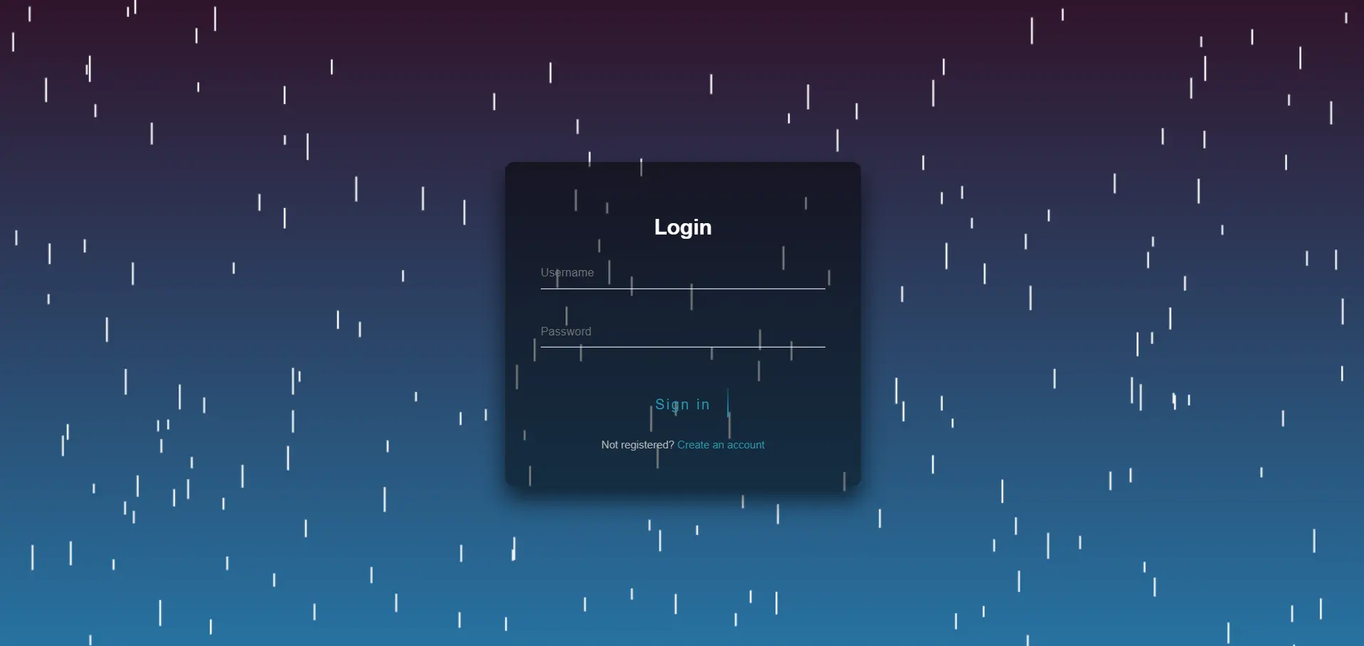
<!DOCTYPE html> <html> <head> <title>Tela de login</title> <style> canvas { position: absolute; top: 0; left: 0; } </style> </head> <body> <canvas id="rainfall"></canvas> <script> const canvas = document.getElementById('rainfall'); const ctx = canvas.getContext('2d'); // Set canvas size to match window size canvas.width = window.innerWidth; canvas.height = window.innerHeight; // Create an array to store the raindrops const raindrops = []; // Function to create a new raindrop function createRaindrop() { const x = Math.random() * canvas.width; const y = -5; const speed = Math.random() * 5 + 2; const length = Math.random() * 20 + 10; raindrops.push({ x, y, speed, length }); } // Function to update the raindrops' positions function updateRaindrops() { for (let i = 0; i < raindrops.length; i++) { const raindrop = raindrops[i]; raindrop.y += raindrop.speed; if (raindrop.y > canvas.height) { raindrops.splice(i, 1); i--; } } } // Function to draw the raindrops function drawRaindrops() { ctx.clearRect(0, 0, canvas.width, canvas.height); ctx.strokeStyle = 'white'; ctx.lineWidth = 2; for (let i = 0; i < raindrops.length; i++) { const raindrop = raindrops[i]; ctx.beginPath(); ctx.moveTo(raindrop.x, raindrop.y); ctx.lineTo(raindrop.x, raindrop.y + raindrop.length); ctx.stroke(); } } // Function to animate the raindrops function animate() { createRaindrop(); updateRaindrops(); drawRaindrops(); requestAnimationFrame(animate); } // Start the animation animate(); </script> <link rel="stylesheet" href="./style.css"> <body style="display:flex; align-items:center; justify-content:center;"> <div class="login-page"> <div class="form"> <form class="register-form" method="POST"> <h2>Register</h2> <input type="text" placeholder="Full Name *" required/> <input type="text" placeholder="Username *" required/> <input type="email" placeholder="Email *" required/> <input type="password" placeholder="Password *" required/> <a class="btn" href="#"> <span></span> <span></span> <span></span> <span></span> Create </a> <p class="message">Already registered? <a href="#">Sign In</a></p> </form> <form class="login-form" method="post"> <h2></i> Login</h2> <input type="text" placeholder="Username" required /> <input type="password" placeholder="Password" required/> <a class="btn" href="#"> <span></span> <span></span> <span></span> <span></span> Sign in </a> <p class="message">Not registered? <a href="#">Create an account</a></p> </form> </div> </div> <script src="https://code.jquery.com/jquery-3.6.0.min.js"></script> <script src="./main.js"></script> </body> </html>
CSS
Copy
@import url(https://fonts.googleapis.com/css?family=Poppins:300); html { height: 100%; } body{ margin:0; padding:0; font-family: sans-serif; background: linear-gradient(#30142b, #2772a1); } .login-page { width: 400px; padding: 8% 0 0; margin: auto; } .form { position: relative; z-index: 1; text-align: center; position: absolute; top: 50%; left: 50%; width: 400px; padding: 40px; transform: translate(-50%, -50%); background: rgba(0,0,0,.5); box-sizing: border-box; box-shadow: 0 15px 25px rgba(0,0,0,.6); border-radius: 10px; } .form input { width: 100%; padding: 10px 0; font-size: 13px; color: #fff; margin-bottom: 30px; border: none; border-bottom: 1px solid #fff; outline: none; background: transparent; } h2{ color:white; } .form .message { margin: 15px 0 0; color: #b3b3b3; font-size: 12px; } .form .message a { color: #289bb8; text-decoration: none; } .form .register-form { display: none; } .btn { position: relative; display: inline-block; padding: 10px 20px; color: #289bb8; font-size: 16px; text-decoration: none; overflow: hidden; transition: .5s; margin-top: 15px; letter-spacing: 2px } .btn:hover { background: #289bb8; color: #fff; border-radius: 5px; box-shadow: 0 0 5px #289bb8, 0 0 25px #289bb8, 0 0 50px #289bb8, 0 0 100px #289bb8; } .btn span { position: absolute; display: block; } .btn span:nth-child(1) { top: 0; left: -100%; width: 100%; height: 2px; background: linear-gradient(90deg, transparent, #289bb8); animation: btn-anim1 1s linear infinite; } @keyframes btn-anim1 { 0% { left: -100%; } 50%,100% { left: 100%; } } .btn span:nth-child(2) { top: -100%; right: 0; width: 2px; height: 100%; background: linear-gradient(180deg, transparent, #289bb8); animation: btn-anim2 1s linear infinite; animation-delay: .25s } @keyframes btn-anim2 { 0% { top: -100%; } 50%,100% { top: 100%; } } .btn span:nth-child(3) { bottom: 0; right: -100%; width: 100%; height: 2px; background: linear-gradient(270deg, transparent, #289bb8); animation: btn-anim3 1s linear infinite; animation-delay: .5s } @keyframes btn-anim3 { 0% { right: -100%; } 50%,100% { right: 100%; } } .btn span:nth-child(4) { bottom: -100%; left: 0; width: 2px; height: 100%; background: linear-gradient(360deg, transparent, #289bb8); animation: btn-anim4 1s linear infinite; animation-delay: .75s } @keyframes btn-anim4 { 0% { bottom: -100%; } 50%,100% { bottom: 100%; } }
JS
Copy
$('.message a').click(function(){ $('form').animate({height: "toggle", opacity: "toggle"}, "slow"); });