WEBLEB
Início
Editor
Entrar
Pro
Português
English
Français
Español
Português
Deutsch
Italiano
हिंदी
2497
Andev.web
Abrir no Editor
Video
Publique Seu Código
4
21 January 2026
Rodapé com atribuição CSS: Fixo, Centralizado, Elegante
30 January 2026
Animação de partículas em tela com interação do mouse
HTML
Copy
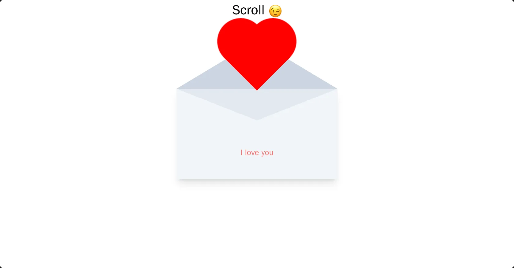
<!DOCTYPE html> <html lang="en"> <head> <meta charset="UTF-8"> <title>Andev Web</title> <script src="https://cdn.tailwindcss.com"></script> <link rel="stylesheet" href="./style.css"> </head> <body> <h1 class="text-[clamp(20px,5vmin,100px)] text-center"> Scroll <img src="https://em-content.zobj.net/source/apple/237/winking-face_1f609.png" alt="Winking Face" class="inline w-[1em] h-[1em] align-middle"> </h1> <div class="top-0 left-0 fixed inset-0 grid place-items-center"> <div class="envelope relative w-[60vmin] aspect-video bg-slate-200 shadow-xl"> <div class="flap bg-slate-300"> </div> <div class="heart"></div> <div class="face bg-slate-100 inset-0 absolute z-[3]"></div> <p class="text-to-show relative z-10 pt-[6cqw] text-center text-[5cqw] text-red-400">I love you</p> </div> </div> </body> </html>
CSS
Copy
@property --flap-rotation { syntax: "<angle>"; inherits: false; initial-value: 0deg; } @property --progress { syntax: "<percentage>"; inherits: false; initial-value: 20%; } @property --text { syntax: "<number>"; inherits: false; initial-value: 0.0; } * { box-sizing: border-box; } body { height: 1000vh; } .text-to-show { animation: reveal-text ease both; animation-timeline: scroll(); animation-range: 80%; opacity: var(--text); } .envelope { container: envelope / inline-size; perspective: 1000px; } .flap { clip-path: polygon(100% 0%, 0 0%, 50% 100%); width: 100cqw; height: 30cqw; transform-style: preserve-3d; rotate: x var(--flap-rotation); transform-origin: 50% 0; animation: animate-flap ease both; animation-timeline: scroll(); animation-range: 0 60%; z-index: 4; position: relative; } .face { clip-path: polygon(50% 35%, 100% 0, 100% 100%, 0 100%, 0 0); } .heart { --c: red; position: absolute; width: 50cqw; left: 50%; top: 0; transform: translateY(var(--progress)); animation: show-heart ease both; animation-timeline: scroll(); animation-range: 60%; margin-left: -25cqw; aspect-ratio: 1/1; z-index: 3; background: radial-gradient(at 70% 31%,var(--c) 29%,#0000 30%), radial-gradient(at 30% 31%,var(--c) 29%,#0000 30%), conic-gradient(from -45deg at 50% 84%,var(--c) 90deg,#0000 0) bottom/100% 50% no-repeat; } @keyframes animate-flap { from { --flap-rotation: 0deg; } 99% { z-index: 4 } 100% { --flap-rotation: 180deg; z-index: 1; } } @keyframes show-heart { from { --progress: 20%; } to { --progress: -90%; } } @keyframes reveal-text { from { --text: 0.0; } to { --text: 1.0; } }
JS
Copy