WEBLEB
Início
Editor
Entrar
Pro
Português
English
Français
Español
Português
Deutsch
Italiano
हिंदी
2083
Andev.web
Abrir no Editor
Video
Publique Seu Código
0
Recomendado
13 January 2026
Metehan
28 November 2024
Fundo animado Matrix
HTML
Copy
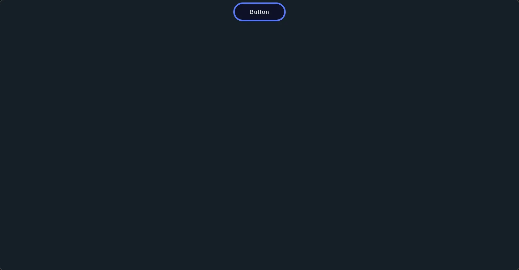
<html> <head> <title>Andev Web</title> <link rel="stylesheet" href="./style.css"> </head> <body> <div class="voltage-button"> <button>Button</button> <svg version="1.1" xmlns="http://www.w3.org/2000/svg" x="0px" y="0px" viewBox="0 0 234.6 61.3" preserveAspectRatio="none" xml:space="preserve"> <filter id="glow"> <feGaussianBlur class="blur" result="coloredBlur" stdDeviation="2"></feGaussianBlur> <feTurbulence type="fractalNoise" baseFrequency="0.075" numOctaves="0.3" result="turbulence"></feTurbulence> <feDisplacementMap in="SourceGraphic" in2="turbulence" scale="30" xChannelSelector="R" yChannelSelector="G" result="displace"></feDisplacementMap> <feMerge> <feMergeNode in="coloredBlur"></feMergeNode> <feMergeNode in="coloredBlur"></feMergeNode> <feMergeNode in="coloredBlur"></feMergeNode> <feMergeNode in="displace"></feMergeNode> <feMergeNode in="SourceGraphic"></feMergeNode> </feMerge> </filter> <path class="voltage line-1" d="m216.3 51.2c-3.7 0-3.7-1.1-7.3-1.1-3.7 0-3.7 6.8-7.3 6.8-3.7 0-3.7-4.6-7.3-4.6-3.7 0-3.7 3.6-7.3 3.6-3.7 0-3.7-0.9-7.3-0.9-3.7 0-3.7-2.7-7.3-2.7-3.7 0-3.7 7.8-7.3 7.8-3.7 0-3.7-4.9-7.3-4.9-3.7 0-3.7-7.8-7.3-7.8-3.7 0-3.7-1.1-7.3-1.1-3.7 0-3.7 3.1-7.3 3.1-3.7 0-3.7 10.9-7.3 10.9-3.7 0-3.7-12.5-7.3-12.5-3.7 0-3.7 4.6-7.3 4.6-3.7 0-3.7 4.5-7.3 4.5-3.7 0-3.7 3.6-7.3 3.6-3.7 0-3.7-10-7.3-10-3.7 0-3.7-0.4-7.3-0.4-3.7 0-3.7 2.3-7.3 2.3-3.7 0-3.7 7.1-7.3 7.1-3.7 0-3.7-11.2-7.3-11.2-3.7 0-3.7 3.5-7.3 3.5-3.7 0-3.7 3.6-7.3 3.6-3.7 0-3.7-2.9-7.3-2.9-3.7 0-3.7 8.4-7.3 8.4-3.7 0-3.7-14.6-7.3-14.6-3.7 0-3.7 5.8-7.3 5.8-2.2 0-3.8-0.4-5.5-1.5-1.8-1.1-1.8-2.9-2.9-4.8-1-1.8 1.9-2.7 1.9-4.8 0-3.4-2.1-3.4-2.1-6.8s-9.9-3.4-9.9-6.8 8-3.4 8-6.8c0-2.2 2.1-2.4 3.1-4.2 1.1-1.8 0.2-3.9 2-5 1.8-1 3.1-7.9 5.3-7.9 3.7 0 3.7 0.9 7.3 0.9 3.7 0 3.7 6.7 7.3 6.7 3.7 0 3.7-1.8 7.3-1.8 3.7 0 3.7-0.6 7.3-0.6 3.7 0 3.7-7.8 7.3-7.8h7.3c3.7 0 3.7 4.7 7.3 4.7 3.7 0 3.7-1.1 7.3-1.1 3.7 0 3.7 11.6 7.3 11.6 3.7 0 3.7-2.6 7.3-2.6 3.7 0 3.7-12.9 7.3-12.9 3.7 0 3.7 10.9 7.3 10.9 3.7 0 3.7 1.3 7.3 1.3 3.7 0 3.7-8.7 7.3-8.7 3.7 0 3.7 11.5 7.3 11.5 3.7 0 3.7-1.4 7.3-1.4 3.7 0 3.7-2.6 7.3-2.6 3.7 0 3.7-5.8 7.3-5.8 3.7 0 3.7-1.3 7.3-1.3 3.7 0 3.7 6.6 7.3 6.6s3.7-9.3 7.3-9.3c3.7 0 3.7 0.2 7.3 0.2 3.7 0 3.7 8.5 7.3 8.5 3.7 0 3.7 0.2 7.3 0.2 3.7 0 3.7-1.5 7.3-1.5 3.7 0 3.7 1.6 7.3 1.6s3.7-5.1 7.3-5.1c2.2 0 0.6 9.6 2.4 10.7s4.1-2 5.1-0.1c1 1.8 10.3 2.2 10.3 4.3 0 3.4-10.7 3.4-10.7 6.8s1.2 3.4 1.2 6.8 1.9 3.4 1.9 6.8c0 2.2 7.2 7.7 6.2 9.5-1.1 1.8-12.3-6.5-14.1-5.5-1.7 0.9-0.1 6.2-2.2 6.2z" fill="transparent" stroke="#fff"></path> <path class="voltage line-2" d="m216.3 52.1c-3 0-3-0.5-6-0.5s-3 3-6 3-3-2-6-2-3 1.6-6 1.6-3-0.4-6-0.4-3-1.2-6-1.2-3 3.4-6 3.4-3-2.2-6-2.2-3-3.4-6-3.4-3-0.5-6-0.5-3 1.4-6 1.4-3 4.8-6 4.8-3-5.5-6-5.5-3 2-6 2-3 2-6 2-3 1.6-6 1.6-3-4.4-6-4.4-3-0.2-6-0.2-3 1-6 1-3 3.1-6 3.1-3-4.9-6-4.9-3 1.5-6 1.5-3 1.6-6 1.6-3-1.3-6-1.3-3 3.7-6 3.7-3-6.4-6-6.4-3 2.5-6 2.5h-6c-3 0-3-0.6-6-0.6s-3-1.4-6-1.4-3 0.9-6 0.9-3 4.3-6 4.3-3-3.5-6-3.5c-2.2 0-3.4-1.3-5.2-2.3-1.8-1.1-3.6-1.5-4.6-3.3s-4.4-3.5-4.4-5.7c0-3.4 0.4-3.4 0.4-6.8s2.9-3.4 2.9-6.8-0.8-3.4-0.8-6.8c0-2.2 0.3-4.2 1.3-5.9 1.1-1.8 0.8-6.2 2.6-7.3 1.8-1 5.5-2 7.7-2 3 0 3 2 6 2s3-0.5 6-0.5 3 5.1 6 5.1 3-1.1 6-1.1 3-5.6 6-5.6 3 4.8 6 4.8 3 0.6 6 0.6 3-3.8 6-3.8 3 5.1 6 5.1 3-0.6 6-0.6 3-1.2 6-1.2 3-2.6 6-2.6 3-0.6 6-0.6 3 2.9 6 2.9 3-4.1 6-4.1 3 0.1 6 0.1 3 3.7 6 3.7 3 0.1 6 0.1 3-0.6 6-0.6 3 0.7 6 0.7 3-2.2 6-2.2 3 4.4 6 4.4 3-1.7 6-1.7 3-4 6-4 3 4.7 6 4.7 3-0.5 6-0.5 3-0.8 6-0.8 3-3.8 6-3.8 3 6.3 6 6.3 3-4.8 6-4.8 3 1.9 6 1.9 3-1.9 6-1.9 3 1.3 6 1.3c2.2 0 5-0.5 6.7 0.5 1.8 1.1 2.4 4 3.5 5.8 1 1.8 0.3 3.7 0.3 5.9 0 3.4 3.4 3.4 3.4 6.8s-3.3 3.4-3.3 6.8 4 3.4 4 6.8c0 2.2-6 2.7-7 4.4-1.1 1.8 1.1 6.7-0.7 7.7-1.6 0.8-4.7-1.1-6.8-1.1z" fill="transparent" stroke="#fff"></path> </svg> <div class="dots"> <div class="dot dot-1"></div> <div class="dot dot-2"></div> <div class="dot dot-3"></div> <div class="dot dot-4"></div> <div class="dot dot-5"></div> </div> </div> </body> </html>
CSS
Copy
body{ display: flex; justify-content: center; align-items: center; background: #151F28; } .voltage-button { position: relative; } .voltage-button button { color: white; background: #0D1127; padding: 1rem 3rem 1rem 3rem; border-radius: 5rem; border: 5px solid #5978F3; font-size: 1.2rem; line-height: 1em; letter-spacing: 0.075em; transition: background 0.3s; } .voltage-button button:hover { cursor: pointer; background: #0F1C53; } .voltage-button button:hover + svg, .voltage-button button:hover + svg + .dots { opacity: 1; } .voltage-button svg { display: block; position: absolute; top: -0.75em; left: -0.25em; width: calc(100% + 0.5em); height: calc(100% + 1.5em); pointer-events: none; opacity: 0; transition: opacity 0.4s; transition-delay: 0.1s; } .voltage-button svg path { stroke-dasharray: 100; filter: url("#glow"); } .voltage-button svg path.line-1 { stroke: #f6de8d; stroke-dashoffset: 0; animation: spark-1 3s linear infinite; } .voltage-button svg path.line-2 { stroke: #6bfeff; stroke-dashoffset: 500; animation: spark-2 3s linear infinite; } .voltage-button .dots { opacity: 0; transition: opacity 0.3s; transition-delay: 0.4s; } .voltage-button .dots .dot { width: 1rem; height: 1rem; background: white; border-radius: 100%; position: absolute; opacity: 0; } .voltage-button .dots .dot-1 { top: 0; left: 20%; animation: fly-up 3s linear infinite; } .voltage-button .dots .dot-2 { top: 0; left: 55%; animation: fly-up 3s linear infinite; animation-delay: 0.5s; } .voltage-button .dots .dot-3 { top: 0; left: 80%; animation: fly-up 3s linear infinite; animation-delay: 1s; } .voltage-button .dots .dot-4 { bottom: 0; left: 30%; animation: fly-down 3s linear infinite; animation-delay: 2.5s; } .voltage-button .dots .dot-5 { bottom: 0; left: 65%; animation: fly-down 3s linear infinite; animation-delay: 1.5s; } @keyframes spark-1 { to { stroke-dashoffset: -1000; } } @keyframes spark-2 { to { stroke-dashoffset: -500; } } @keyframes fly-up { 0% { opacity: 0; transform: translateY(0) scale(0.2); } 5% { opacity: 1; transform: translateY(-1.5rem) scale(0.4); } 10%, 100% { opacity: 0; transform: translateY(-3rem) scale(0.2); } } @keyframes fly-down { 0% { opacity: 0; transform: translateY(0) scale(0.2); } 5% { opacity: 1; transform: translateY(1.5rem) scale(0.4); } 10%, 100% { opacity: 0; transform: translateY(3rem) scale(0.2); } }
JS
Copy